Portland
Below you’ll find a list of articles broken down by sub-topics that cover every aspect of your theme. We regularly maintain our documentation in collaboration with our support staff.
General sections
The sections that are used on all pages by default
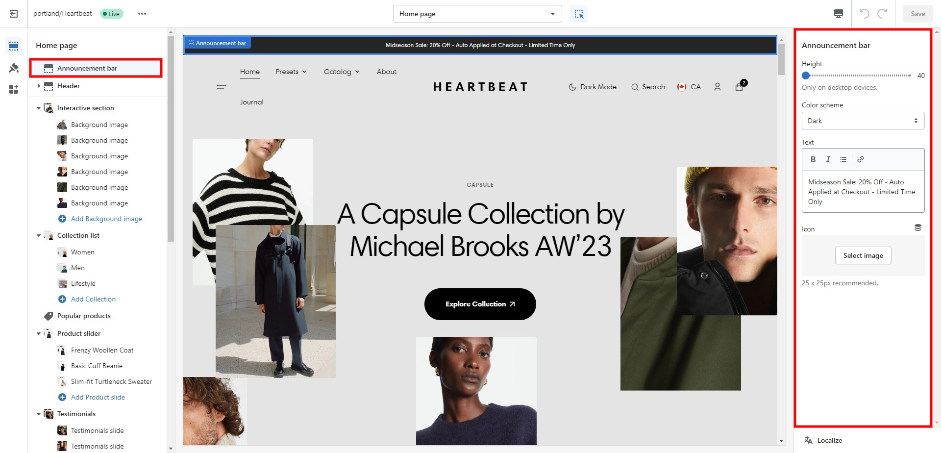
Announcement bar
The announcement bar appears at the top of every page and includes custom messages with optional links. It's good to use for promoting sales or need-to-know updates.
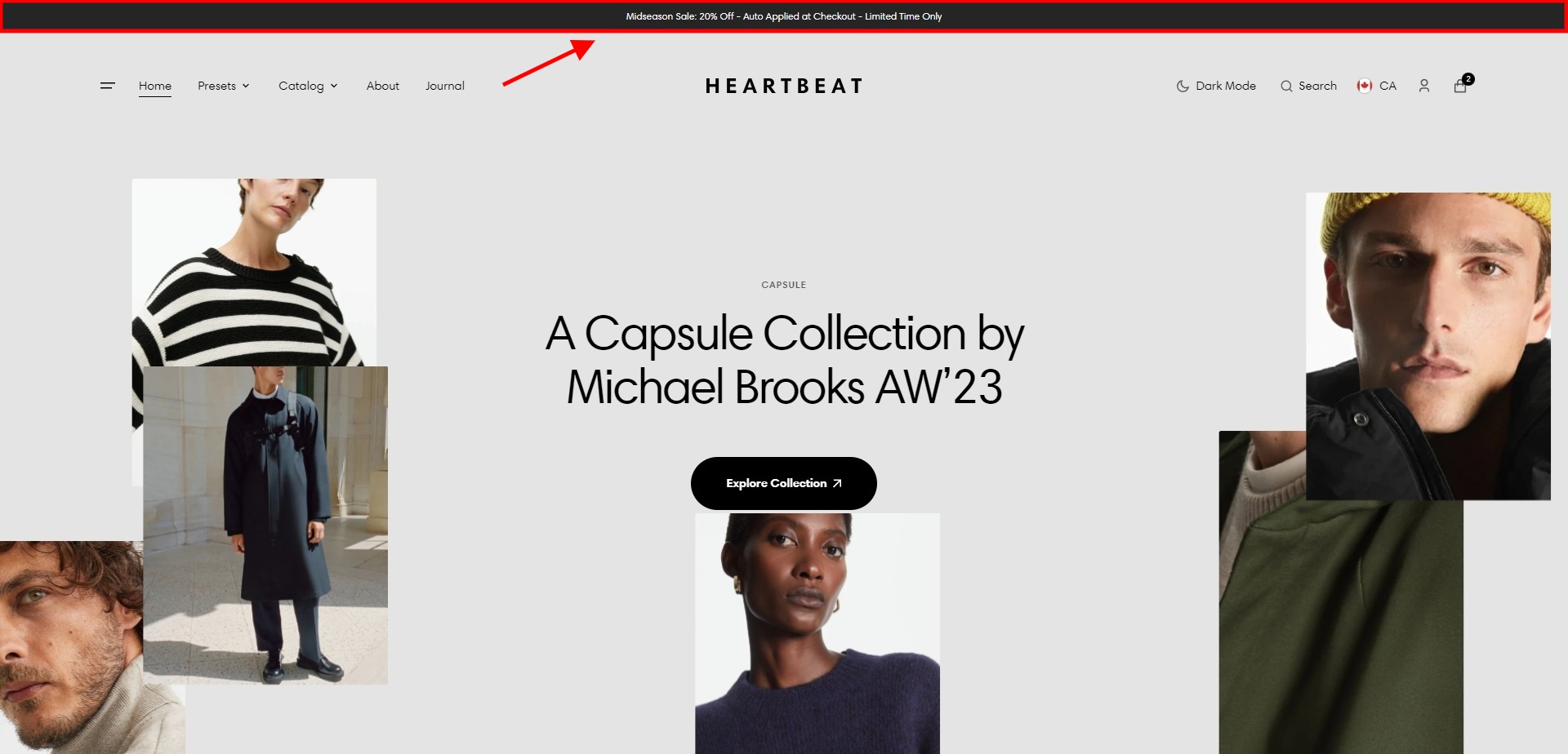
- Height slider allows you to change the bar's height.
- Color scheme selector allows you to change the color scheme. (You can change the background color in the Theme settings.
- Text field allows you to add and edit text.
- Use the field Icon (Optional.) to add/change the image.
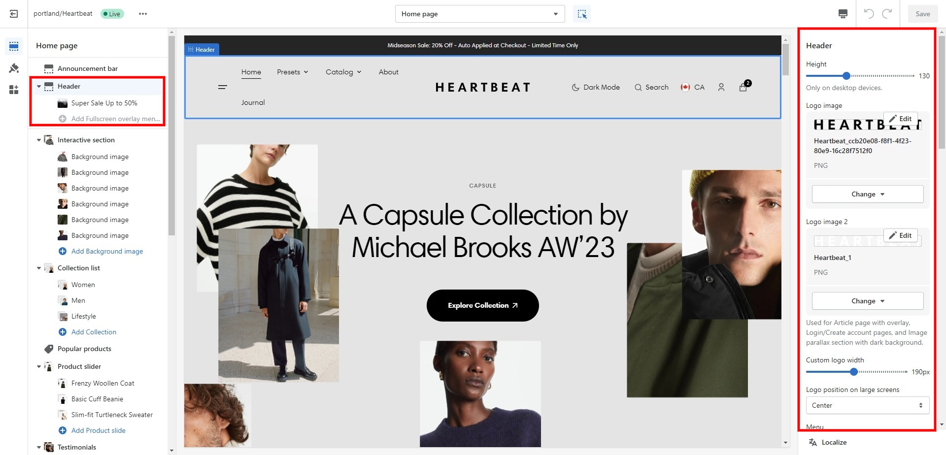
Header
Header appears at the top of every page right below the Announcement bar. You can customize it to fit your brand and product offerings.
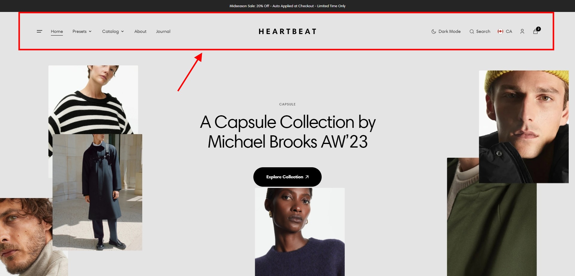
- Height slider allows you to change the header's height only on desktop devices.
- Use the Logo image file selector allows you to select or upload your logo file.
- Use the Logo image 2 file selector to select or upload your logo, which can be seen on pages with an overlay header and also in Dark mode.
- (Optional.) If you add a logo, you can use the Custom logo width slider to change the logo size.
- Use the Logo position on large screen field to select a position of the logo.
- Choose a Menu to be displayed in the header.
- Active menu item style selector allows you to select an active menu item's style.
- Enable Fullscreen overlay menu field enables the display of a Fullscreen overlay menu.
- Choose a Fullscreen overlay menu to be displayed in the Fullscreen overlay menu.
- Enable country/region selector field enables the display of country/region.
- Enable sticky header field enables the display of a header on the screen as the user scrolls up.
- Enable Search field enables the display of a Search icon (Not displayed when Menu is not enabled).
- Heading allows you to set a heading for the Search modal.
- Show collections field enables the display of collection links in the Search modal and the settings below allow you to customize these links.
- Show popular items field enables the display of popular items in the Search modal, and the settings below allow you to choose and customize these items.
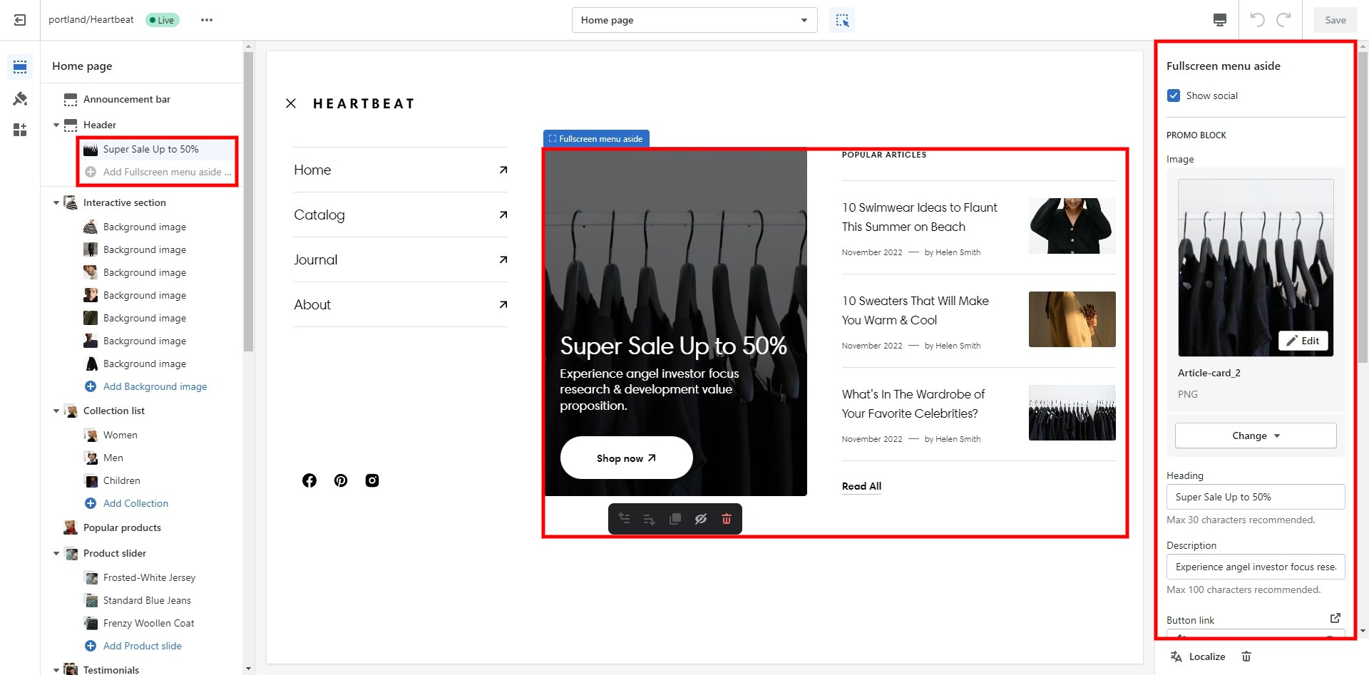
Fullscreen overlay menu aside
- Show social field enables the display of social icons.
- Use the Aside options selector to select the type of aside.
- Use the Image file selector to select or upload an image for Promo block.
- Use the Heading field to set a heading for Promo block.
- Description field allows you to add text to Promo block.
- Button link field allows you to add a link to any sourse.
- Button label field sets the button's label.
- Button style field sets the button's style.
- Show articles field enables the display of blog articles in search and the settings below allow you to customize these articles.
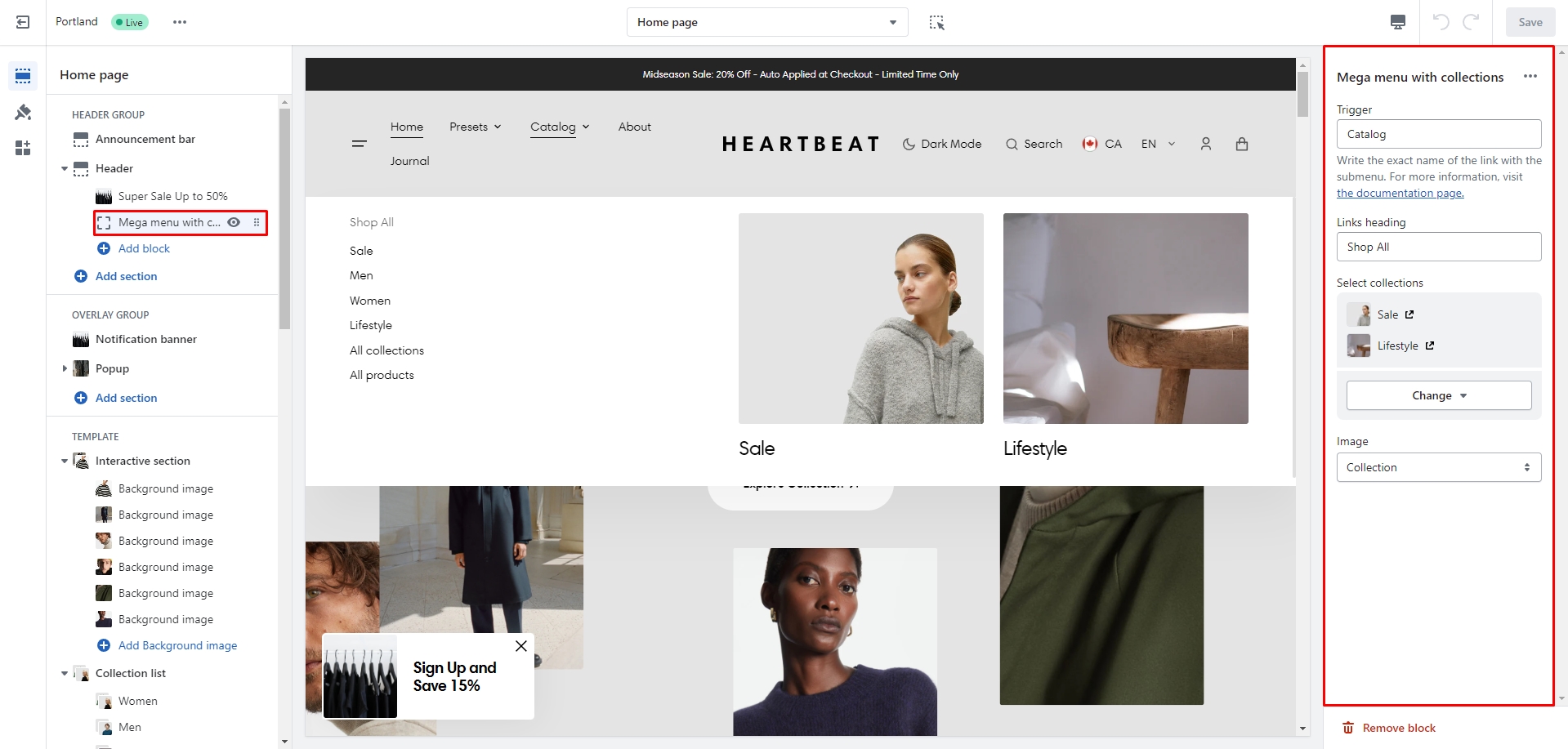
Mega Menu
You can add a Mega menu to the Header as a new block and choose up to 2 collections as promo blocks.
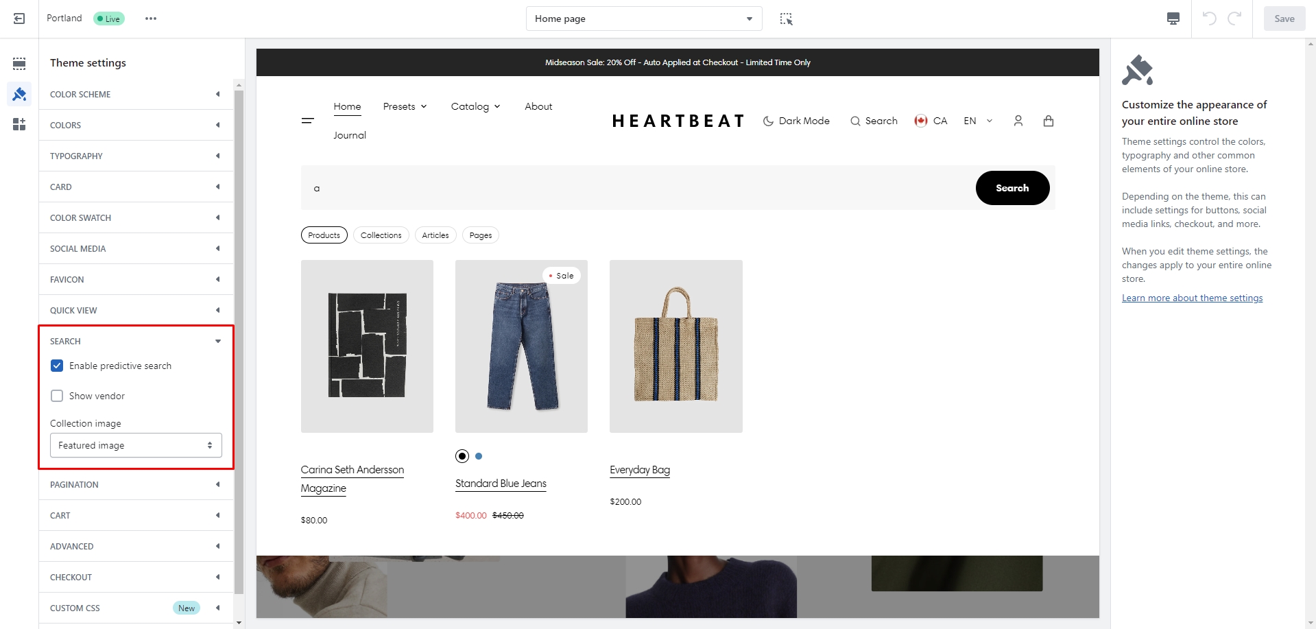
Predictive Search
In this theme, you can use a predictive search. It is enabled by default, but you can disable it in the Theme settings > Search.
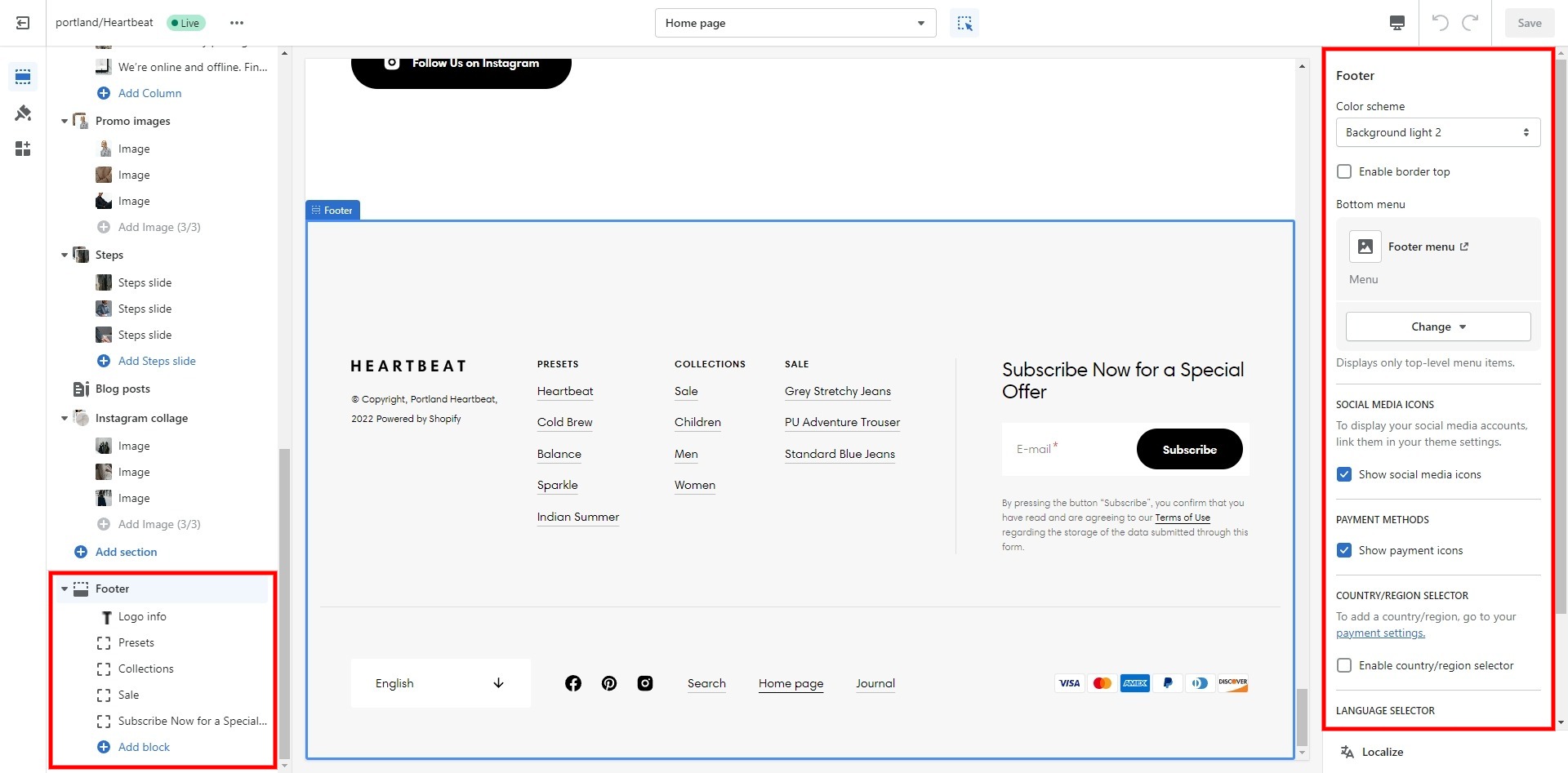
Footer
Footer appears at the bottom of every page. You can customize it to fit your brand and product offerings.
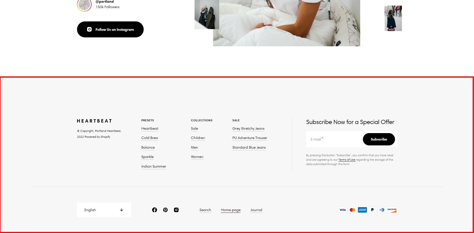
- Use Color scheme selector to change the color scheme.
- Enable border top field enables a line above the section.
- Choose a Bottom menu to be displayed in the bottom line footer.
- Show social media icons field enables the display of social media icons in the bottom line of the footer.
- Enable Follow on Shop field turns on the display of the Follow on Shop button in the bottom line of the footer.
- Show payment icons field enables the display of payment methods in the bottom line of the footer.
- Show policy links field enables the display of wage types in the bottom line of the footer.
- Enable country/region field enables the display of the region selector in the footer.
- Enable language field enables the display of the language selector in the footer.
- Block Logo info file selector allows you to select or upload your logo files.
- (Optional.) If you add a logo, use the Custom logo width slider to change the logo size in the footer.
- Block Menu allows you to select up to 6 menus, which will be displayed on the top line of the footer.
- Block Subscribe form allows you to add and customize subscribe form.
Theme settings
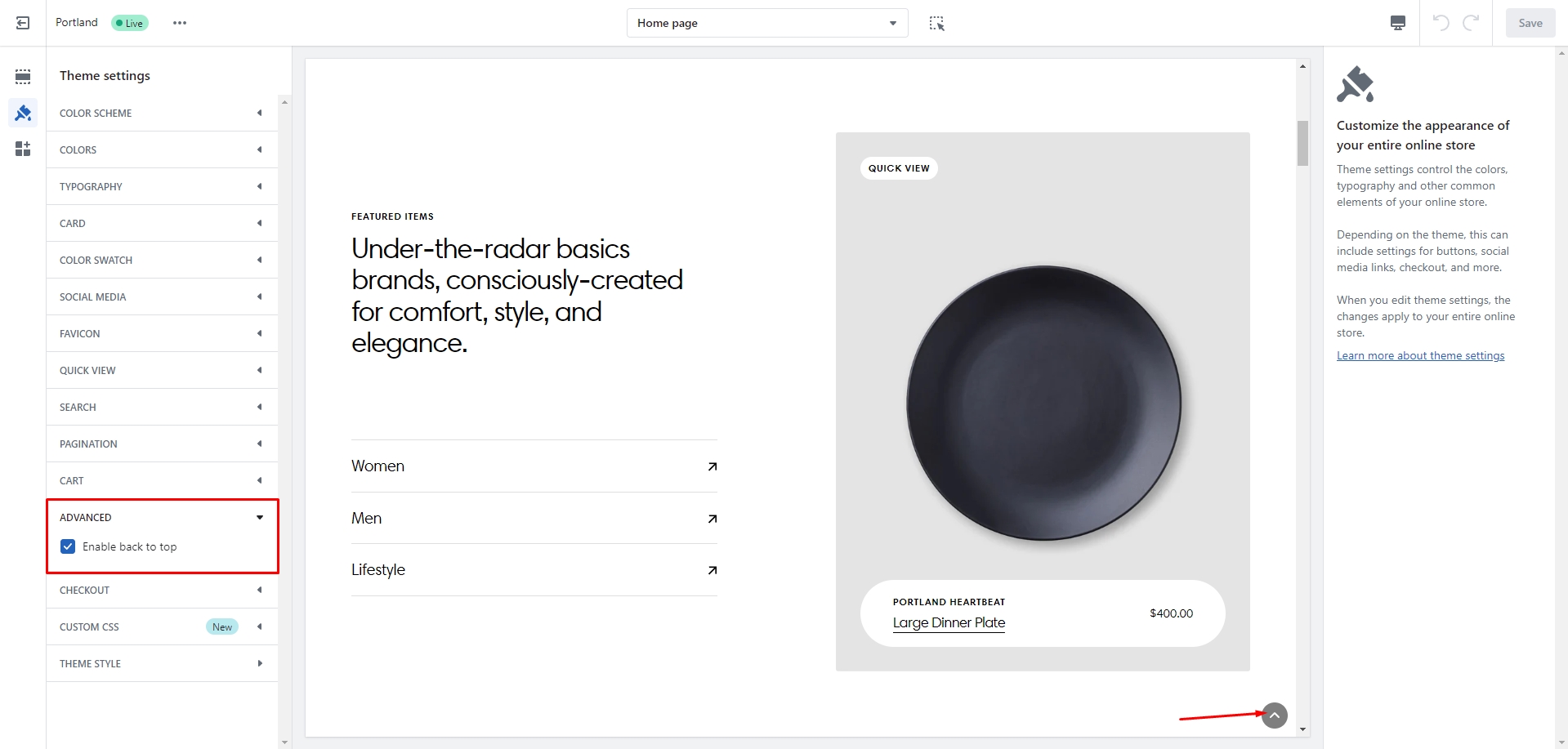
Back to Top
To enable Back to Top button, navigate to Theme settings > Advanced.
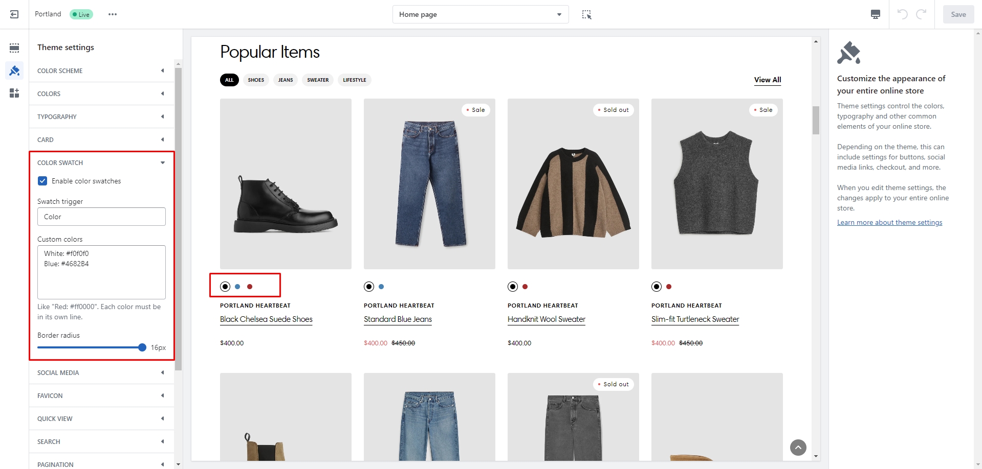
Color swatches
To enable and edit Color swatches, navigate to Theme settings > Color swatches. Swatch trigger should be the same as the option in Product variants. You can also add custom colors by adding their name and color in HEX format.
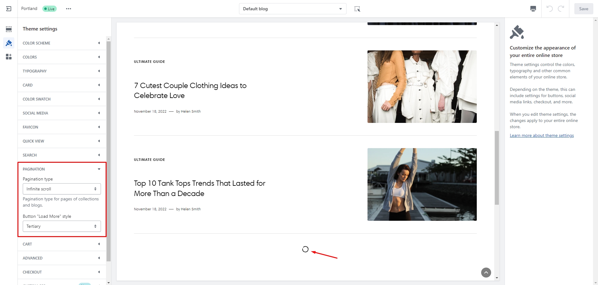
Infinite scroll
To enable and edit Infinite scroll, navigate to Theme settings > Pagination > Pagination type.
Overlay Group
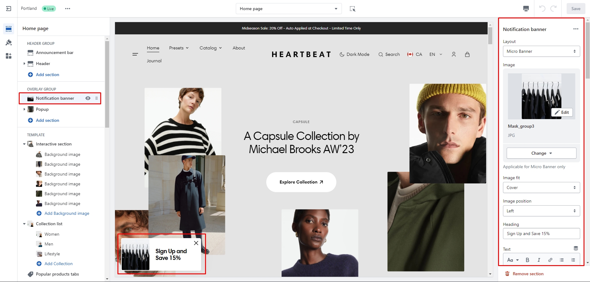
Notification Banner
In the Notification Banner settings, you can change layout, add image, texts, edit banner position, change open and exit animations and options.
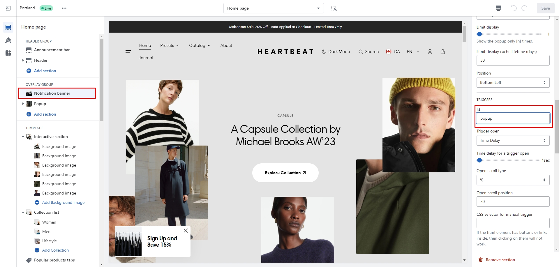
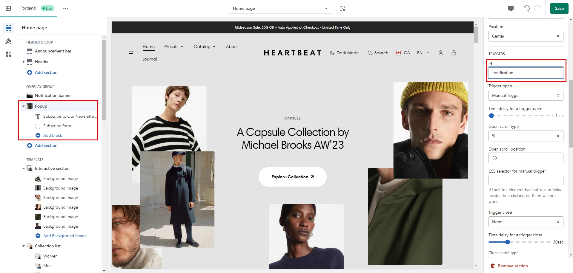
You can also use this banner as a button-trigger for opening another notification bar or a popup by following these steps:
- Add the id of the popup/notification bar you chose to open to the Id field in the Triggers section (e.g. "popup")
- Navigate to the popup/notification bar settigns and add the Id with "#" in the beginning to the "CSS selector for manual trigger" field.
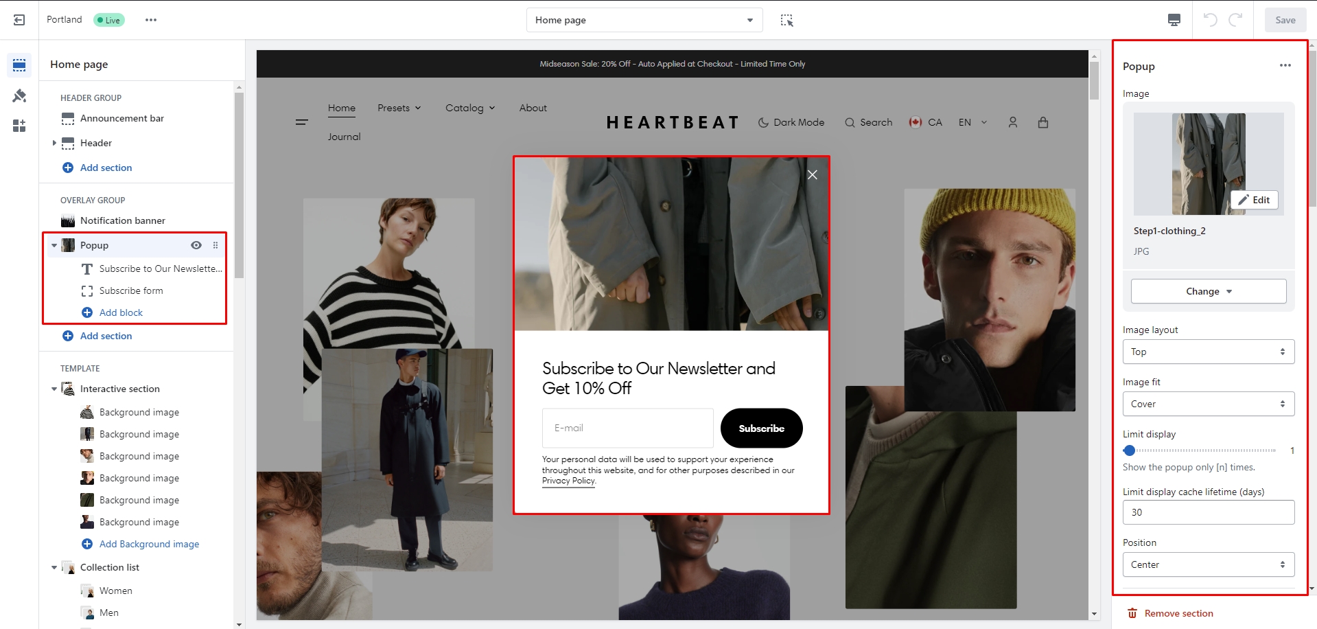
Popup
In the Popup settings, you can change layout, add image, subscribe form, edit position, change open and exit animations and options.
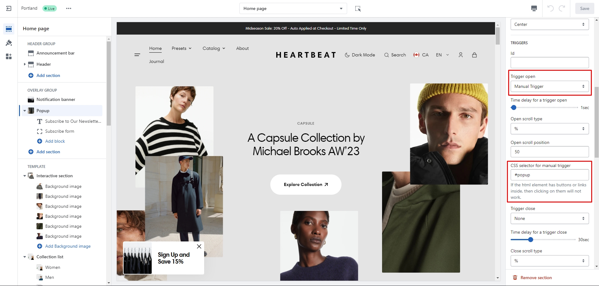
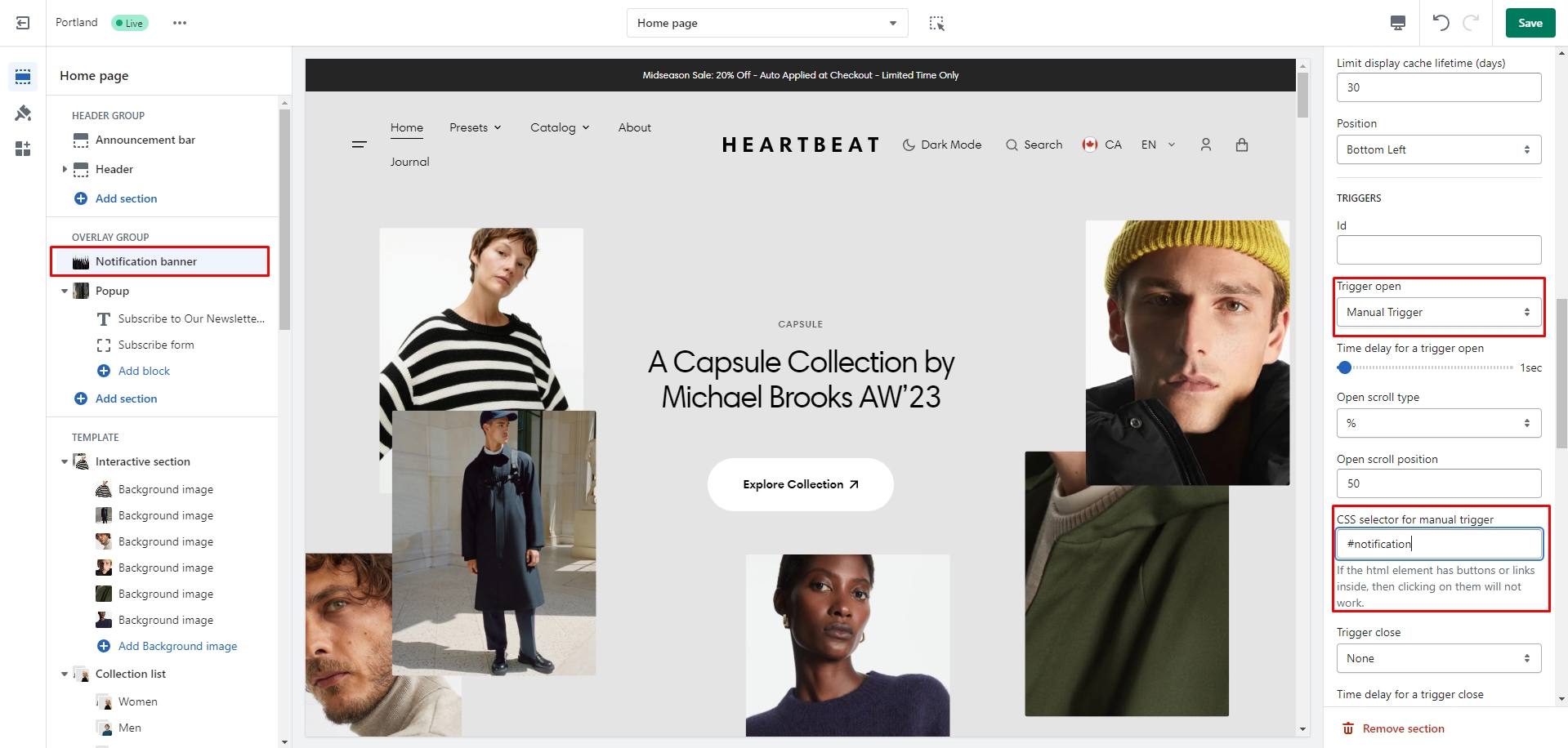
You can also use this popup as a button-trigger for opening another popup or notification bar by following these steps:
- Add the id of the popup/notification bar you chose to open to the Id field in the Triggers section (e.g. "notification").
- Navigate to the popup/notification bar settings and Add the Id with "#" in the beginning to the "CSS selector for manual trigger" field.
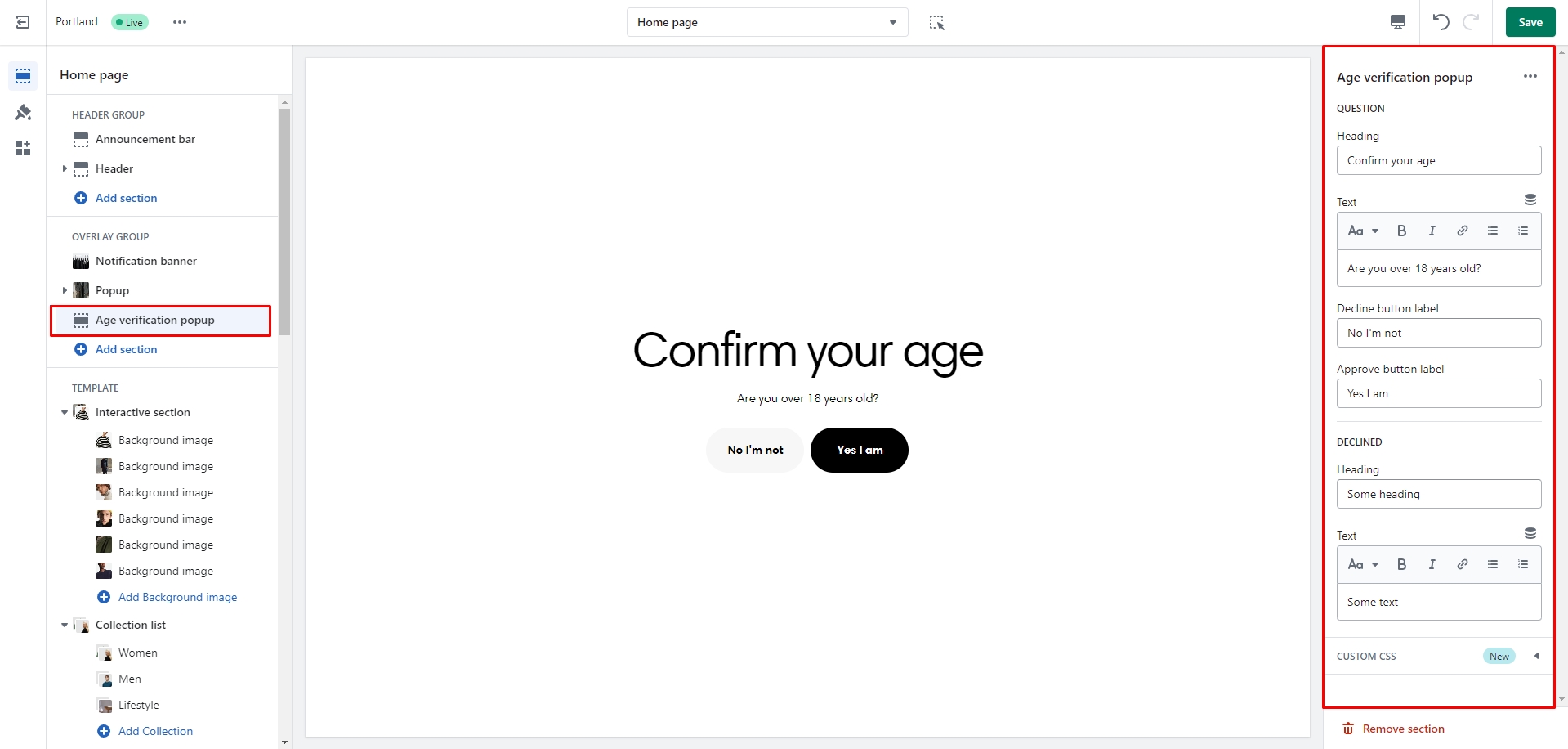
Age verification popup
An Age verification popup is a prompt that appears on a website to confirm the user's age before accessing restricted content. In the Age verification popup settings, you can change customize text and buttons.
All sections
The theme contains several customizable sections that you can add to your page in any order.
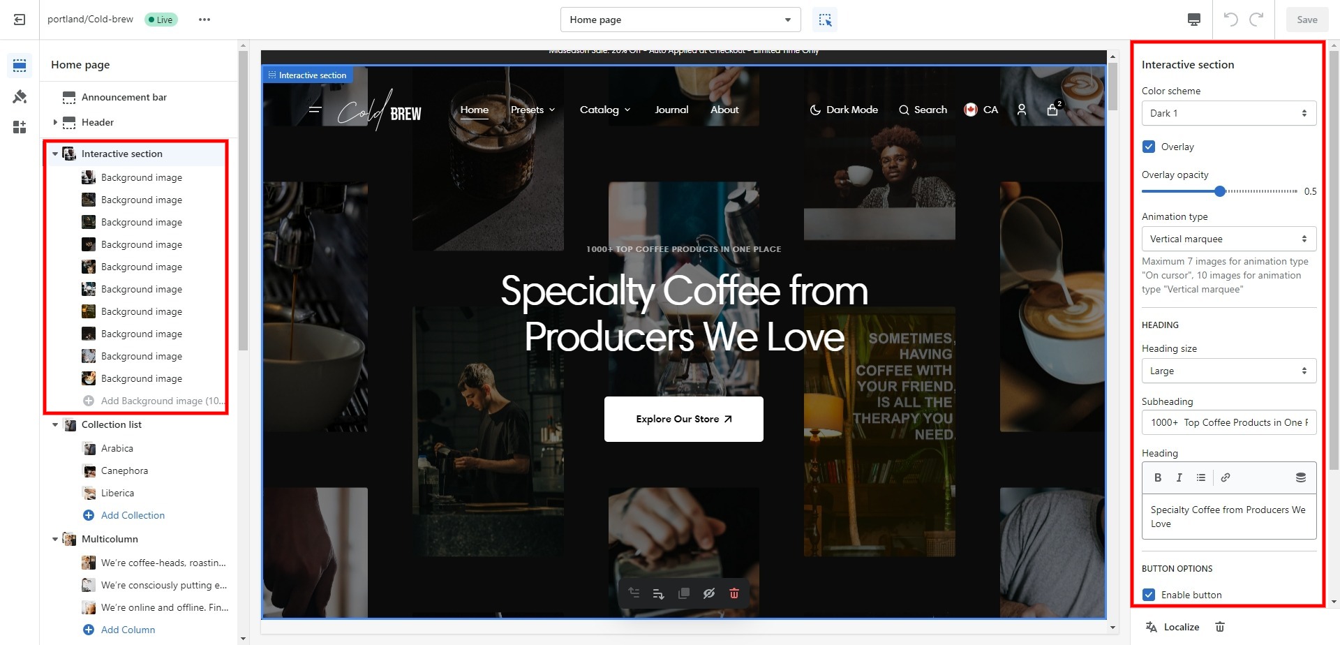
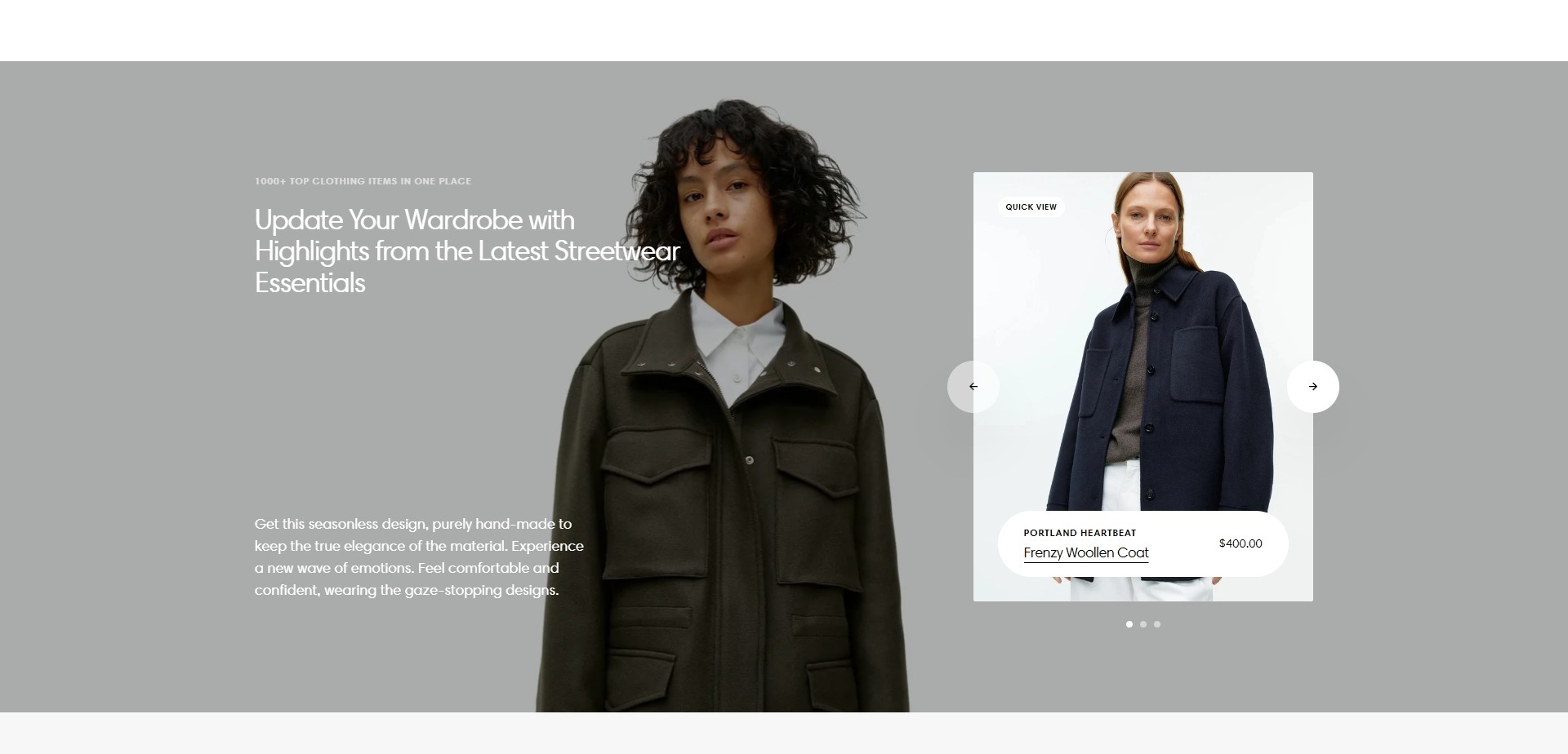
Interactive section
Allows you to add the main heading, subheading, and images with effects.
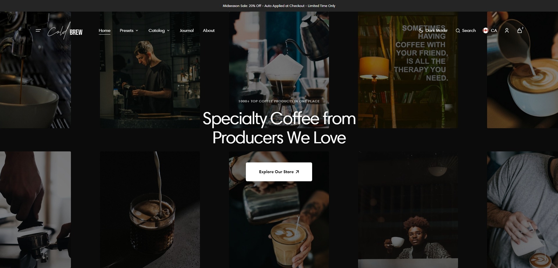
- Use Color scheme selector to change the color scheme.
- Overlay checkbox field allows you to enable an overlay.
- Overlay opacity slider allows you to choose an overlay's opacity.
- Animation type selector allows you to choose an animation for images.
- Heading size selector allows you to choose a heading size.
- Heading allows you to set a heading for the section.
- Subheading allows you to set a subheading for the section.
- Additional information field allows you to add text to the section.
- Enable button field includes a button/link to go to the general collections page.
- Button label field sets the button's label.
- Button style field sets the button's style.
- Block Background image allows you to set an image for the section.
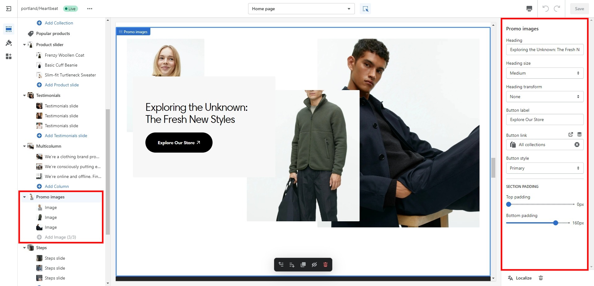
Promo images
Allows you to add the main heading, and images with effect on scroll.
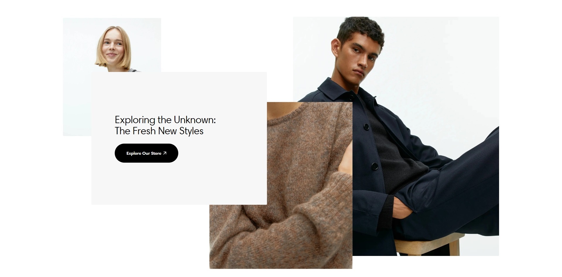
- Heading allows you to set a heading for the section.
- Heading size selector allows you to choose a heading size.
- Heading transform selector allows you to choose a heading style.
- Additional information field allows you to add text to the section.
- Button link field allows you to add a link to any sourse.
- Button label field sets the button's label.
- Button style field sets the button's style.
- Top padding slider allows you to change the top padding in the section.
- Bottom padding slider allows you to change the bottom padding in the section.
- Block Image allows you to set an image for the section.
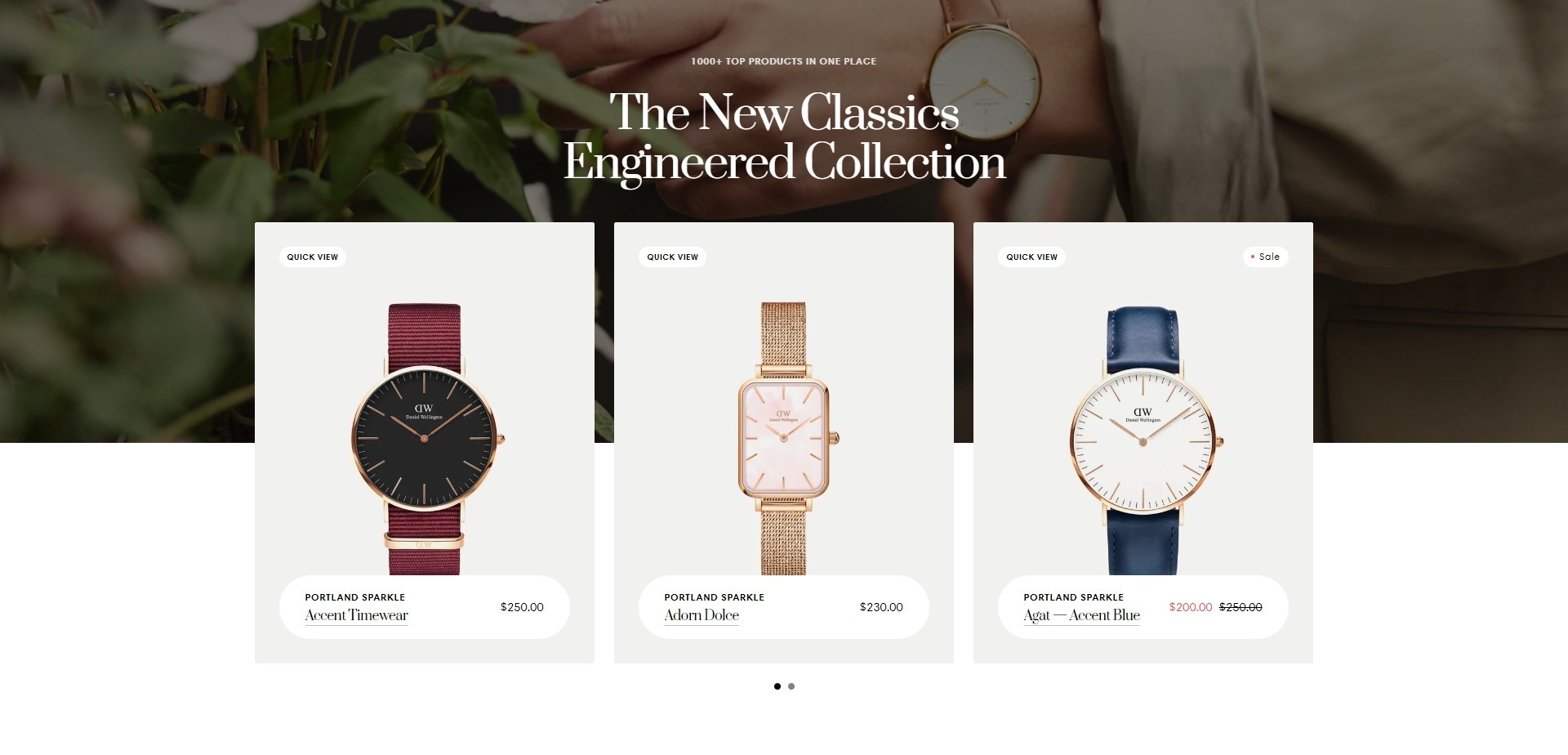
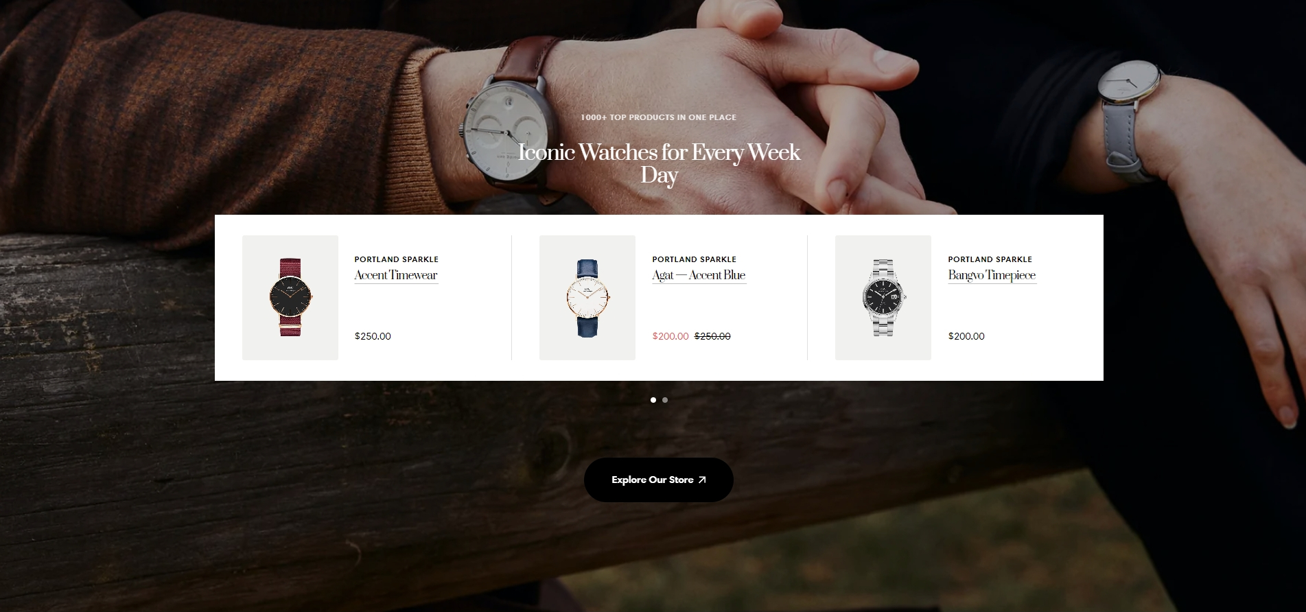
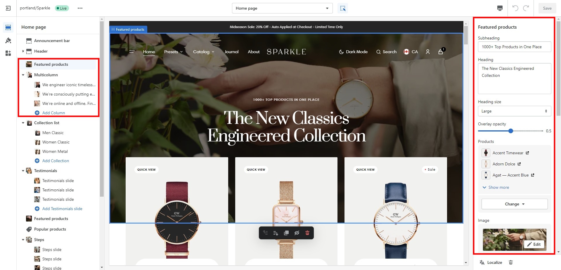
Featured products
The section allows you to select products and customize their display.
- Use Color scheme selector to change the color scheme.
- Heading allows you to set a heading for the section.
- Heading size selector allows you to choose a heading size.
- Overlay opacity slider allows you to choose an overlay's opacity.
- Products field allows you to select products that will be displayed.
- Image file selector allows you to select or upload your image files.
- Animation selector allows you to choose an animation for the section.
- Products position selector allows you to choose the products position.
- Product card options allow you to customize product cards in the section.
- Button options allow you to customize the button in the section.
- Bottom padding slider allows you to change the bottom padding in the section.
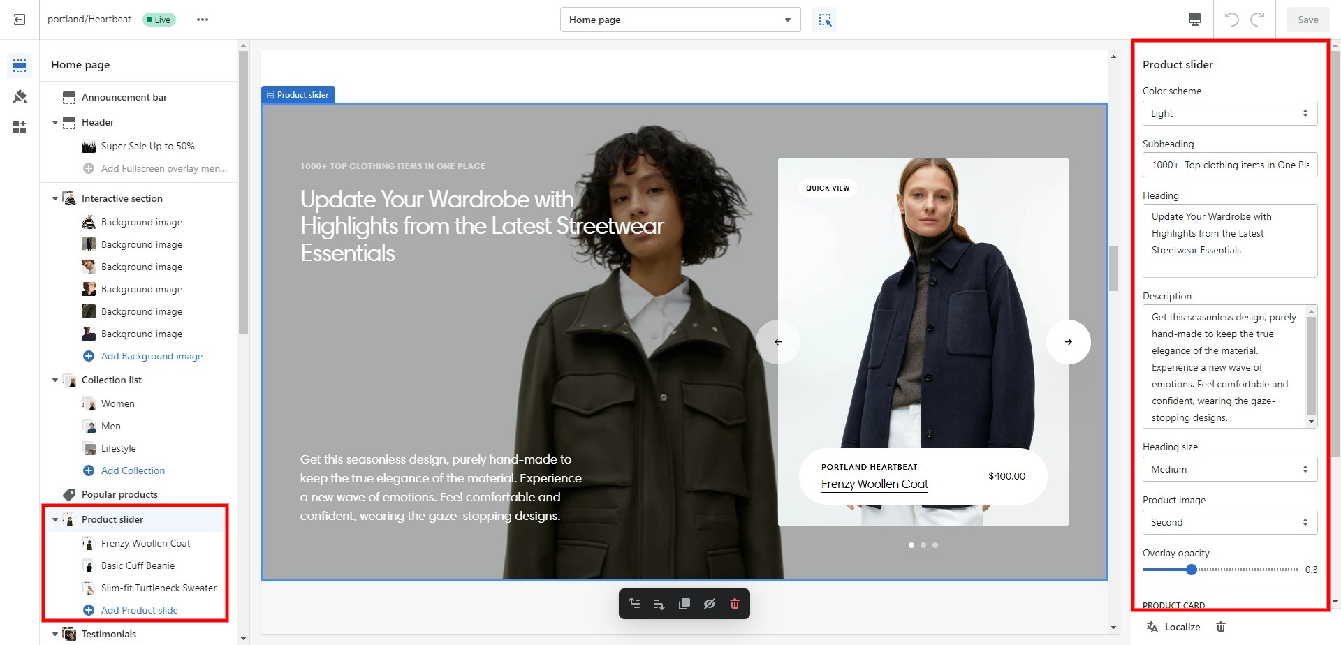
Product slider
The section allows you to add slides, select products, and customize their display.
- Use Color scheme selector to change the color scheme.
- Subheading allows you to set a subheading for the section.
- Heading allows you to set a heading for the section.
- Heading size selector allows you to choose a heading size.
- Overlay opacity slider allows you to choose an overlay's opacity.
- Product card options allow you to customize product cards in the section.
- Block Product slider allows you to add an image and choose a product.
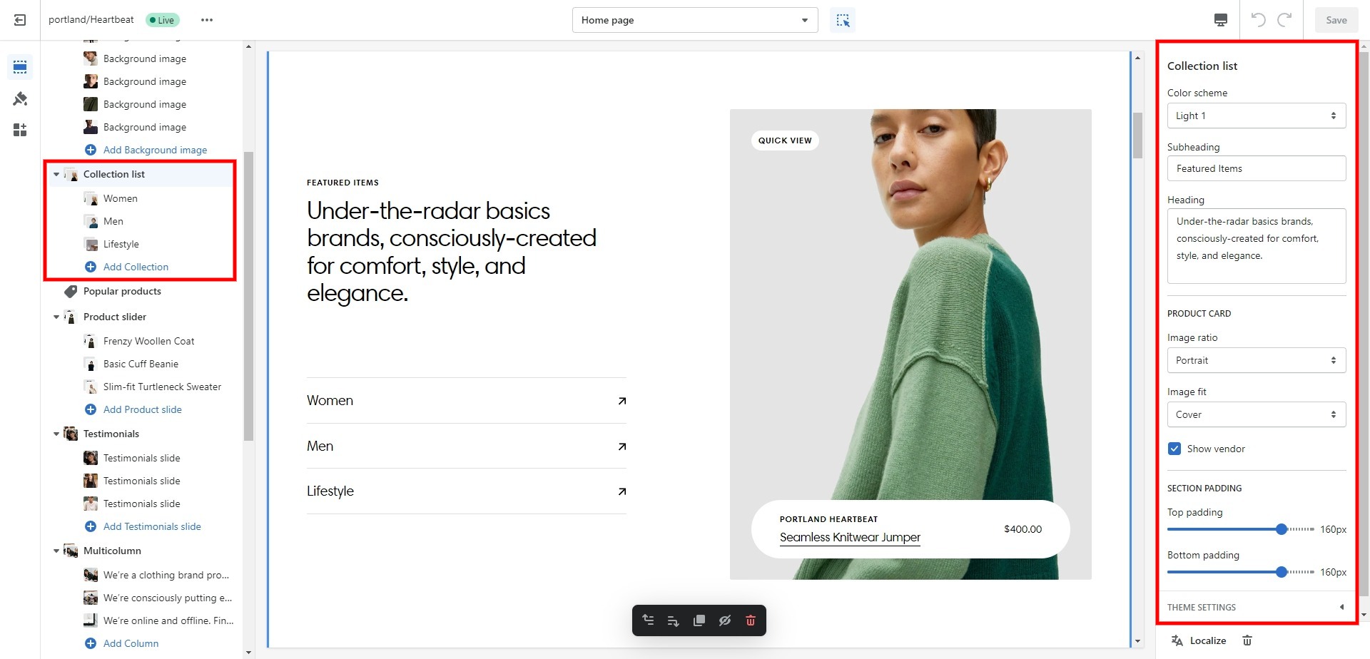
Collection list
Allows you to select up to several collections (categories).
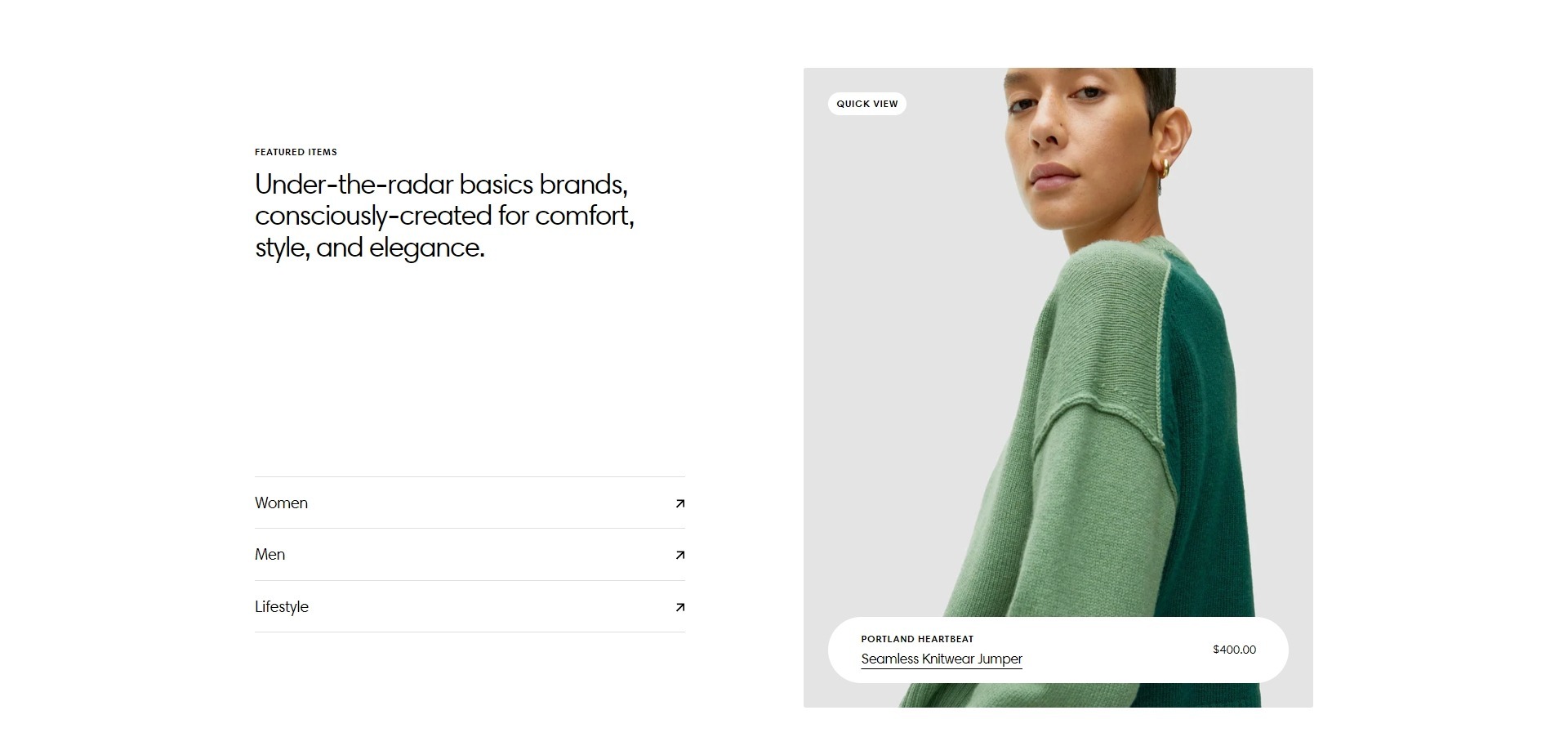
- Use Color scheme selector to change the color scheme.
- Subheading allows you to set a subheading for the section.
- Heading allows you to set a heading for the section.
- Product card options allow you to customize product cards in the section.
- Top padding slider allows you to change the top padding in the section.
- Bottom padding slider allows you to change the bottom padding in the section.
- Block Collection allows you choose a collection and a product.
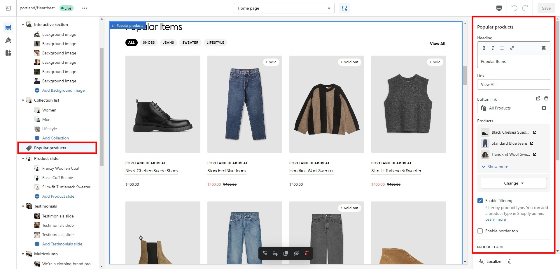
Popular products
The section allows you to select products, enable filtering and customize their display.
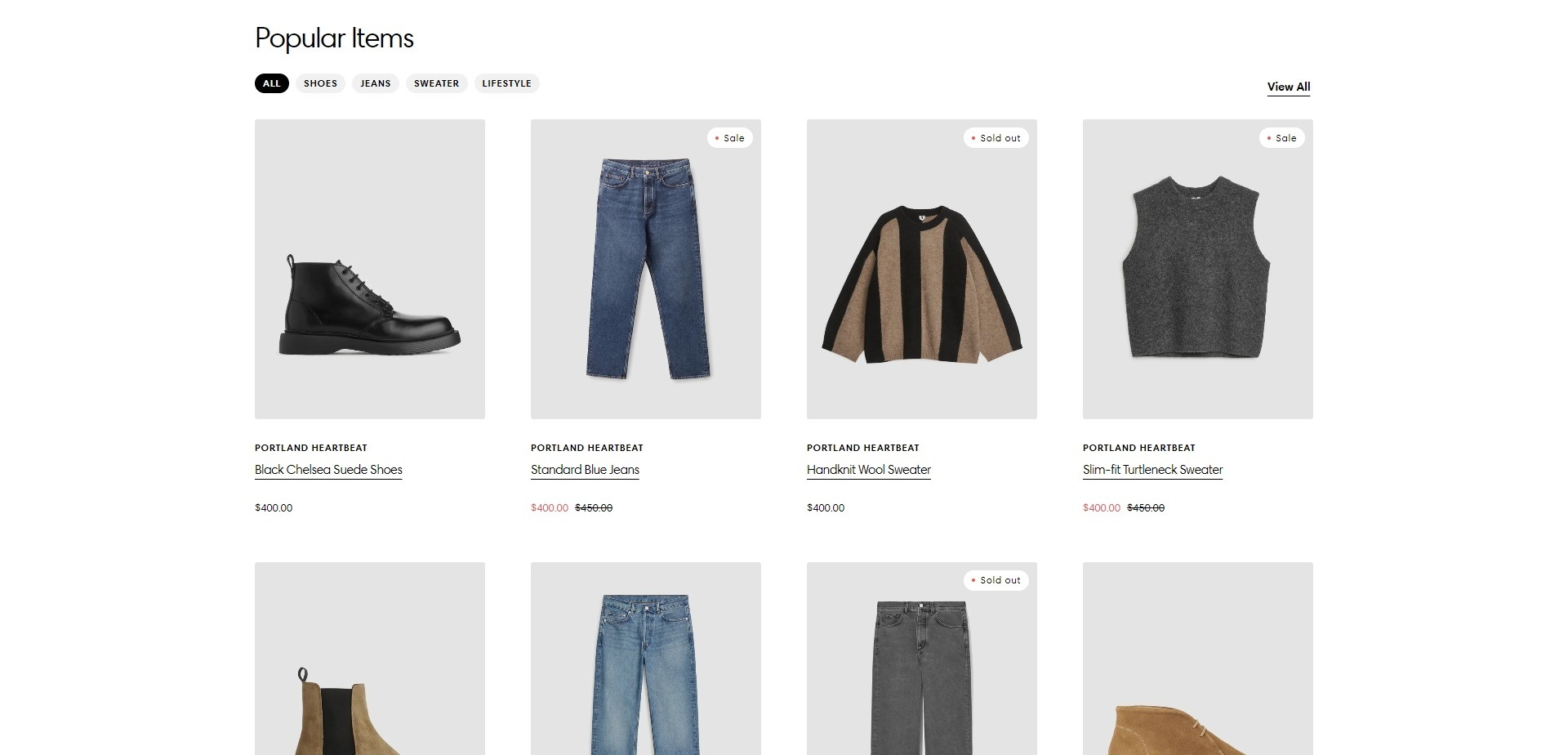
- Heading allows you to set a heading for the section.
- Link field allows you to set a label for a link.
- Button link field includes a button/link to go to the general collections page.
- Products field allows you choose up to 12 products.
- Enable filtering field allows you to enable filtering products by their type.
- Enable border top field enables the display of a line above the section.
- Product card options allow you to customize product cards in the section.
- Top padding slider allows you to change the top padding in the section.
- Bottom padding slider allows you to change the bottom padding in the section.
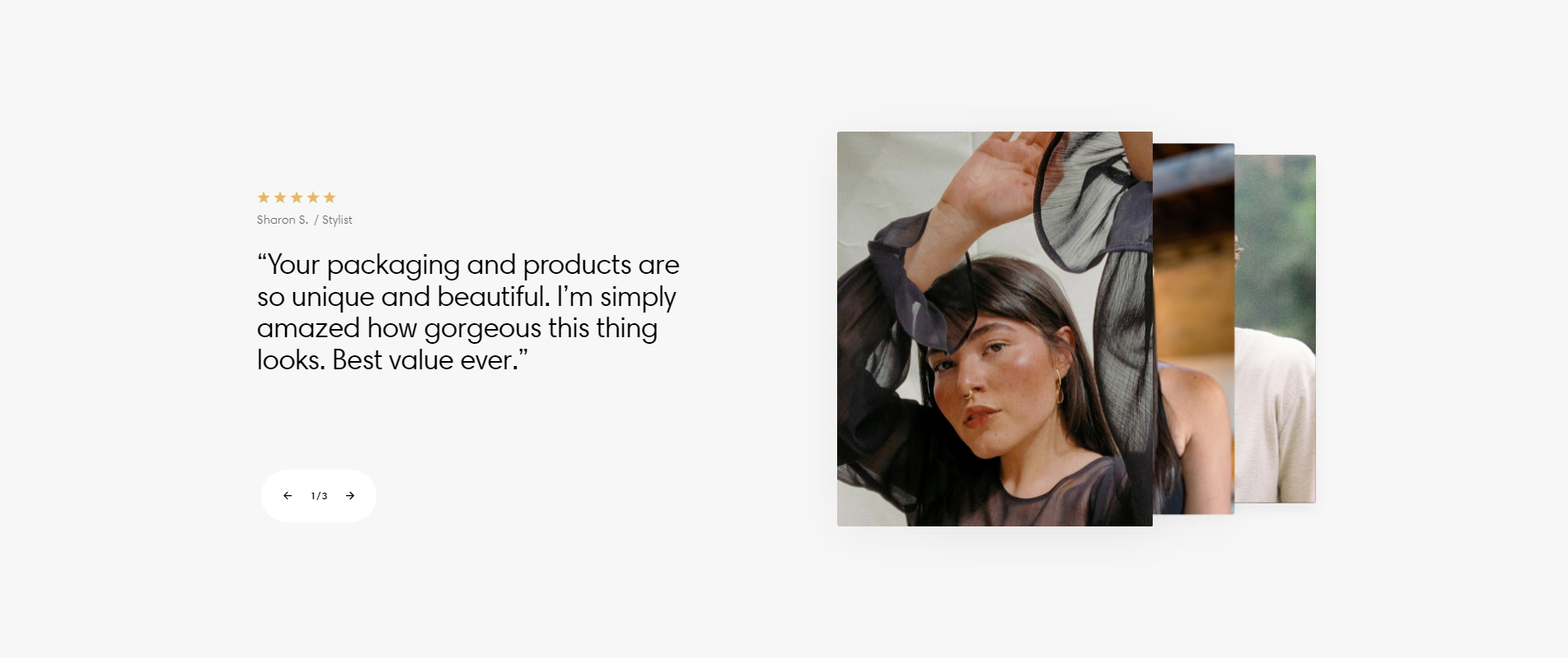
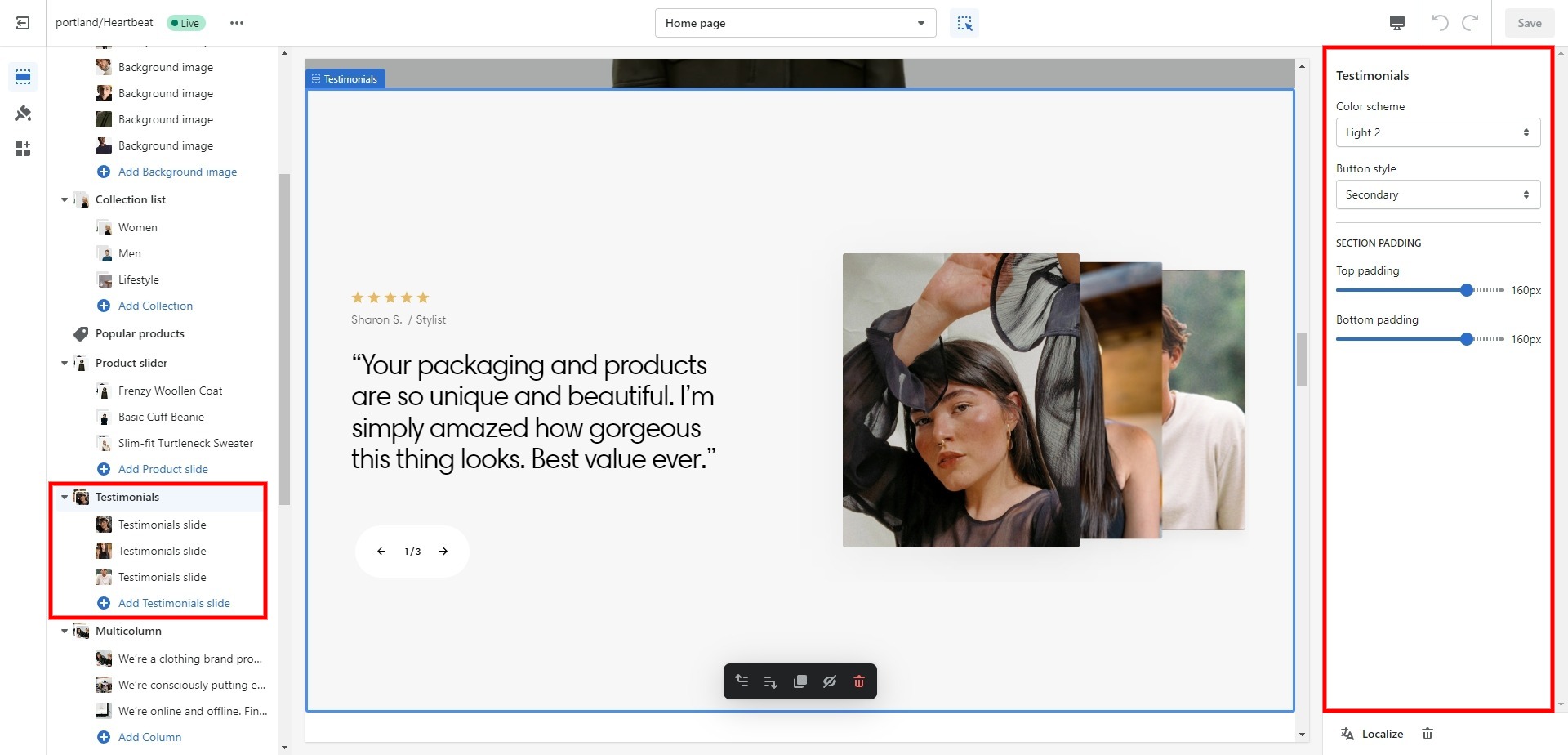
Testimonials
The section is designed for the review carousel.
- Use Color scheme selector to change the color scheme.
- Button style field sets the button's style.
- Top padding slider allows you to change the top padding in the section.
- Bottom padding slider allows you to change the bottom padding in the section.
- Block Testimonials slide slider Rating allows you to set a review score.
- Block Testimonials slide option Text adds a text for its slide.
- Block Testimonials slide option Author's picture adds an author's picture for its slide.
- Block Testimonials slide option Author's name adds an author's name for its slide.
- Block Testimonials slide option Author's position adds an author's position for its slide.
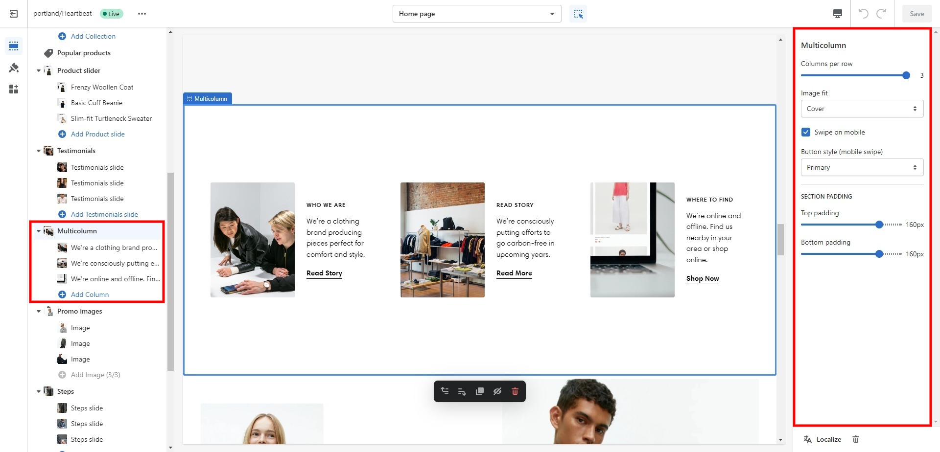
Multicolumn
Section consisting of several columns with images and descriptions.
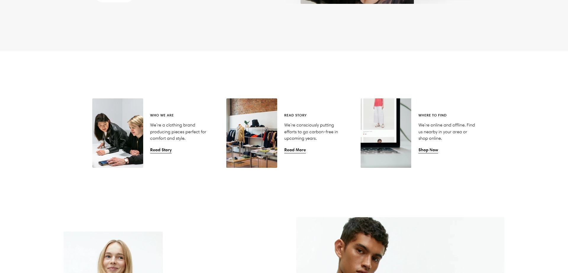
- Columns per row slider allows you to select the number of columns in one line.
- Image fit field allows you to choose the fit of images.
- Top padding slider allows you to change the top padding in the section.
- Bottom padding slider allows you to change the bottom padding in the section.
- Block Column file selector Image allows you to select or upload your image files to the column.
- Block Column field Subheading allows you to set a subheading for the column.
- Block Column field Heading allows you to set a heading for the column.
- Block Column field Description allows you to set a description for the column.
- Block Column field Button label allows you to add text for the button.
- Block Column field Button link sets a link for the button.
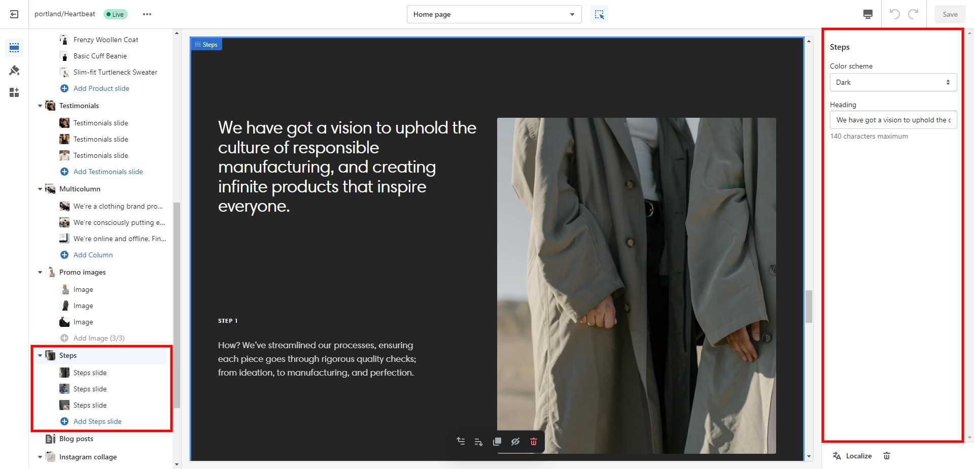
Steps
Allows you to add up to 5 slides/steps and customize them.
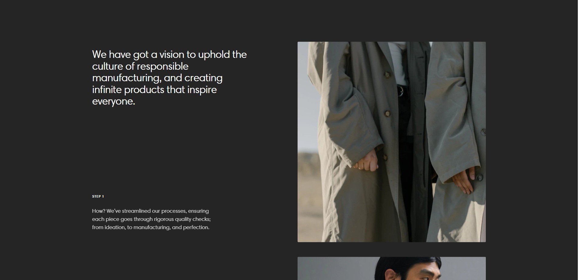
- Position field allows you to select the position of the section
- Heading allows you to set a heading for the section.
- Block Steps slide field Headingallows you to set a heading for the slide.
- Block Steps slide field Textallows you to set a text for the slide.
- Block Steps slide field Imageallows you to set an image for the slide.
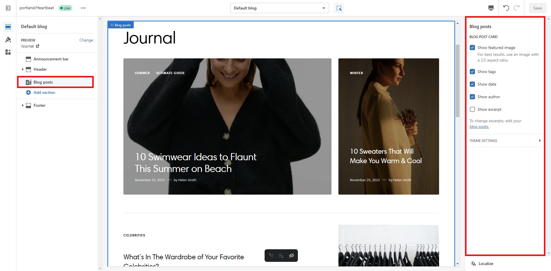
Blog posts
The section allows you to select a blog and customize it.
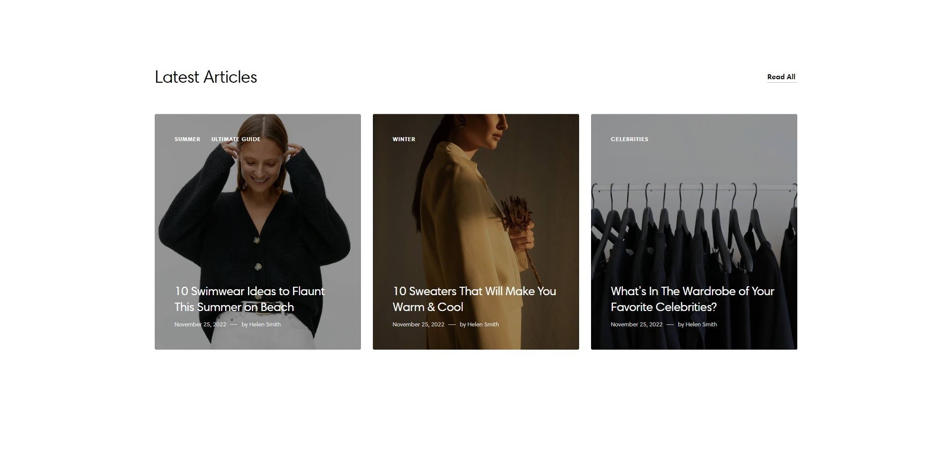
- Post layout field allows you to select layout type.
- Heading field adds a header for the section.
- Blog field allows you to choose a blog.
- Blog posts slider allows you to select the number of columns in one line.
- Show featured image field enables the display of an image for the blog post.
- Show date field enables the display of the date for the blog post.
- Show tags field enables the display of tags for the blog post.
- Show author enables the display of the author for the blog post.
- Enable "Read all button" field enables the display of a button linking to all blog posts.
- Top padding slider allows you to change the top padding in the section.
- Bottom padding slider allows you to change the bottom padding in the section.
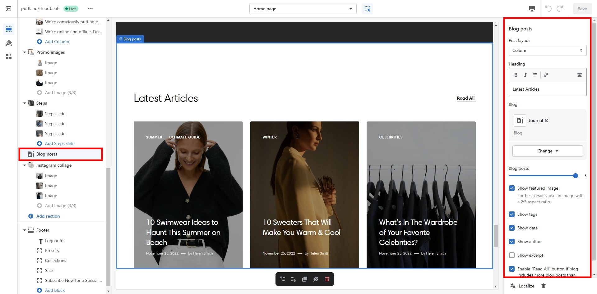
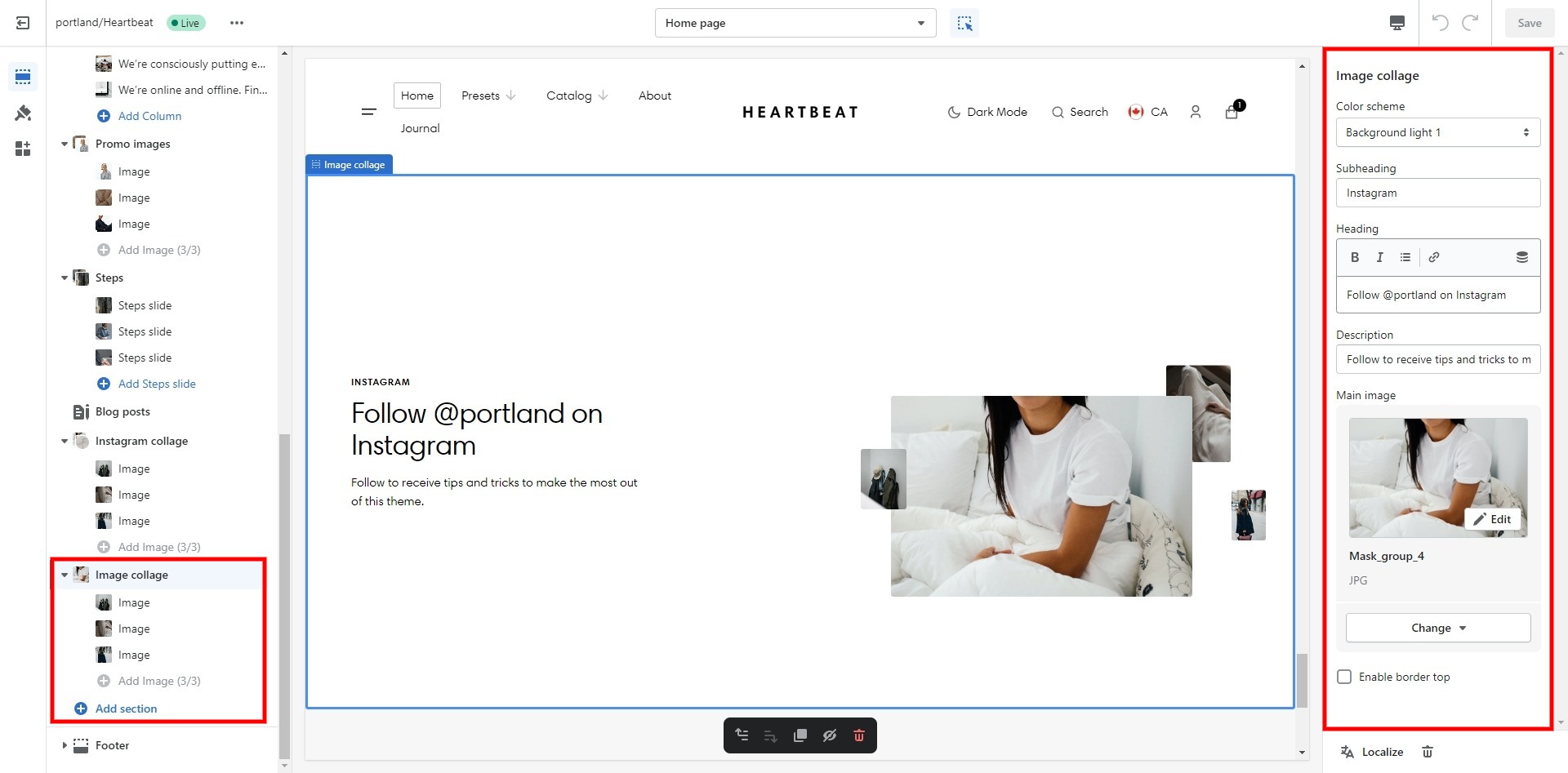
Image collage
Decorating section with heading, images, and text.
- Use Color scheme selector to change the color scheme.
- Subheading allows you to set a subheading for the section.
- Heading allows you to set a heading for the section.
- Description allows you to set a description for the section.
- Main image allows you to set a large image for the section.
- Enable border top field enables the display of a line above the section.
- Top padding slider allows you to change the top padding in the section.
- Bottom padding slider allows you to change the bottom padding in the section.
- Block Image optionImage allows you to set an image for the block.
- Block Image optionimage width field sets the width of the image for the block.
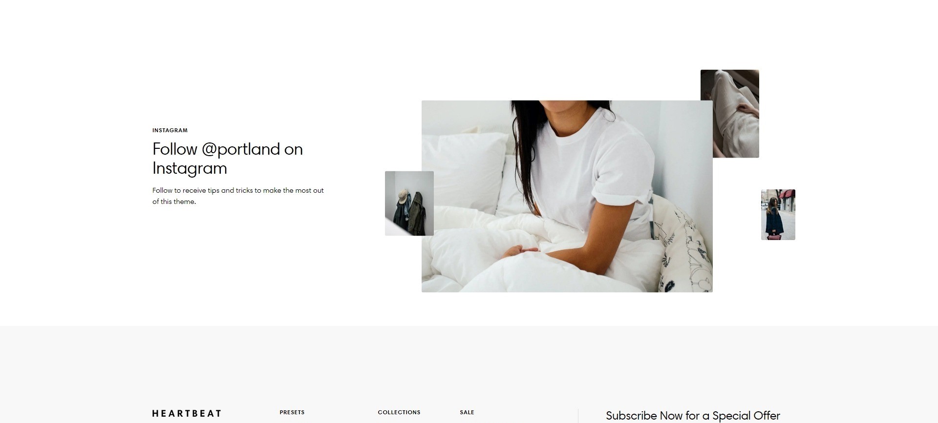
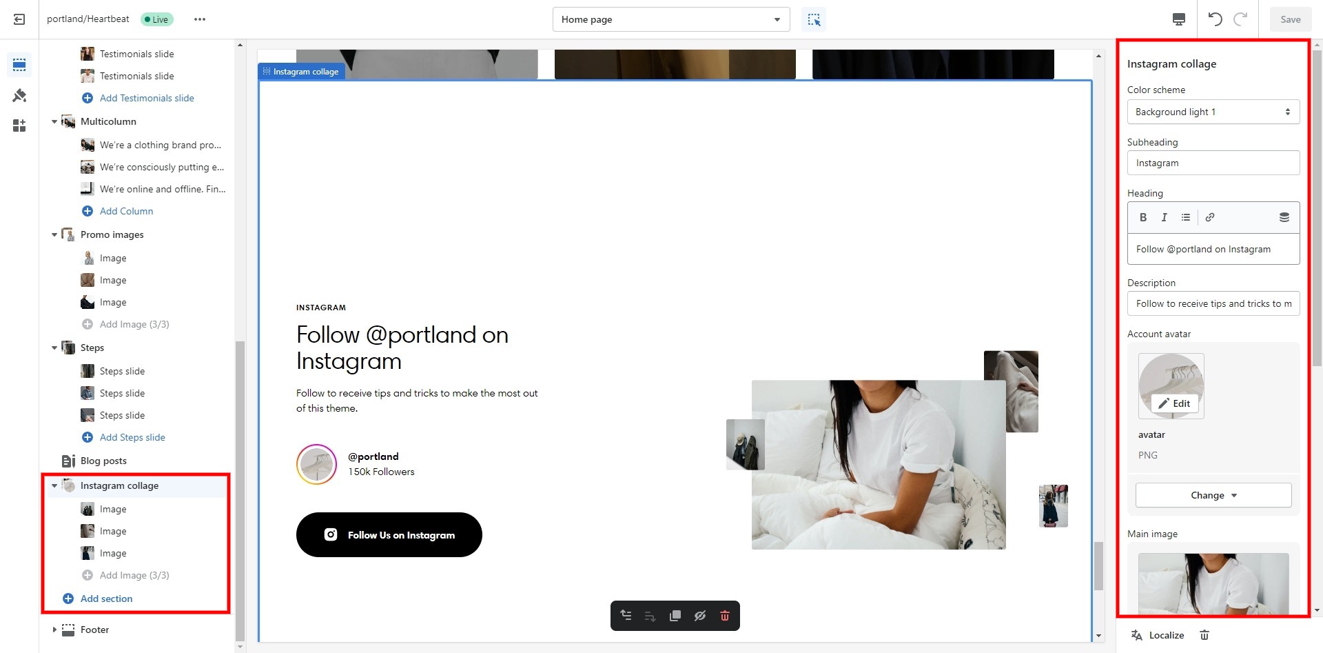
Instagram collage
Decorating section with heading, images, link and text.
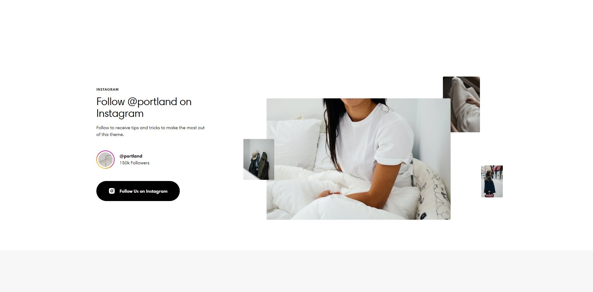
- Use Color scheme selector to change the color scheme.
- Subheading allows you to set a subheading for the section.
- Heading allows you to set a heading for the section.
- Description allows you to set a description for the section.
- Account avatar allows you to set a left image for the section.
- Main image allows you to set a large image for the section.
- Account name allows you to set an account name.
- Account description allows you to set an account description.
- Button label field allows you to add text for the button.
- Button link field sets a link for the button.
- Button style field sets the button's style.
- Enable border top field enables the display of a line above the section.
- Top padding slider allows you to change the top padding in the section.
- Bottom padding slider allows you to change the bottom padding in the section.
- Block Image optionImage allows you to set an image for the block.
- Block Image optionimage width field sets the width of the image for the block.
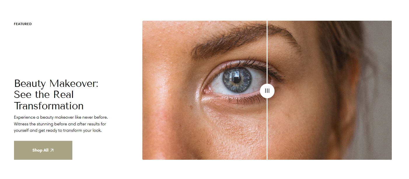
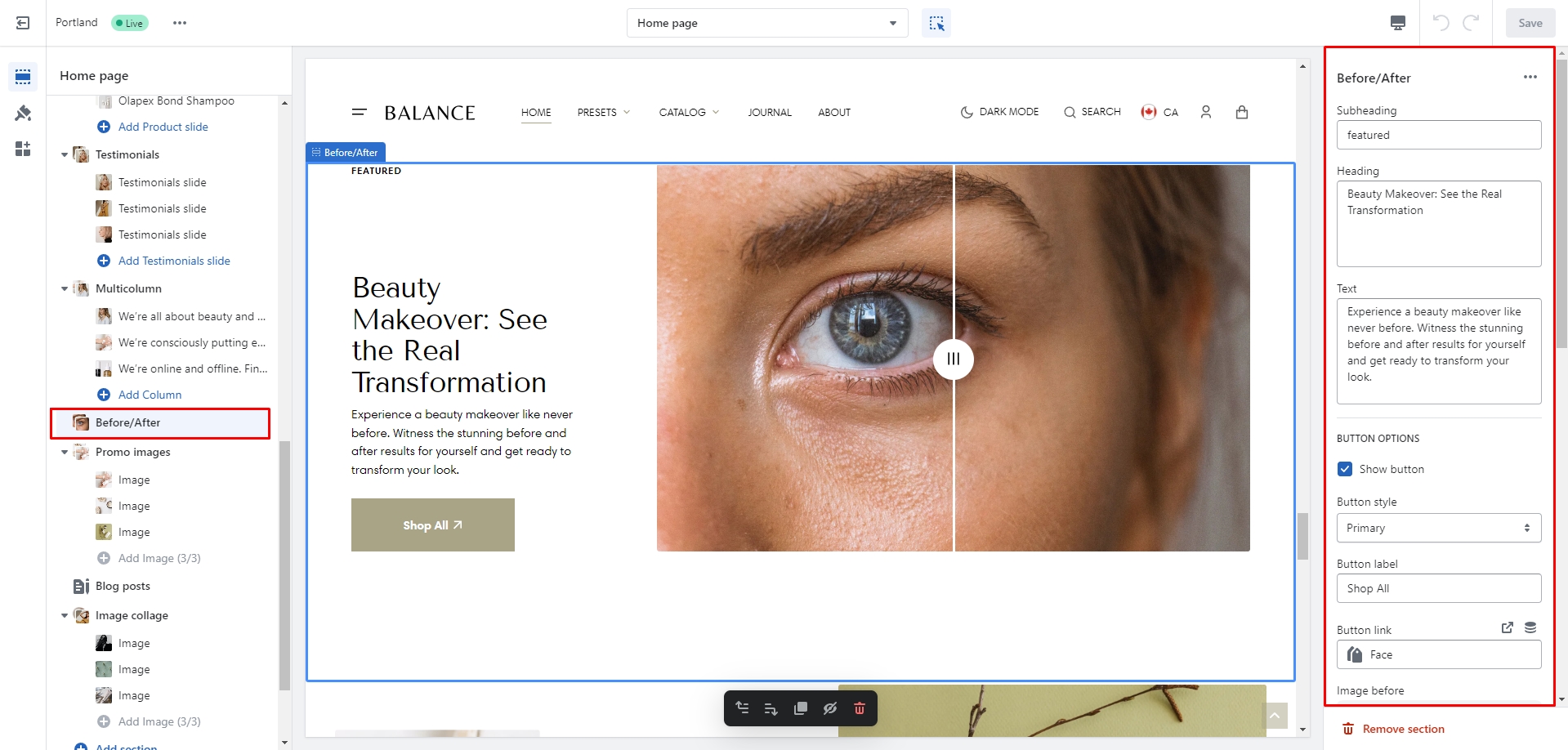
Before/After
You can add two comparable images, along with text and a button, in this section.
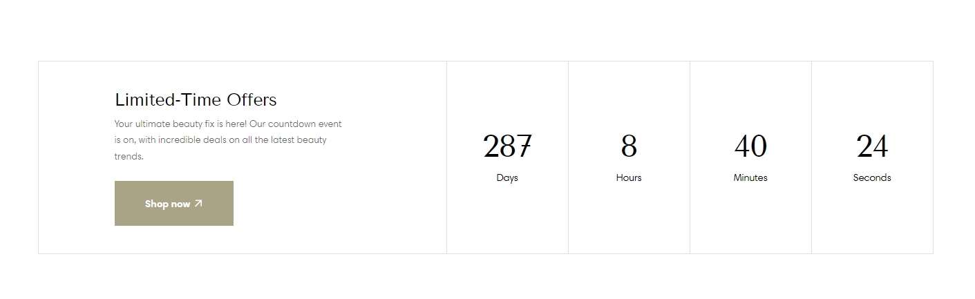
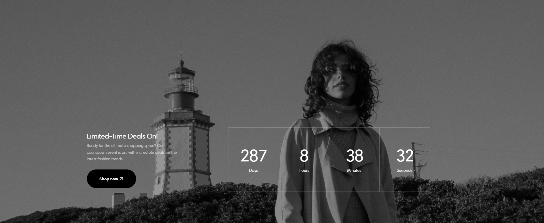
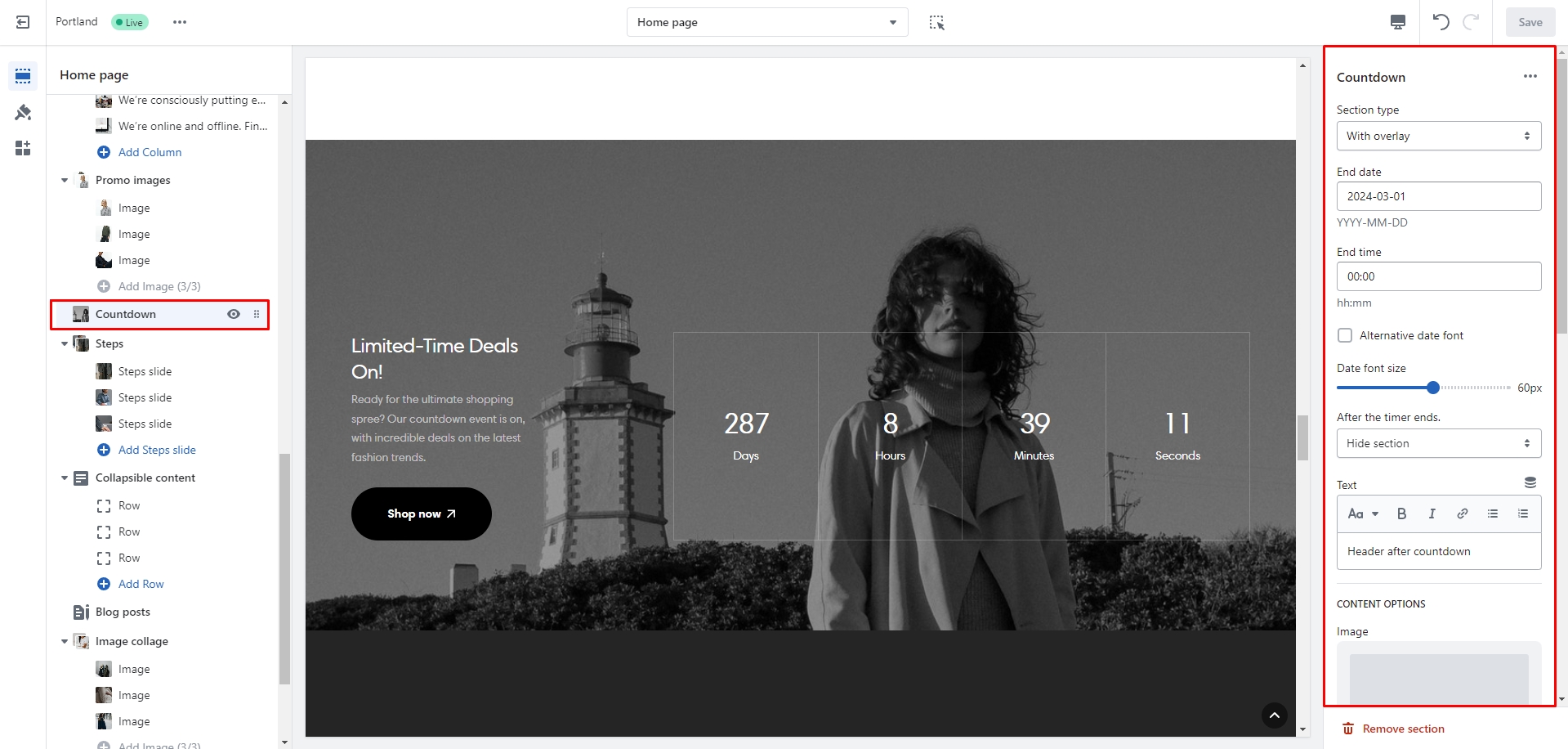
Countdown
You can add and customize a countdown timer.
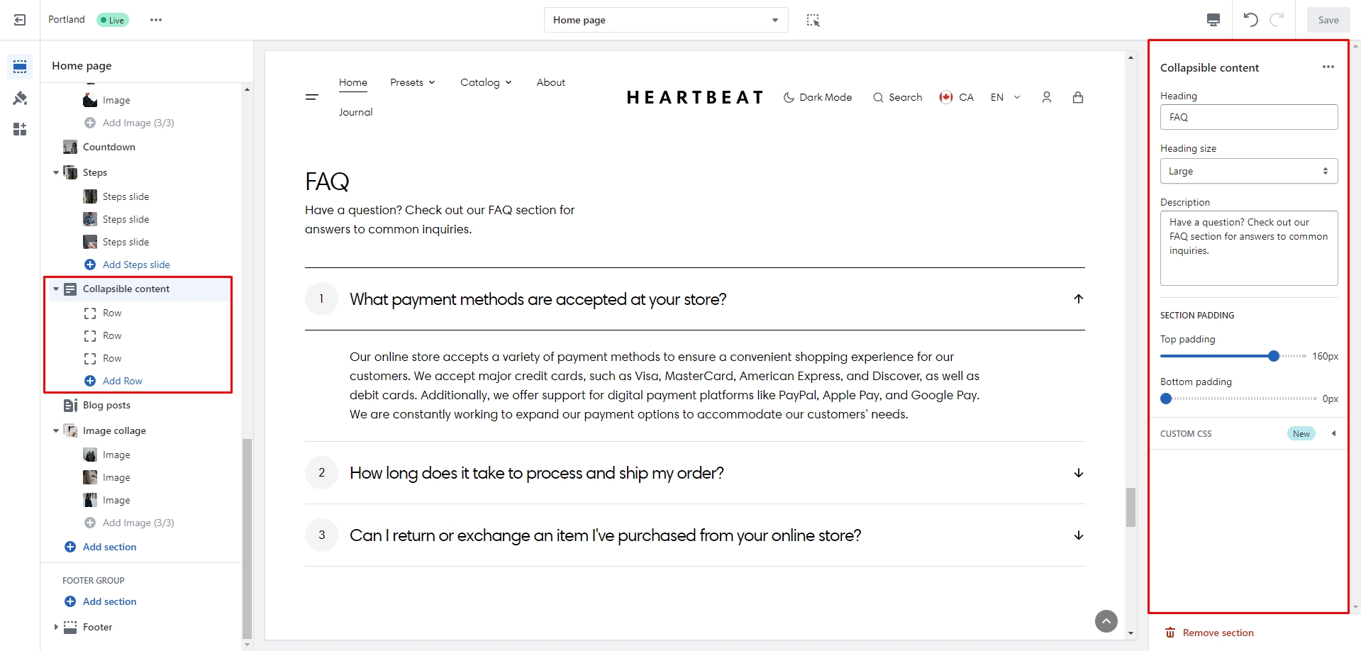
Collapsible content
You can add and customize a collapsible content section, such as using it for FAQs.
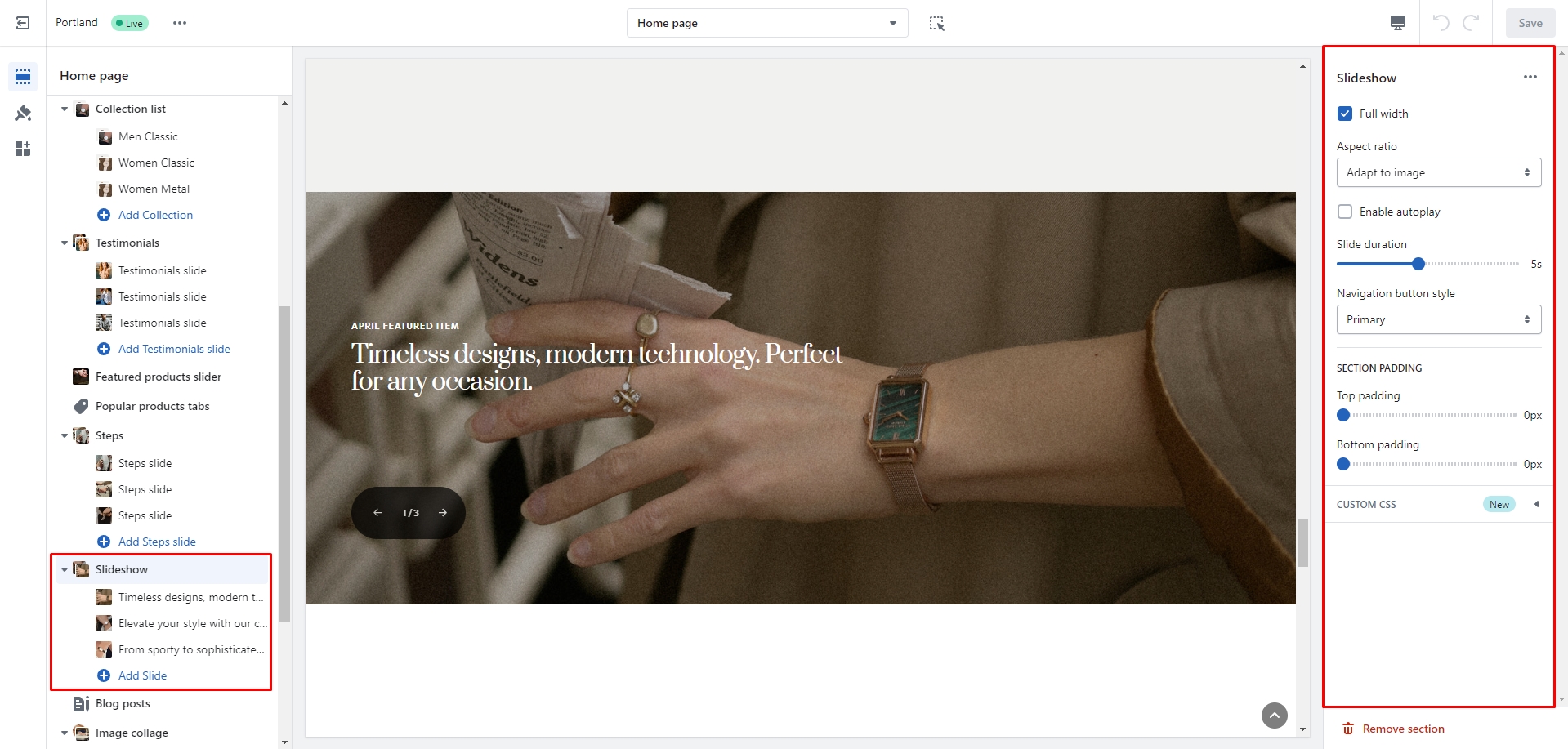
Slideshow
In this section, you can add and customize slides, adjust the color scheme, width, aspect ratio, and slide autoplay duration.
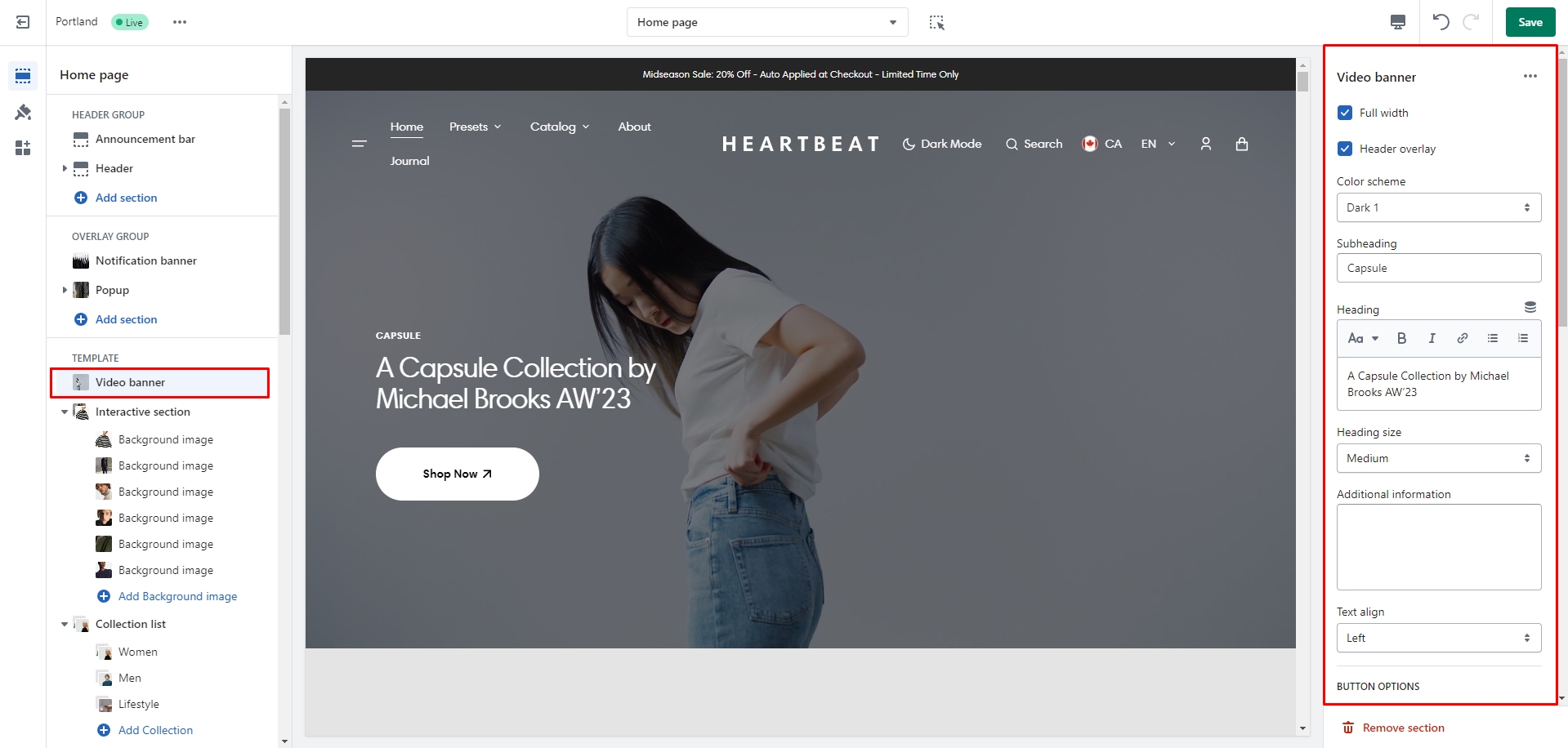
Video Banner
In this section, you can add and customize an autoplay video and an overlay text.
Page
Information on topic pages
Product page
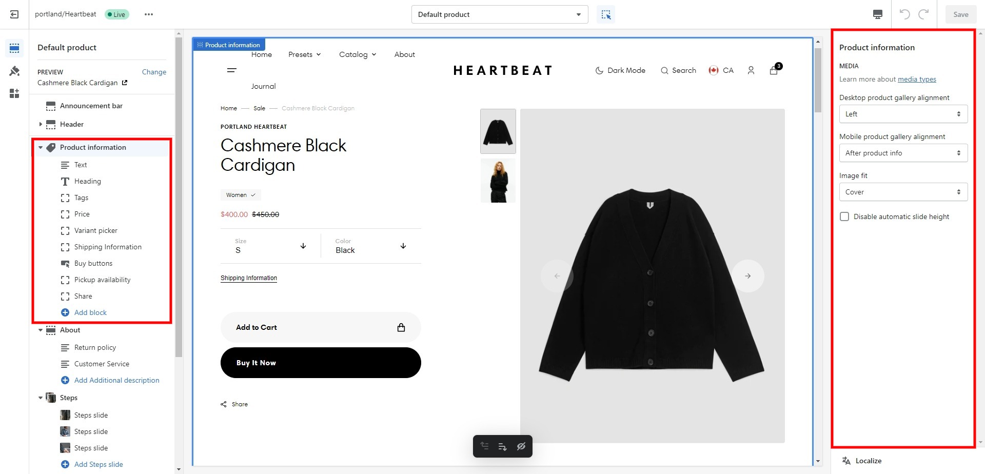
Product information
- Desktop product gallery alignment selector allows you to choose alignment type on desktop devices.
- Mobile product gallery alignment selector allows you to choose alignment type on mobile devices.
- Block Text option Text style sets style vendor text.
- Block Pop-up allows you to enable and customize pop-up modals.
- Block Inventory status displays the number of product items left in stock.
- Block Variant picker allows to choose the type of options, either pills or dropdown.
- Block Buy buttons option Show dynamic checkout buttons using the payment methods available on your store, customers see their preferred option, like PayPal or Apple Pay.
- Block Buy buttons option Show recipient information form for gift card products enables an option to send a gift card as a gift.
- Block Share allows you to enable links from the list.
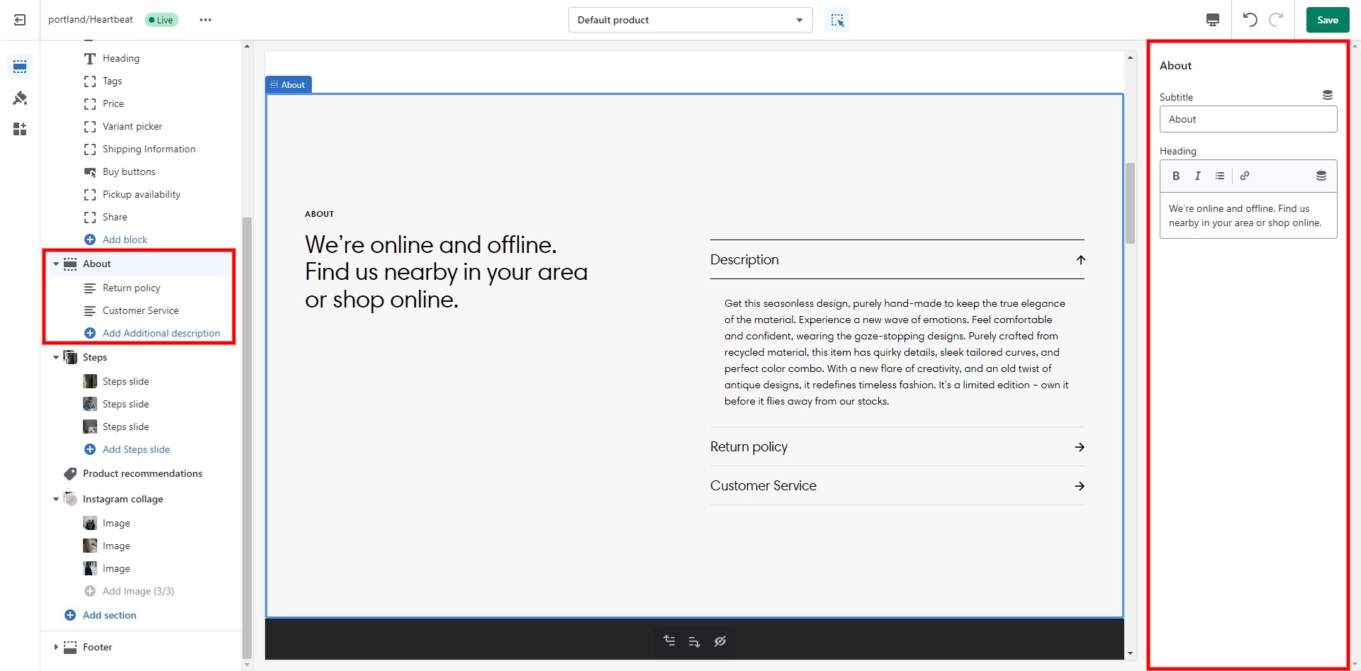
About product
- Subheading allows you to set a subheading for the section.
- Heading allows you to set a heading for the section.
- Block Additional description Heading field sets a heading for the block.
- Block Additional description Content field sets a text for the block.
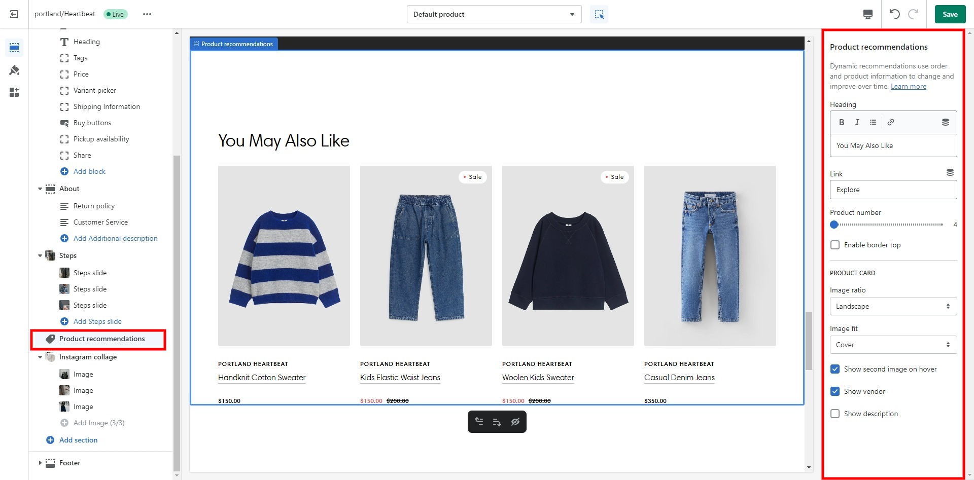
Product recommendations
Dynamic recommendations use order and product information to change and improve over time.
To add and edit product recommendations, follow these steps:
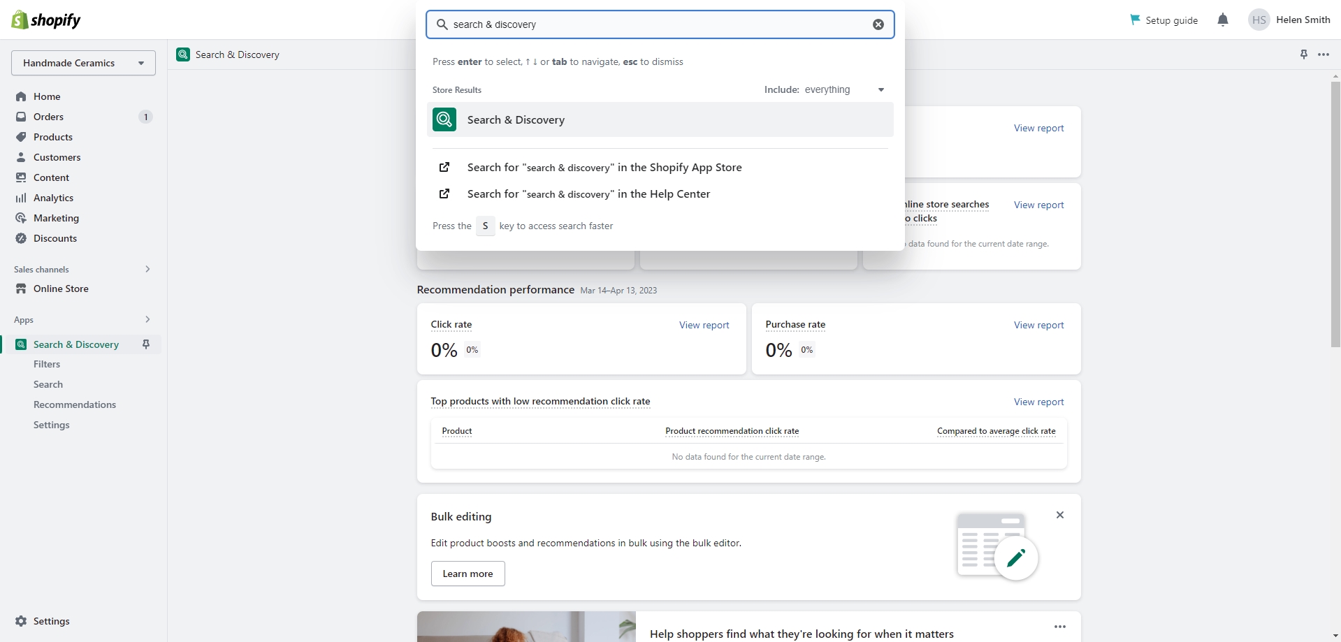
- Install the Search & Discovery app by Shopify from the Apps page in the Admin panel.
-
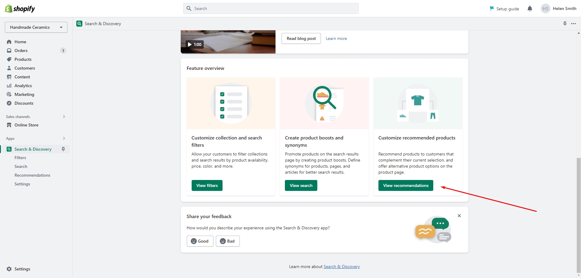
Once installed, open the app and follow the 'View recommendations' link in the Feature overview section to
add
recommendations to your products.
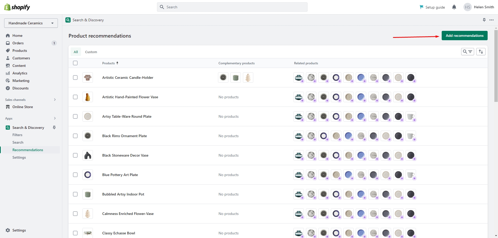
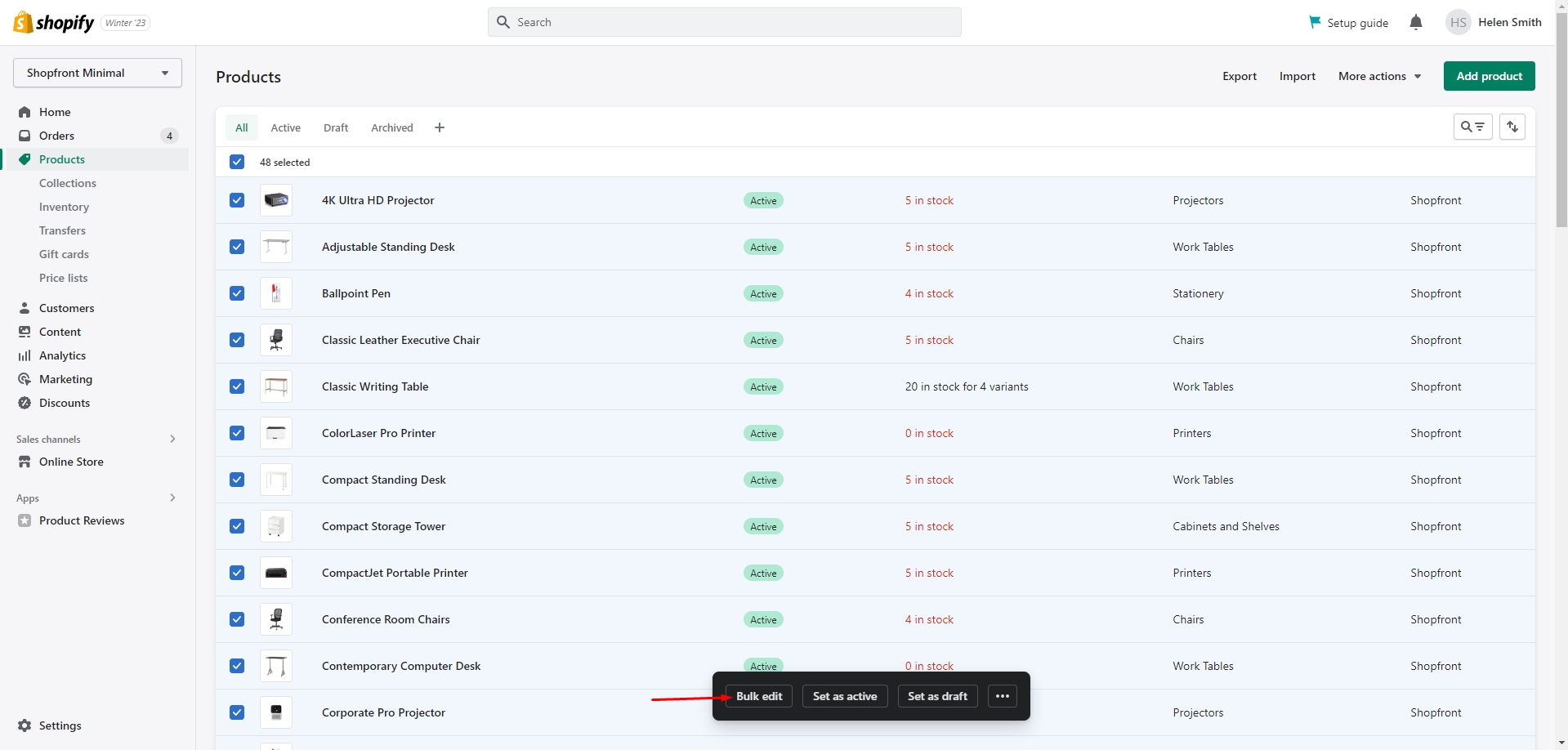
You can easily edit or add recommendations for multiple products using the Bulk Editor in the Products tab
in the Admin
panel.
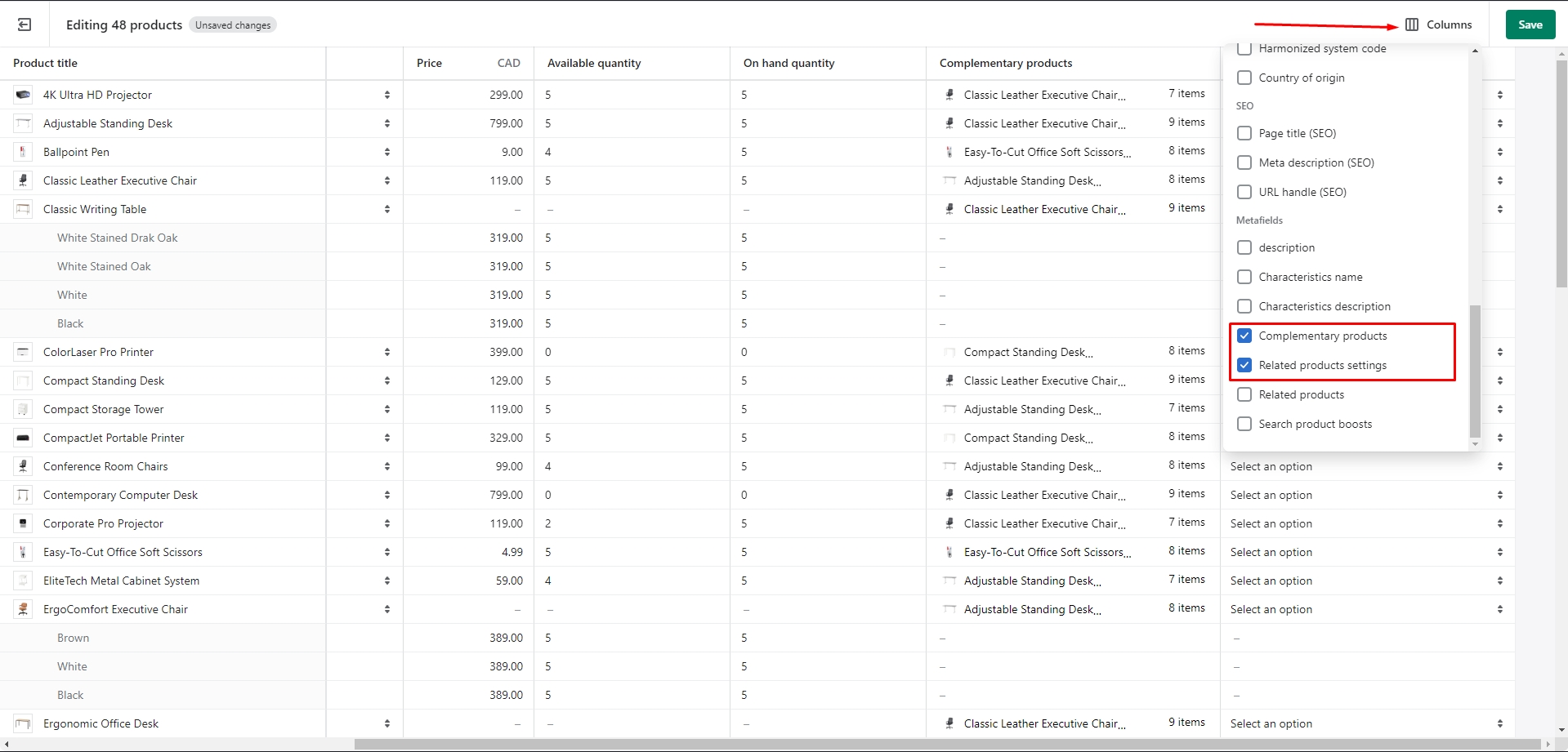
- Heading field sets a heading for the section.
- Link field allows you to add text for the link.
- Products to show field allows you to select the total displayed quantity of products.
- Enable border top field enables the display of a line above the section.
- Image ratio field allows you to choose the orientation of pictures for cards.
- Image fit field allows you to choose the fit of pictures for cards.
- Show second image on hover field enables the display of the second image on hover.
- Show vendor enables the display of the vendor.
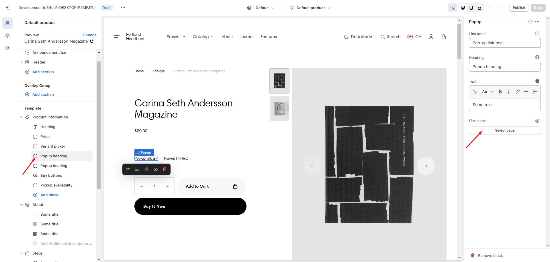
Size chart
To add a size chart, follow these steps:
- Create new page with a table.
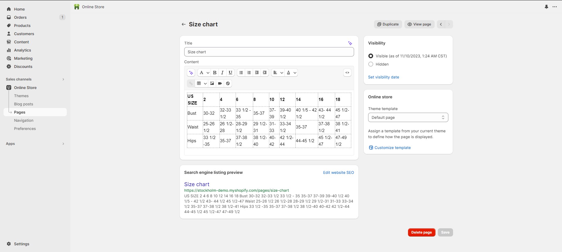
- Add a "Popup" block to the product page.
- Select "Size chart" page.
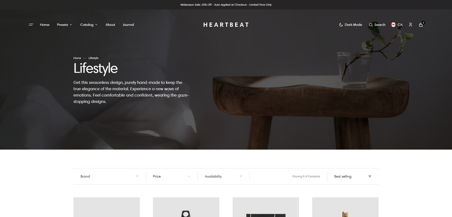
Collection page
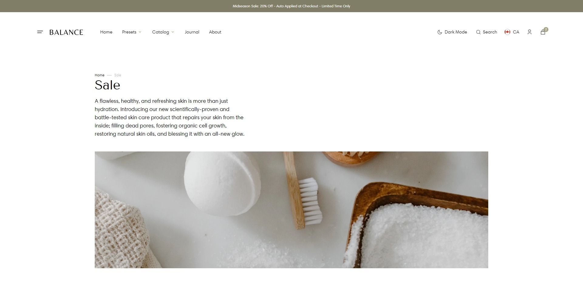
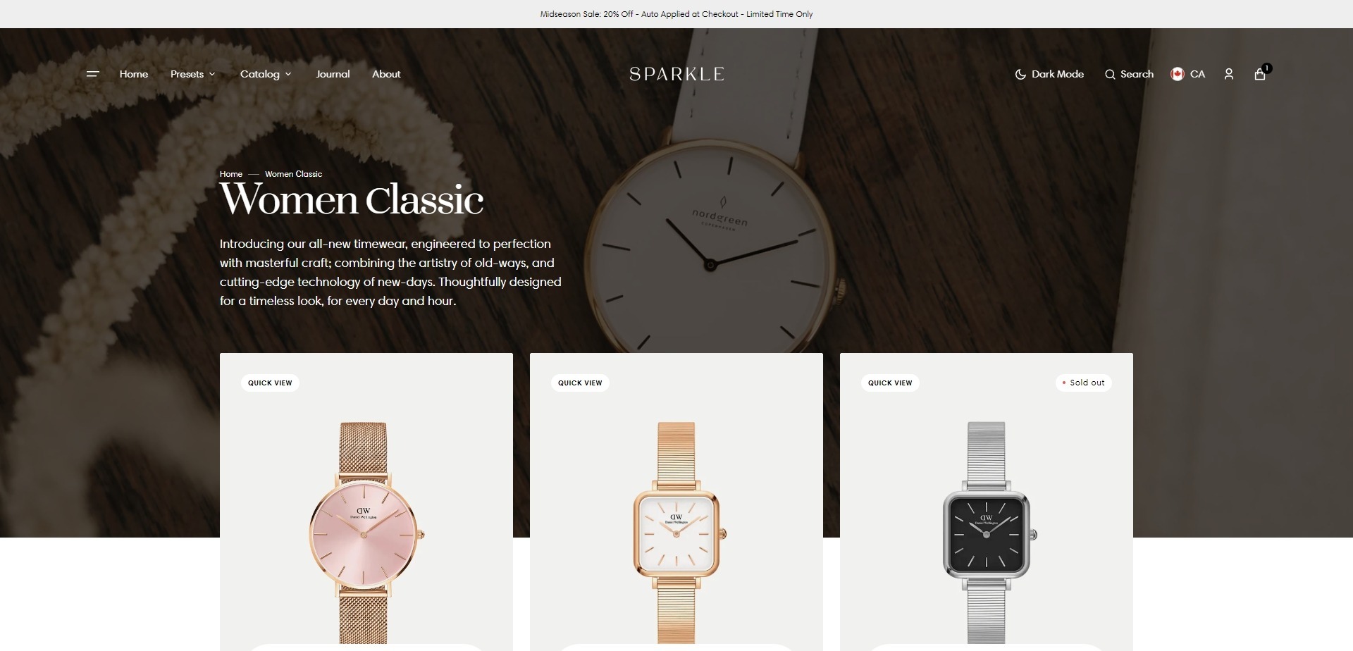
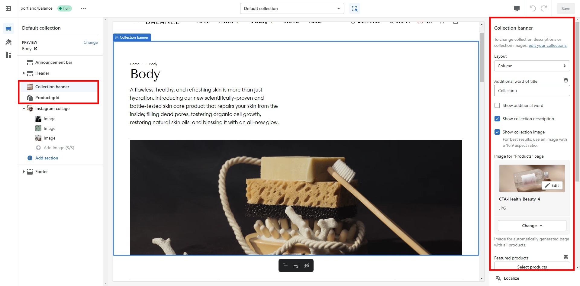
Collection banner
- Layout selector allows you to choose a layout type.
- Additional word field sets the additional word to the collection heading.
- Show additional word field enables the display of the additional word.
- Show collection description field enables the display of the description.
- Show collection image field enables the display of the collection image.
- Image for "Products" page allows you to set an image for automatically generated page with all products.
- Featured products field allows you to select products that will be displayed.
- Product card options allow you to customize product cards in the section.
Product grid
- Products per page field sets the number of displayed cards.
- Image ratio field allows you to choose the orientation of pictures for cards.
- Image fit field allows you to choose the fit of pictures for cards.
- Show second image on hover field enables the display of the second image on hover.
- Show vendor enables the display of the vendor.
- Enable filtering field enables filtering.
- Enable sorting field enables sorting.
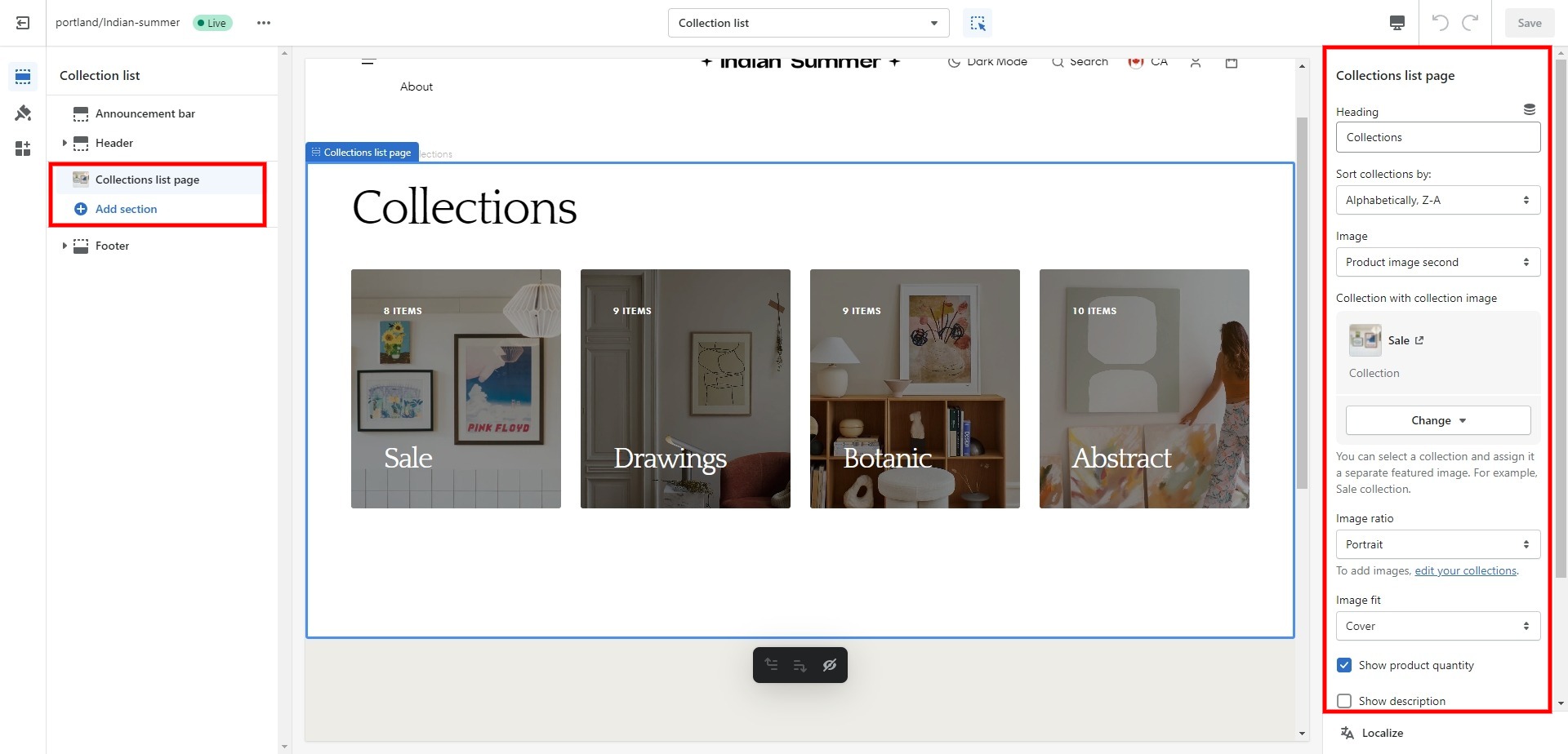
Collections list
Displays a list of all collections
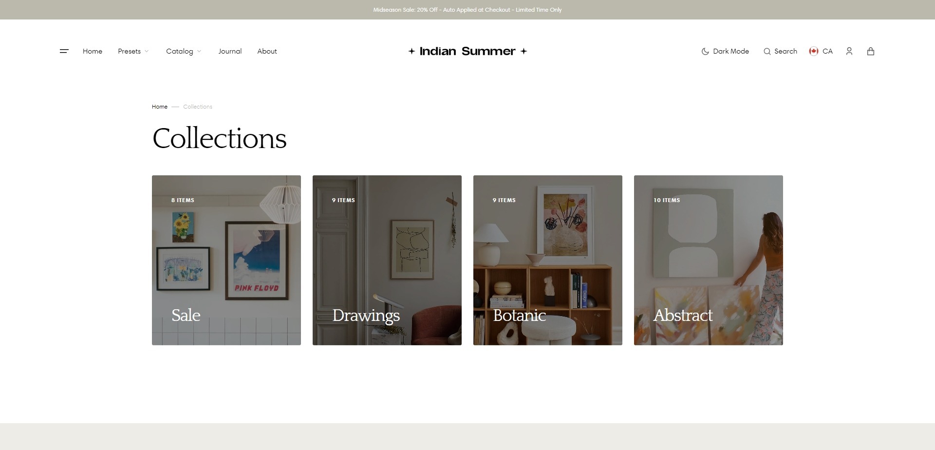
- Heading field sets a heading for the section.
- Sort collections by field filters the collection by the specified parameters.
- Image field allows you to choose cover for collections items.
- Collection with collection image field allows you to select a collection and assign it a separate featured image.
- Image ratio field allows you to choose the orientation of pictures for cards.
- Image fit field allows you to choose the fit of pictures for cards.
- Show count items enables the display of the products amount.
- Show description enables the display of the collection description.
- Top padding slider allows you to change the top padding in the section.
- Bottom padding slider allows you to change the bottom padding in the section.
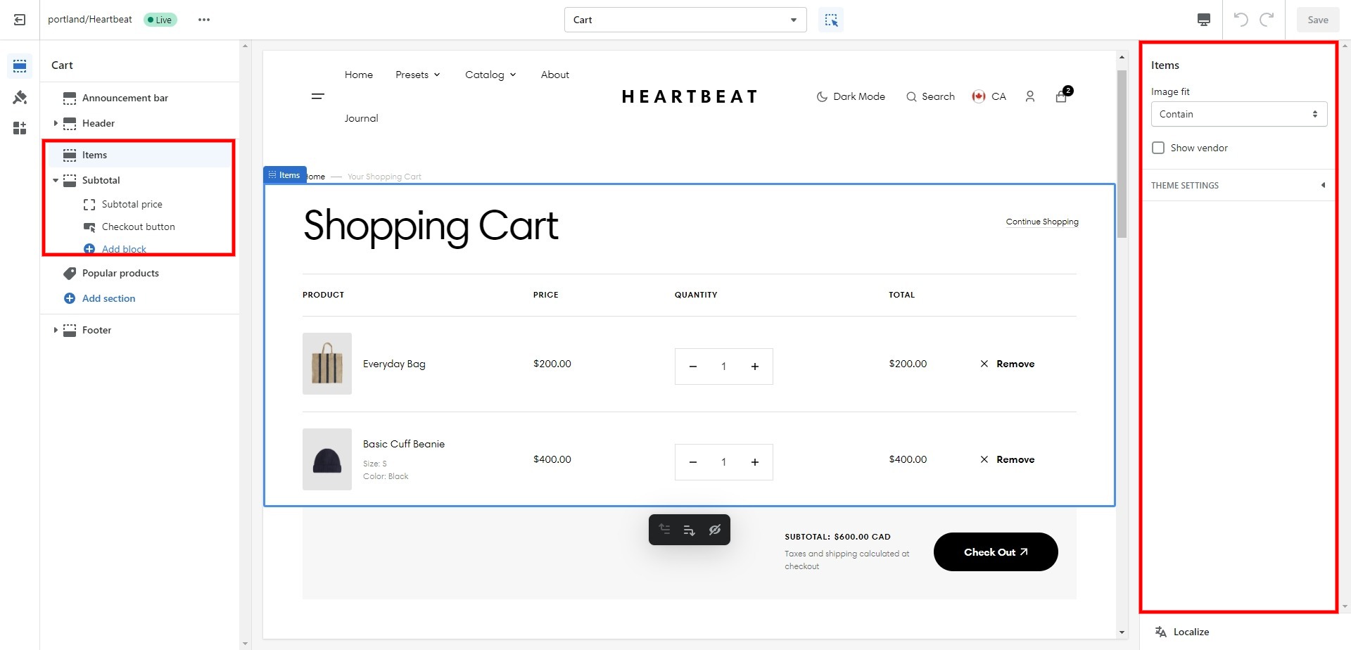
Cart
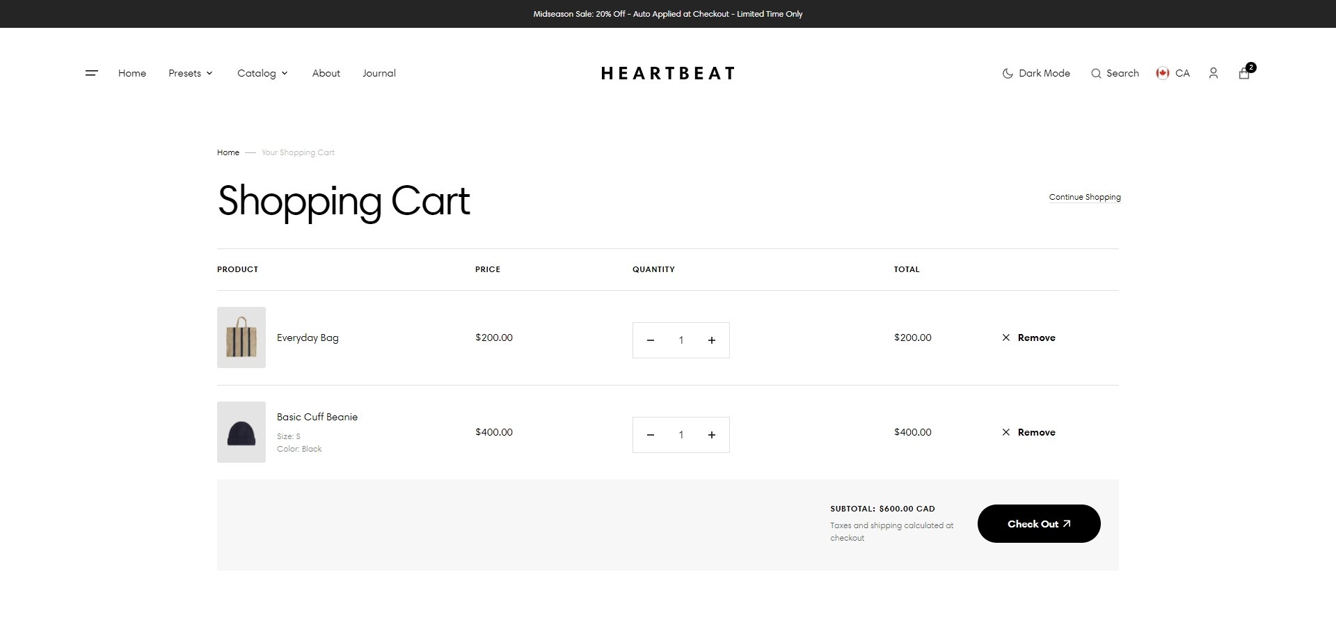
- Image fit field allows you to choose the fit of pictures for cards.
- Show vendor enables the display of the vendor.
- Block Subtotal option Enable cart note field sets a note.
- Block Subtotal option Top padding slider allows you to change the top padding in the section.
- Block Subtotal option Bottom padding slider allows you to change the bottom padding in the section.
Blog
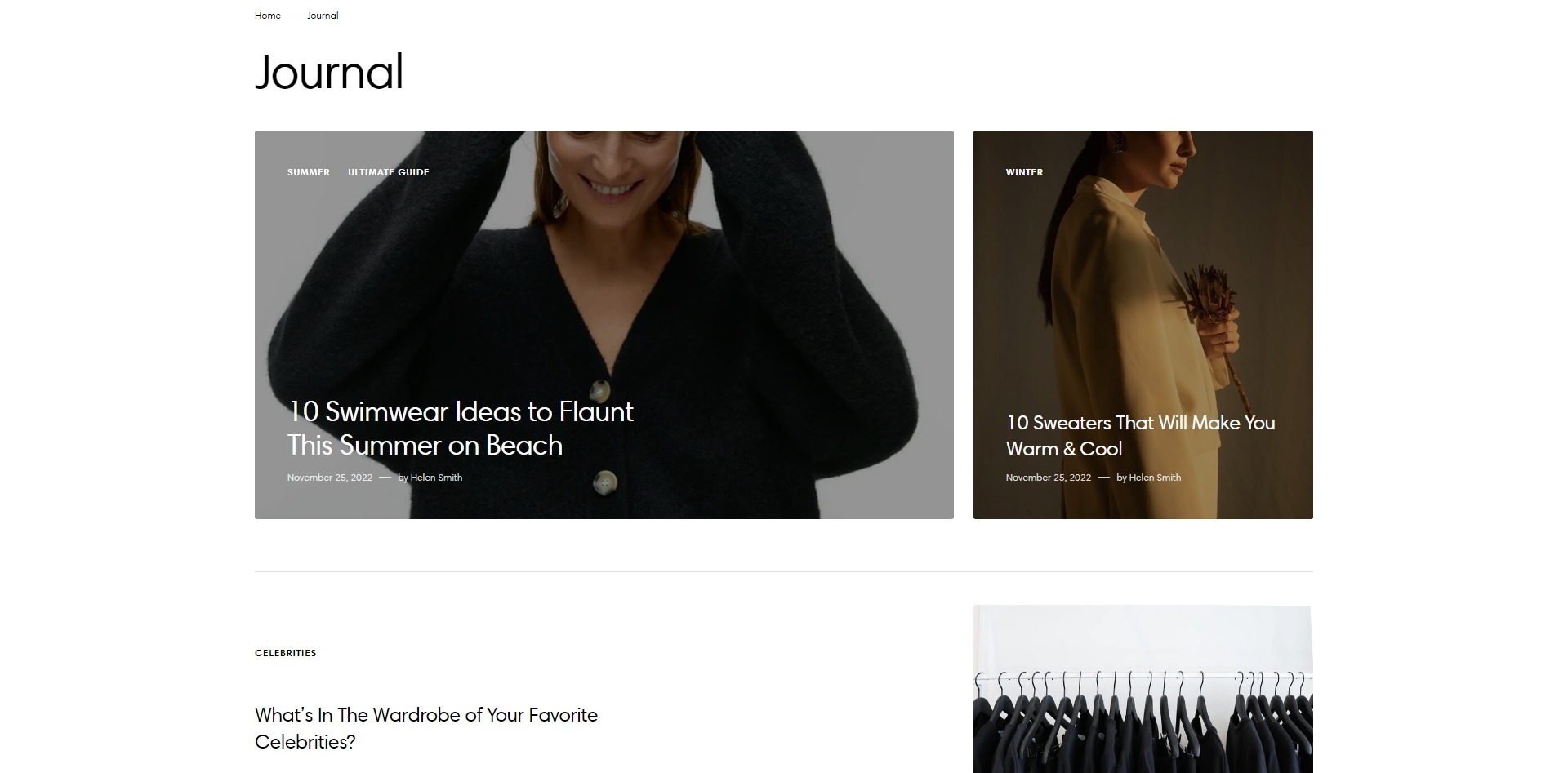
- Show featured image field enables the display of the image for the blog post.
- Show tags field enables the display of the tags for the blog post.
- Show date field enables of the date for the blog post.
- Show author enables the display of the author for the blog post.
- Show excerpt enables the display of the excerpt for the blog post.
- Top padding slider allows you to change the top padding in the section.
- Bottom padding slider allows you to change the bottom padding in the section.
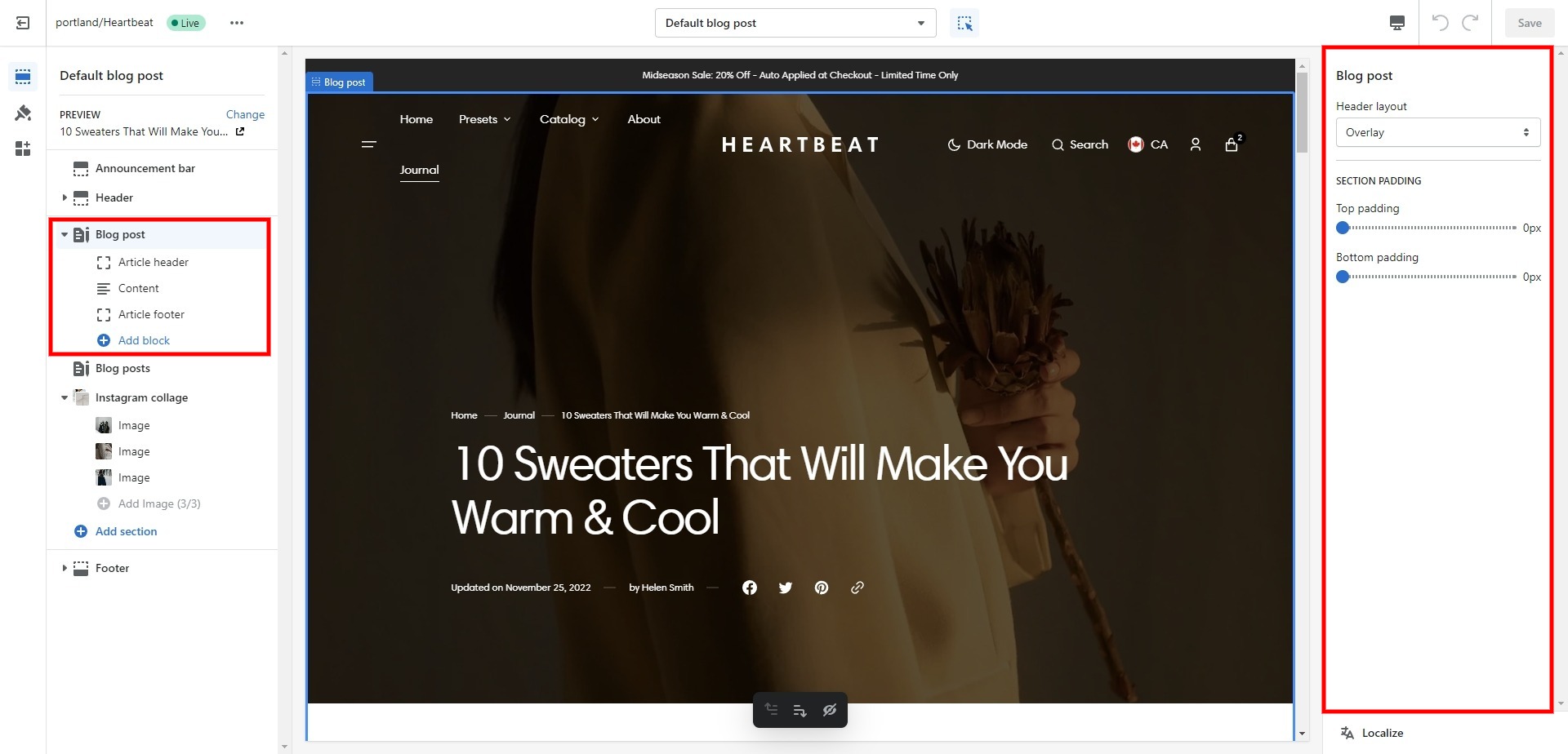
Blog post
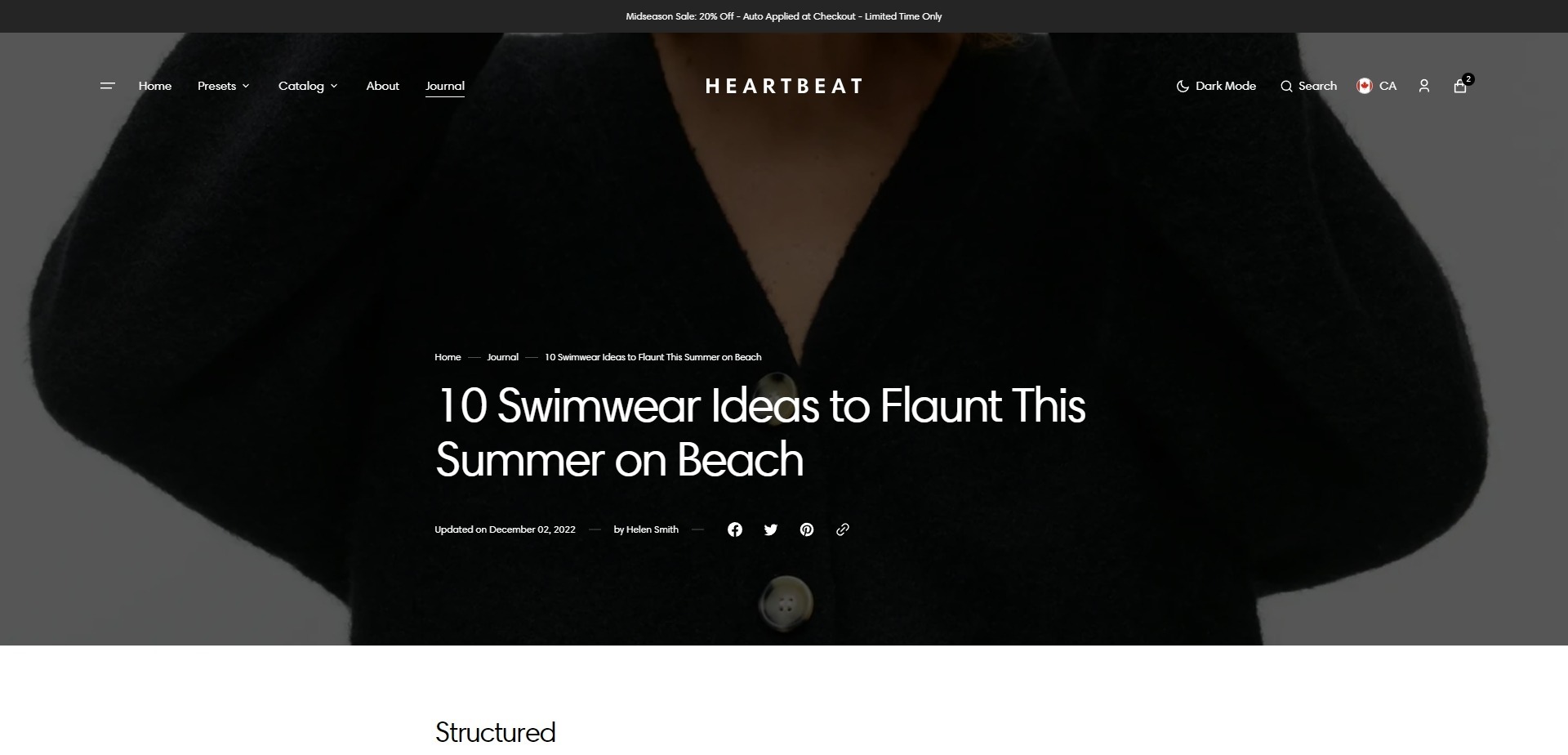
- Header layout allows you to select the location of the image.
- Block Article header option Show tags field enables the display of the tags for the blog post.
- Block Article footer option Show excerpt field enable excerpt for the blog post.
- Block Article header option Show date field enables date for the blog post.
- Block Article header option Show author field enables the display of the author for the blog post.
- Block Article header option Featured image height field allows you to select an image ratio.
- Block Article header option Share allows enable links from the list.
- Block Article footer option Show date field enable date for the blog post.
- Block Article footer option Show author field enables the display of the author for the blog post.
- Block Article footer option Image author field allows you to set an image.
- Block Article footer option Share allows enable links from the list.
Importing Our Demos
You can also copy the structure of any of our 5 demos in a few steps.
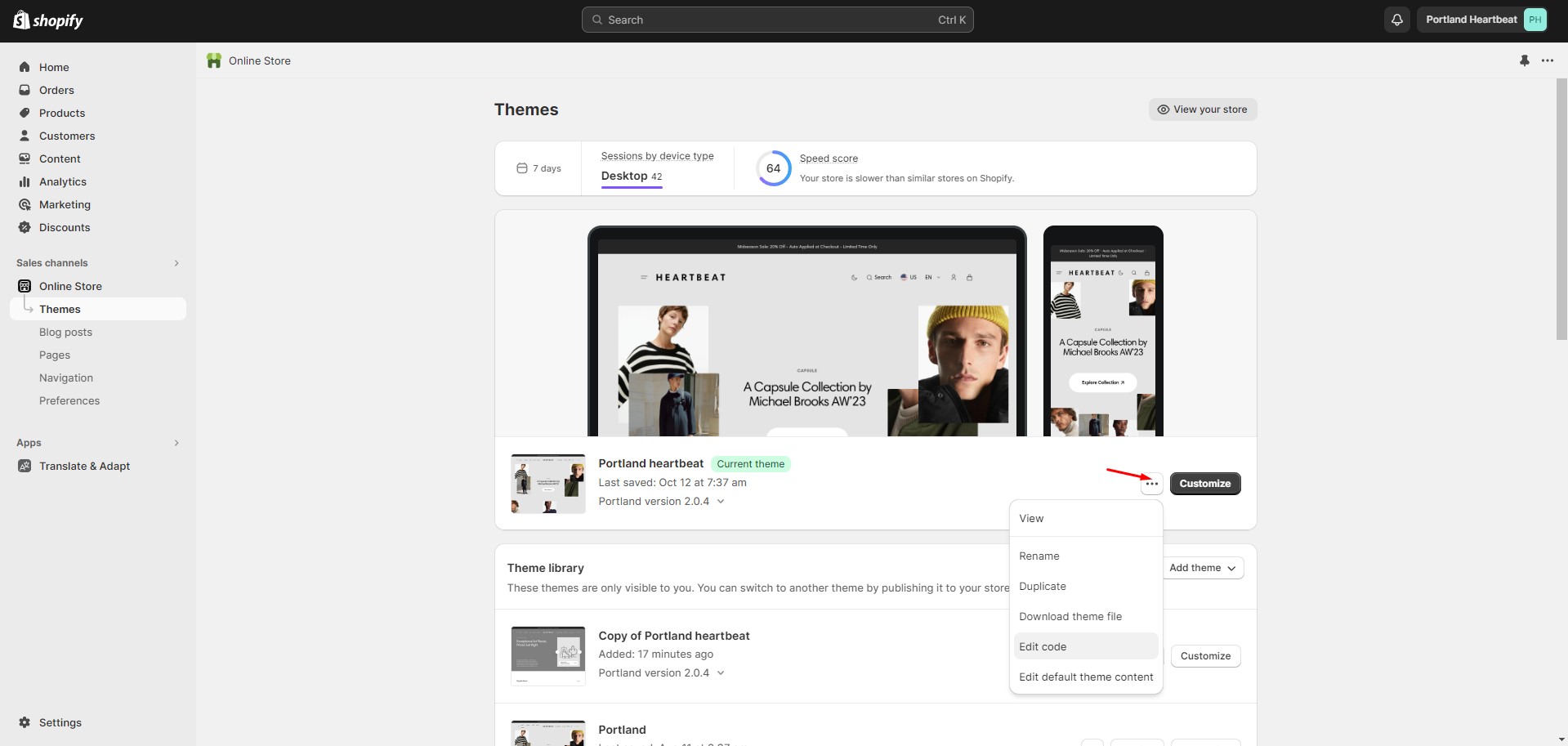
- Copy the demo structure from the links (Cmd-A or Ctrl-A to select all).
- Follow to the section Online Store > Themes in your store. Click the three dots button of your theme.
-
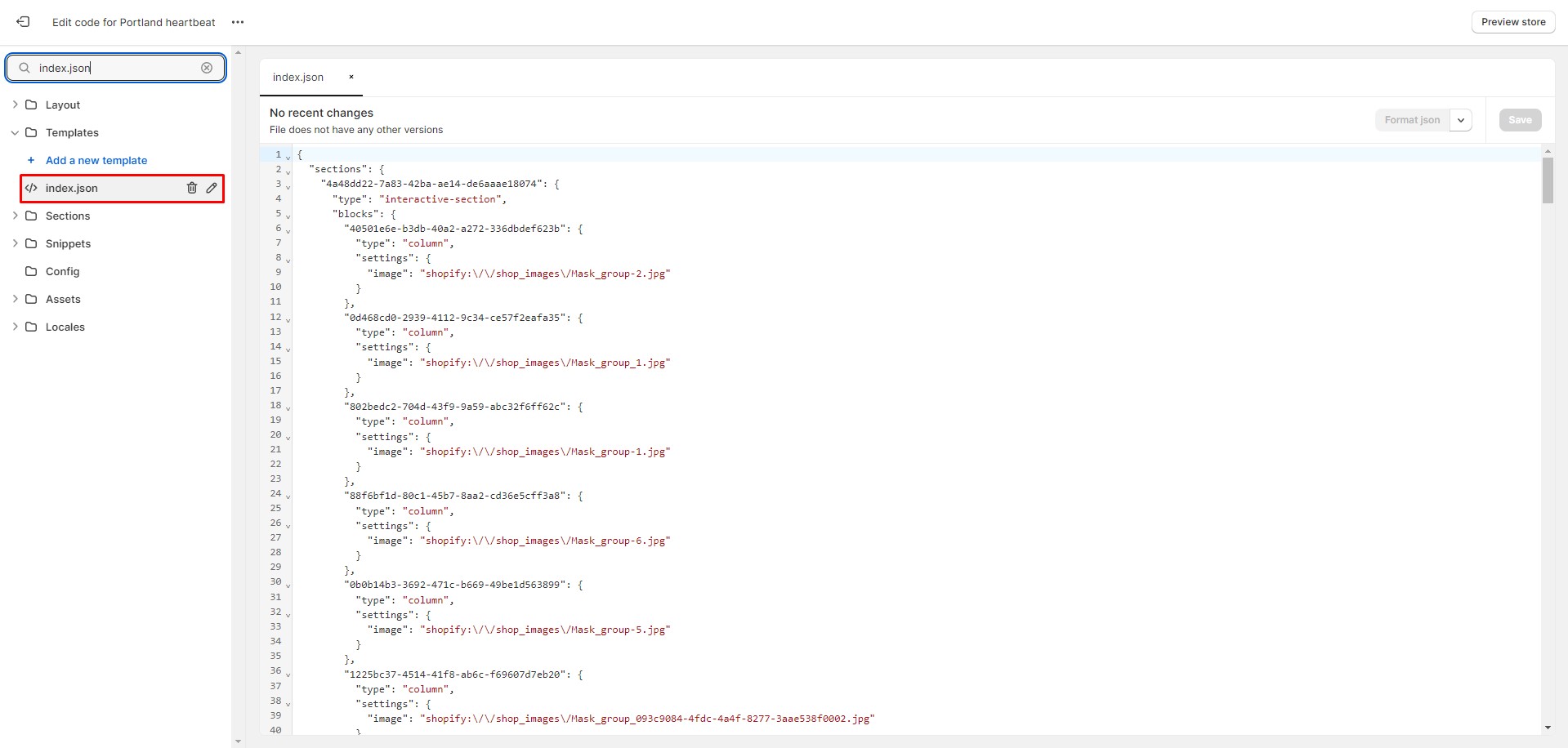
Open the code editor by clicking the Edit code button.
-
In the code editor, search for the file "index.json", select all content, and paste replacing the demo
structure. Click
"Save" to save your changes. If there's an error, click "Format json" and try to save the file again.
Demos structure
Support
You can ask any questions about the theme and our support agent will help you within 24 hours on business days.
Visit Help Center View Terms & Conditions