Monochrome
Below you’ll find a list of articles broken down by sub-topics that cover every aspect of your theme. We regularly maintain our documentation in collaboration with our support staff.
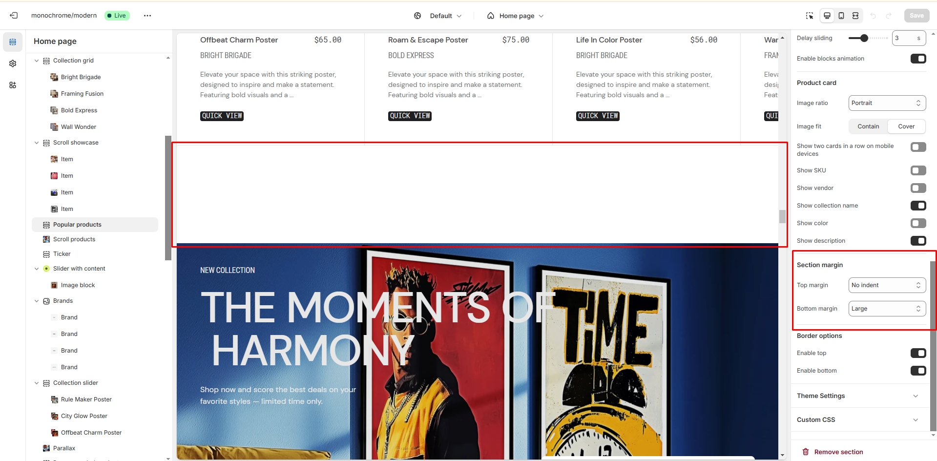
General Settings
Settings that are used in almost all sections
Section margin
Allows you to change the top and bottom margin in the section
- Top margin slider allows you to change the top margin in the section.
- Bottom margin slider allows you to change the bottom margin in the section.
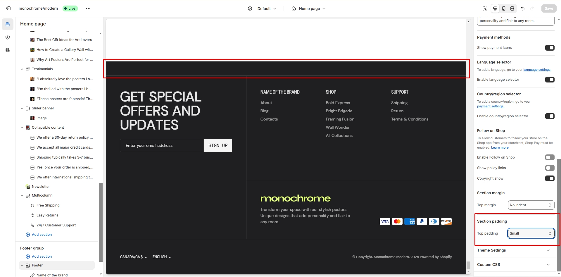
Section padding
Allows you to change the top and bottom padding in the section
- Top padding slider allows you to change the top padding in the section.
- Bottom padding slider allows you to change the bottom padding in the section.
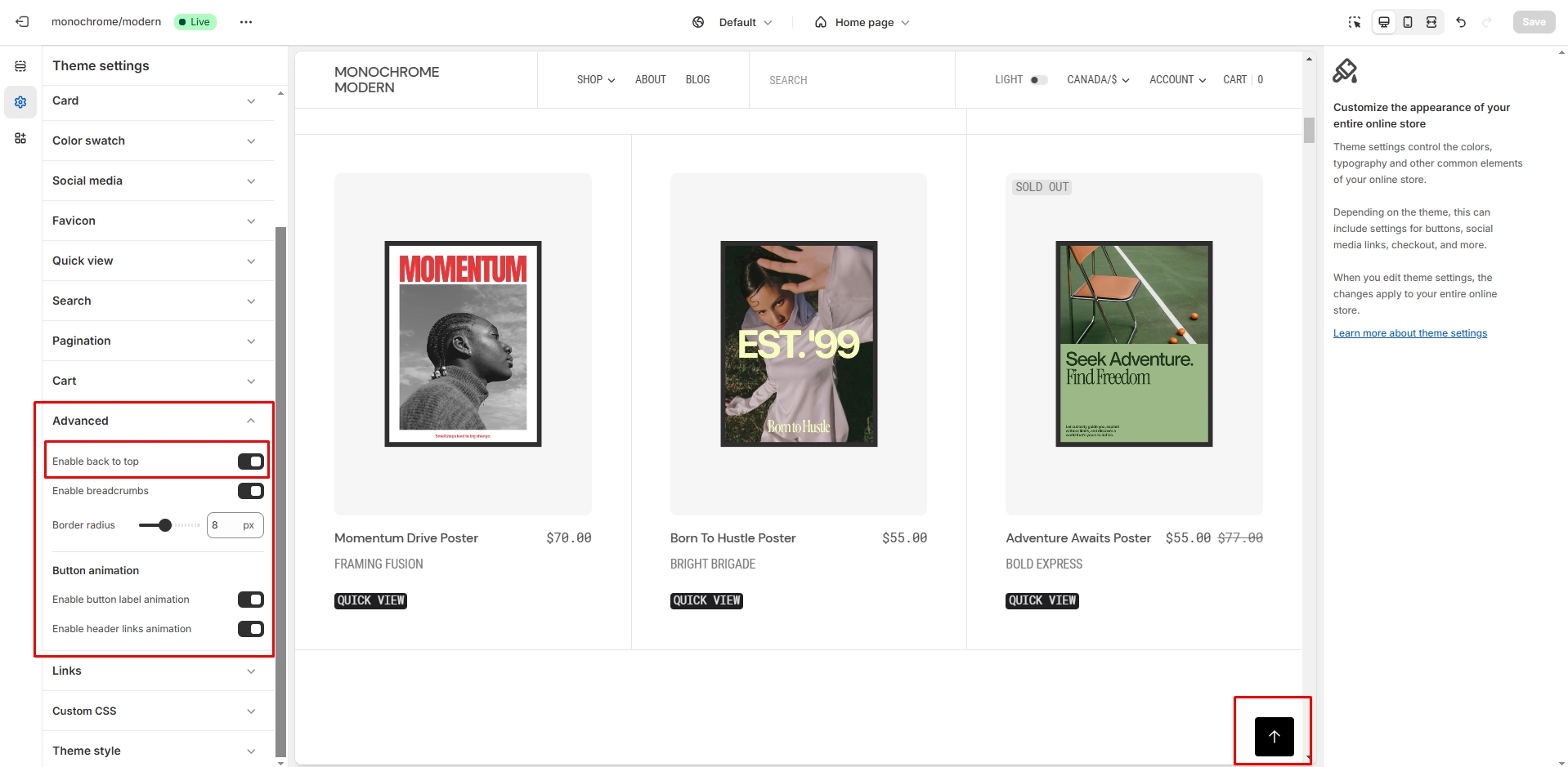
Back to Top
To enable Back to Top button, navigate to Theme settings > Advanced.
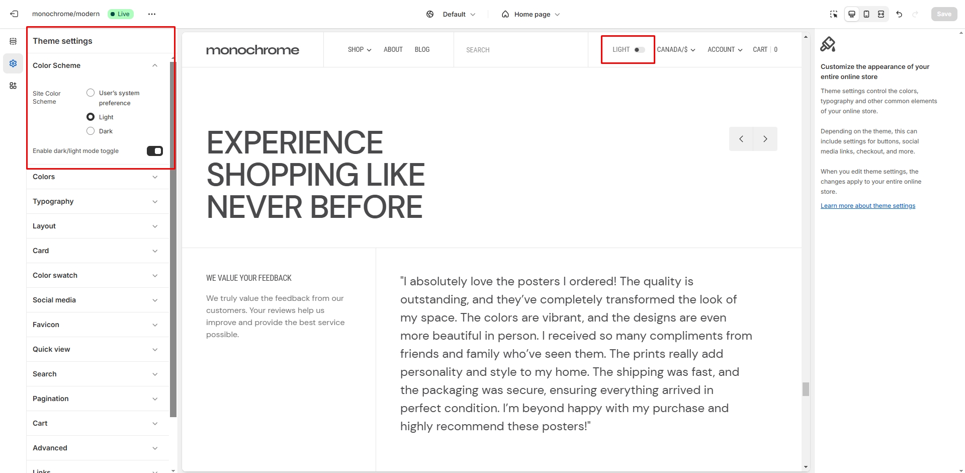
Color scheme
Dark mode toggle allows users to switch between light and dark color schemes.
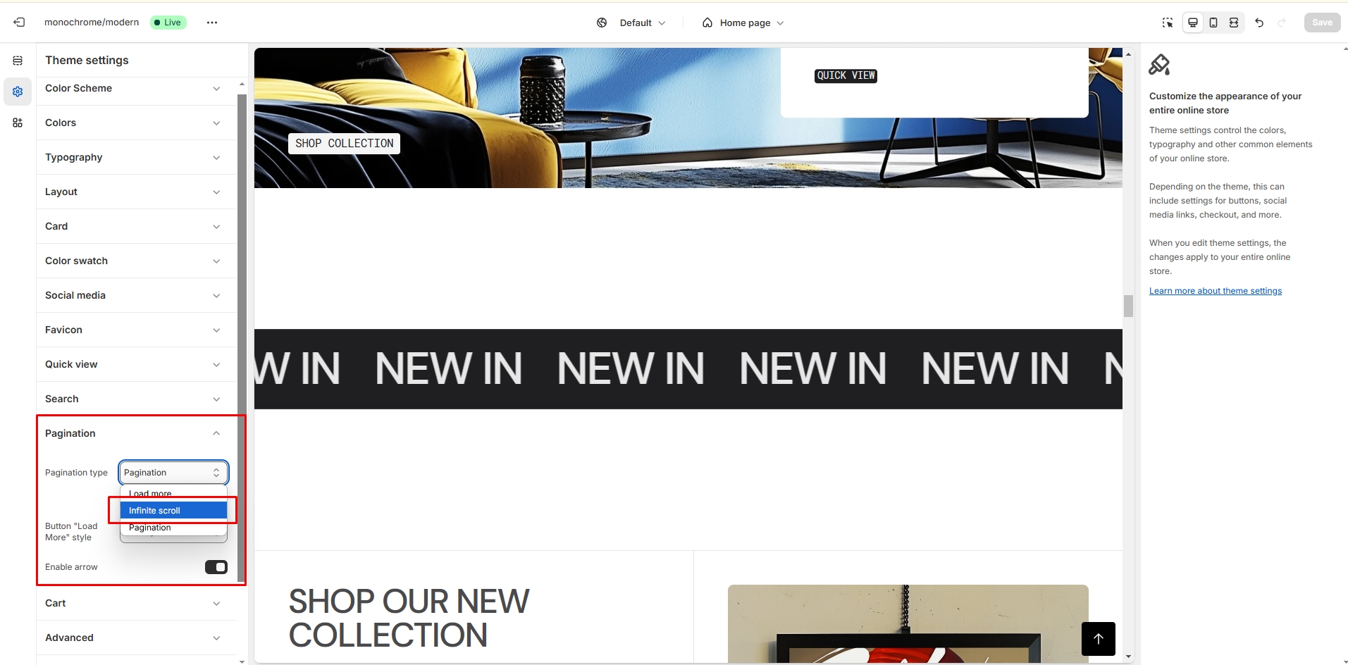
Infinite scroll
To enable and edit Infinite scroll, navigate to Theme settings > Pagination > Pagination type.
General sections
The sections that are used on all pages by default
Header Group
Sections that are used on all pages by default
Announcement bar
The announcement bar appears at the top of every page and includes custom messages with optional links. It's good to use for promoting sales or need-to-know updates.
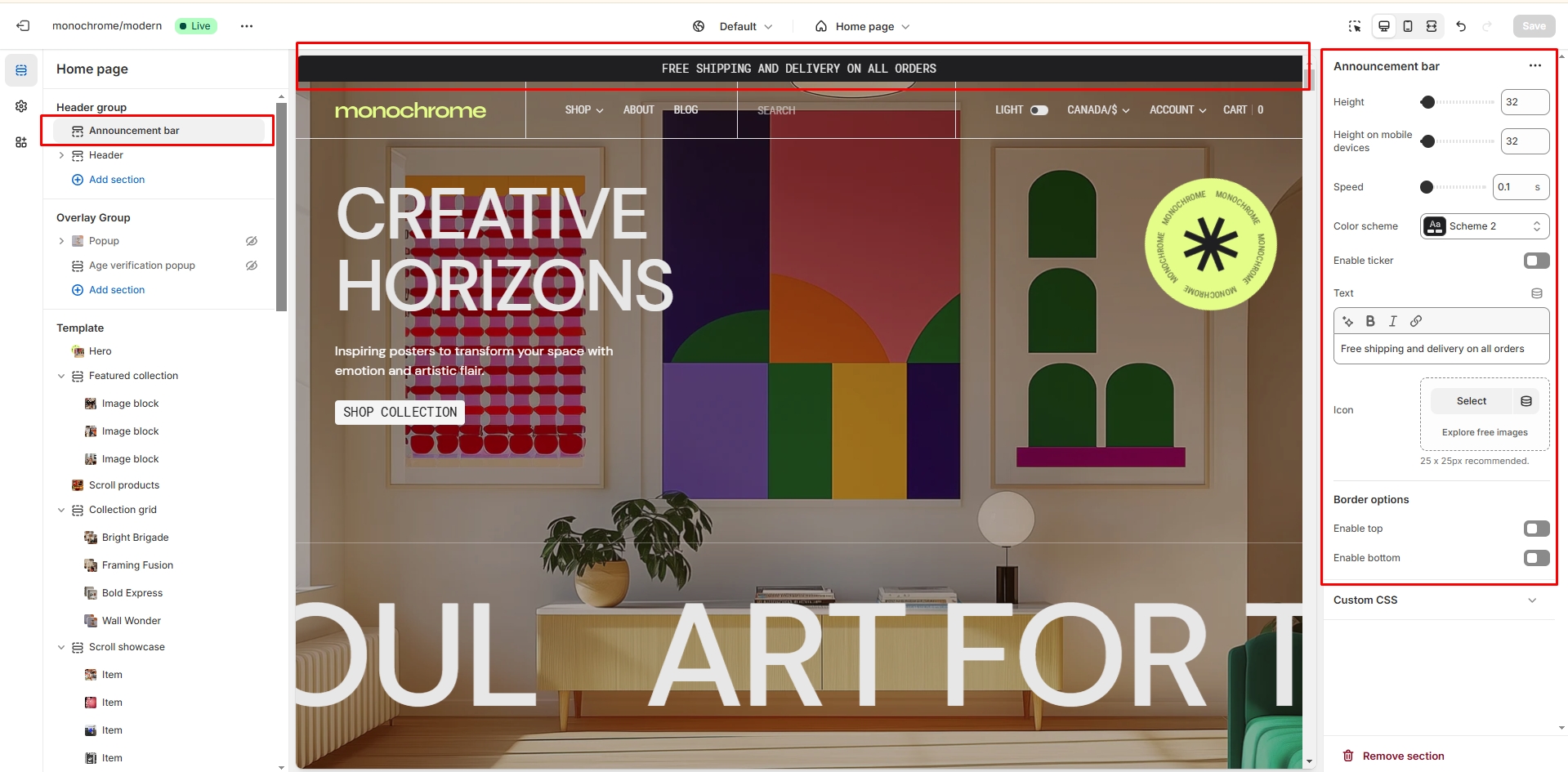
- Height slider allows you to change the bar's height.
- Height on mobile devices slider allows you to change the announcement height only on mobile devices.
- Speed range gives you opportunity to select the speed of the Ticker from 0.1s to 6s.
- Color scheme selector allows you to change the color scheme. (You can change the background color in the Theme settings.
- Enable Ticker option is a toggler to start/stop the ticker - text infinitely scrolling from right to left.
- Text field allows you to add and edit text.
- Use the field Icon (Optional.) to add/change the image.

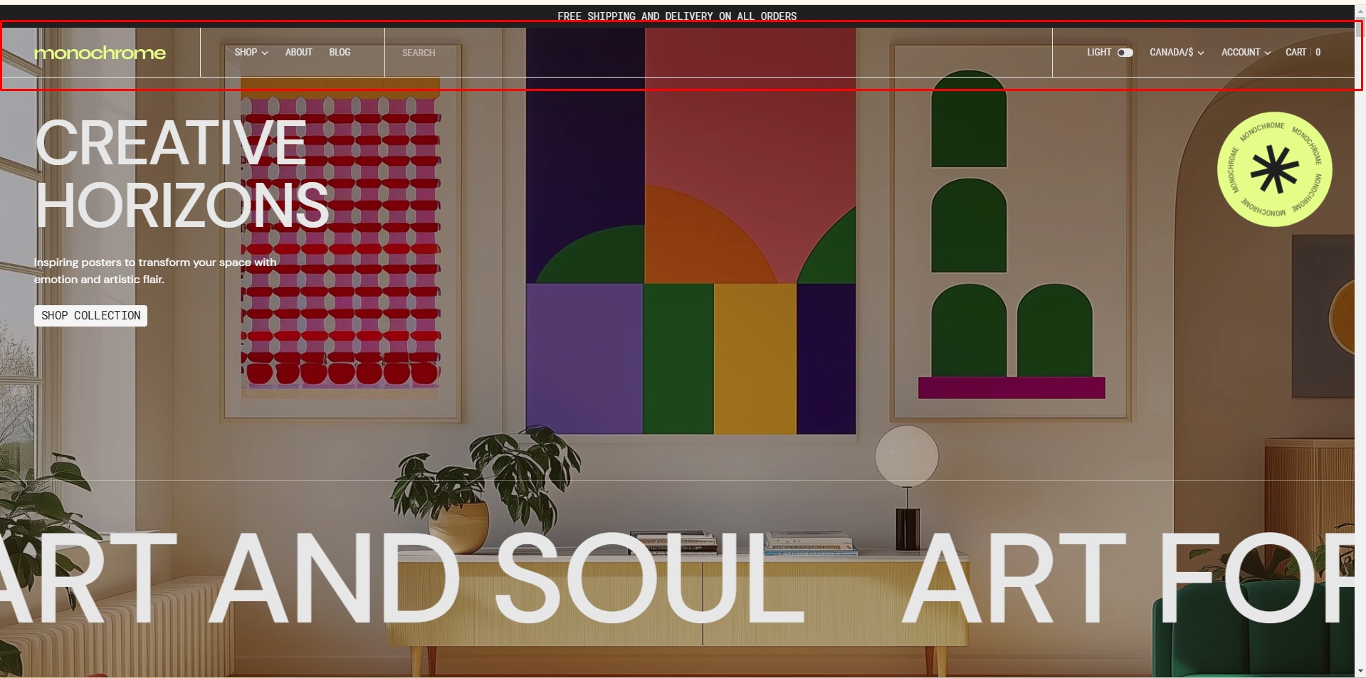
Header
Header appears at the top of every page right below the Announcement bar. You can customize it to fit your brand and product offerings.
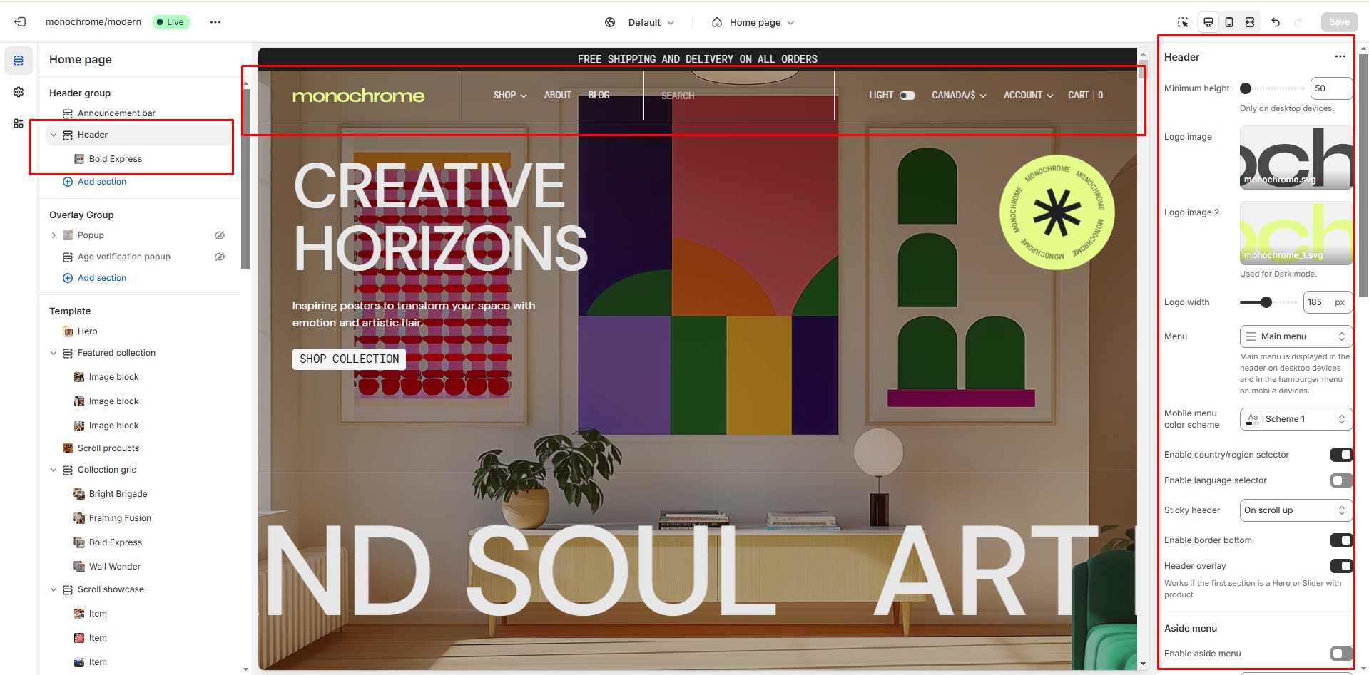
- Minimum Height slider allows you to change the minimum header's height only on desktop devices.
- Use the Logo image file selector to select or upload your logo file.
- Use the Logo image 2 file selector to select or upload your logo, which can be seen on pages with an overlay header and also in Dark mode.
- (Optional.) If you add a logo, you can use the Custom logo width range to change the logo size.
- Choose a Main menu to be displayed in the header.
- Use the Color scheme selector to choose the color palette for the mobile menu.
- Enable country/region selector field enables the display of country/region selector with currency information in the header.
- Enable language selector field enables the display of language selector with available translations.
- Enable sticky header field enables the display of a header on the screen as the user scrolls up.
- Enable bottom border field allows you to add a separator line under the header.
- Enable header overlay allows the header to overlay the content below it. This is useful for example for hero sections.
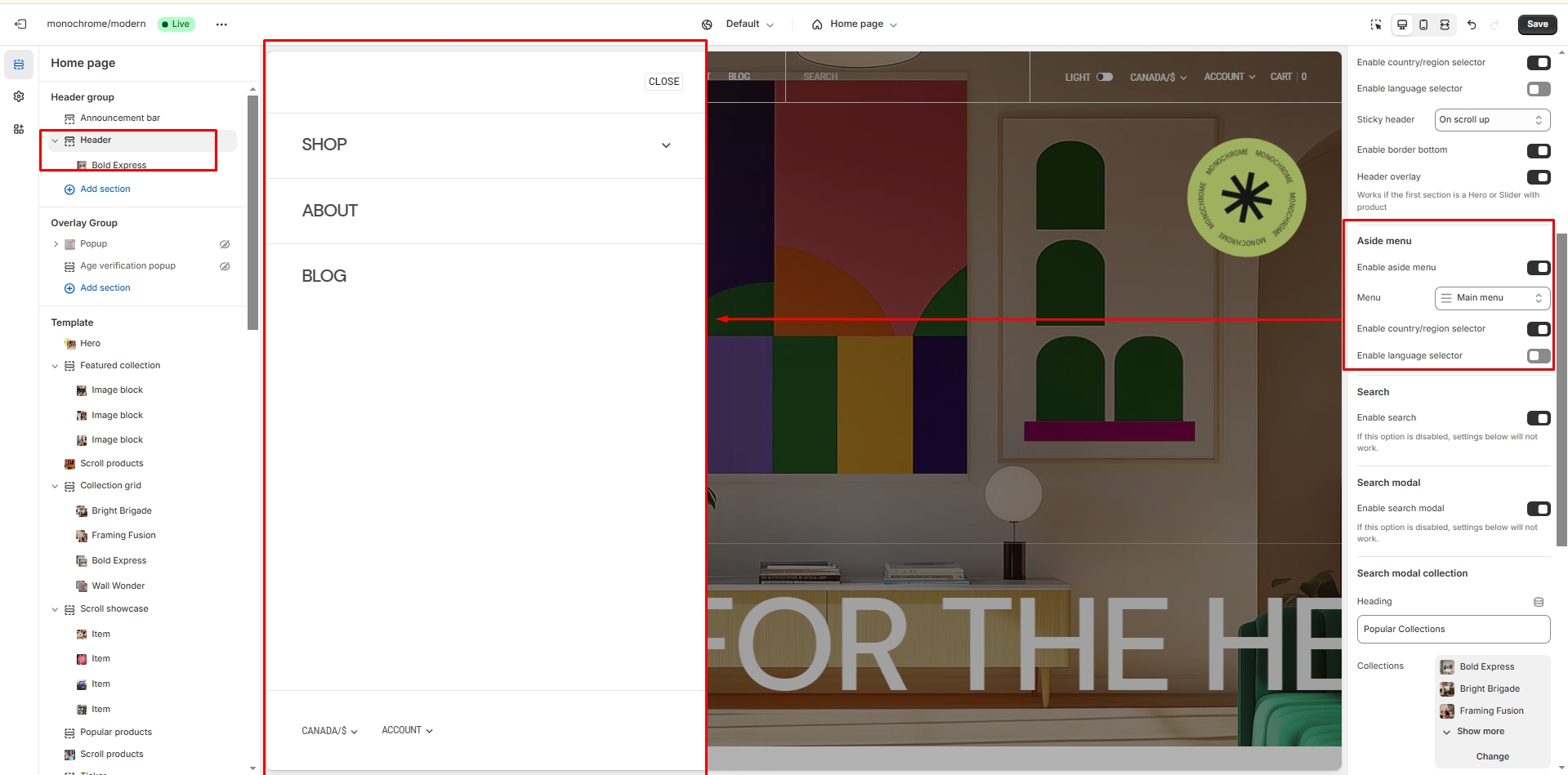
Aside menu
- Enable aside menu activates the fullscreen overlay menu triggered by the Aside icon.
- Choose an Aside menu to be displayed in the overlay menu.
- Enable country/region selector in aside menu shows the country/region selector in the mobile menu.
- Enable language selector in aside menu shows the language selector in the mobile menu.
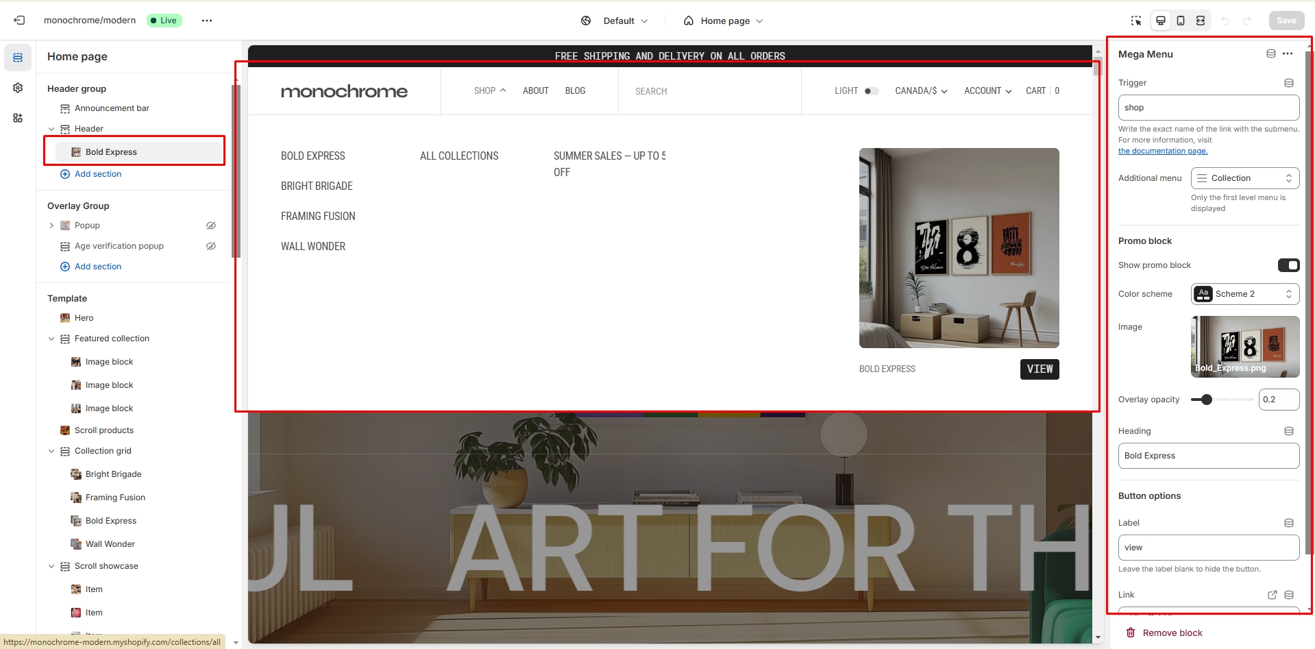
Mega Menu
Create enhanced navigation experiences with mega menus that can include promotional content.
- Set the Menu trigger to specify which menu item will activate the mega menu.
- Add an Additional menu for extra navigation options.
-
Enable the promotional section with:
- Custom image with adjustable overlay opacity
- Promotional heading
- Customizable button (label, link, and style)
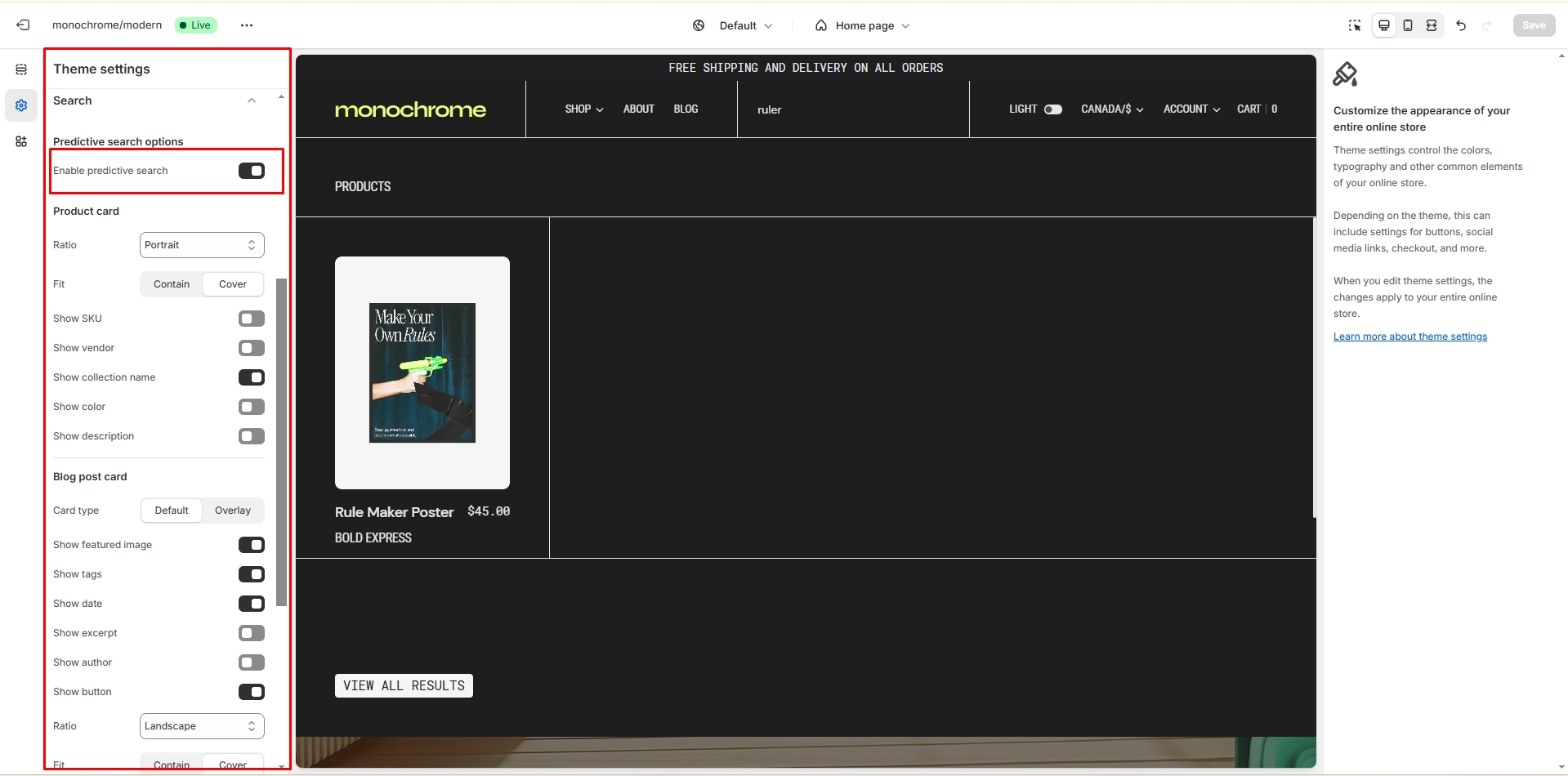
Search
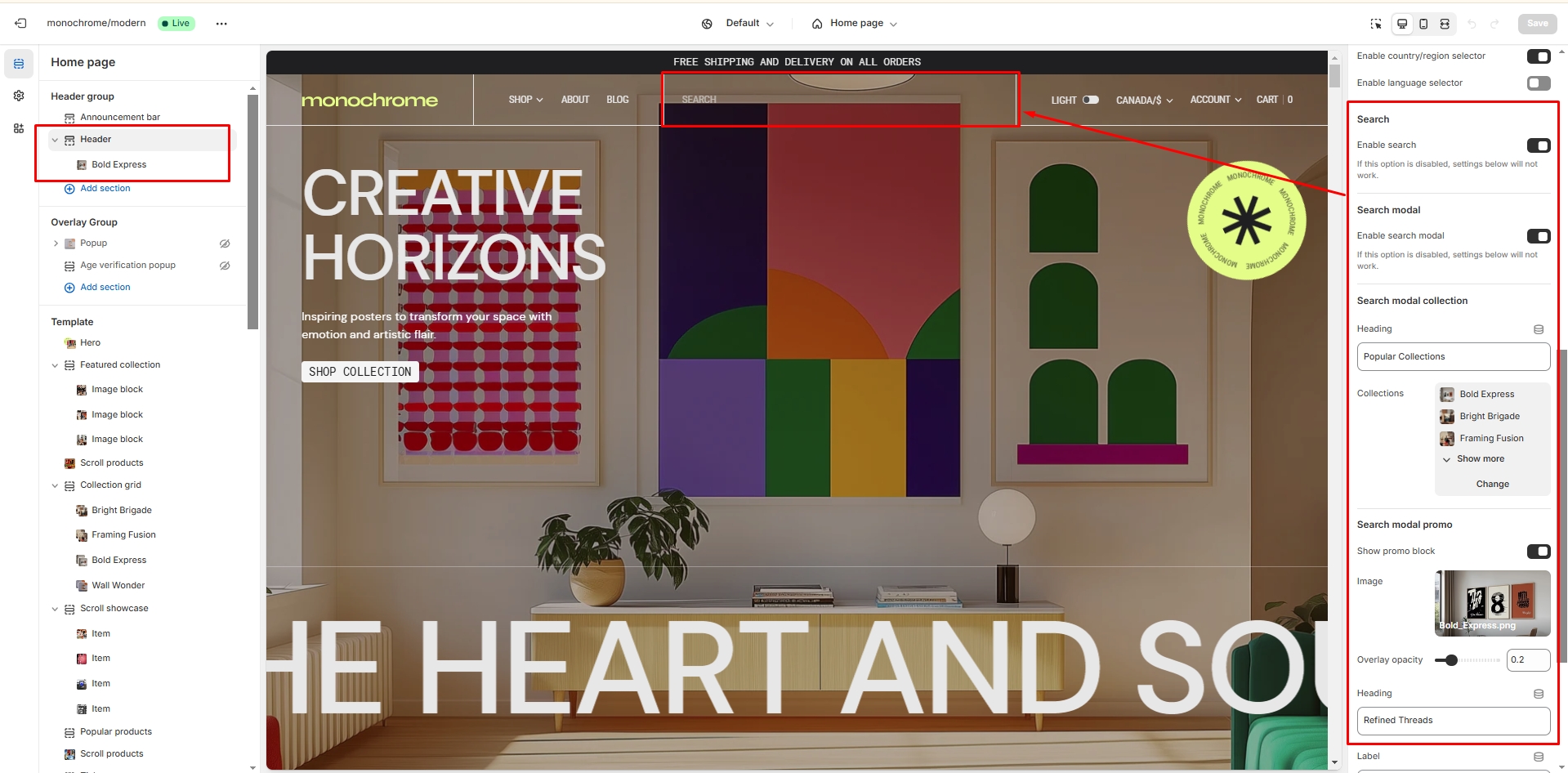
The theme includes a powerful search functionality with predictive search capabilities.
- Enable Search field adds a search icon to the header (Not displayed when Menu is not enabled).
- Enable search modal activates a full-screen search experience with predictive results.
- Collections label sets the heading for the collections section in the search modal (default: "Popular Collections").
- Use the Collection grid to select up to 6 collections to feature in search results.
-
Show search promo enables a promotional section in the search
modal with:
- Custom promotional image
- Adjustable overlay opacity
- Custom heading
- Configurable button with customizable label, link, and style (primary/secondary/tertiary)
- The search includes predictive search functionality that can be enabled/disabled in Theme Settings > Search.
Footer
Footer appears at the bottom of every page. You can customize it to fit your brand and product offerings.
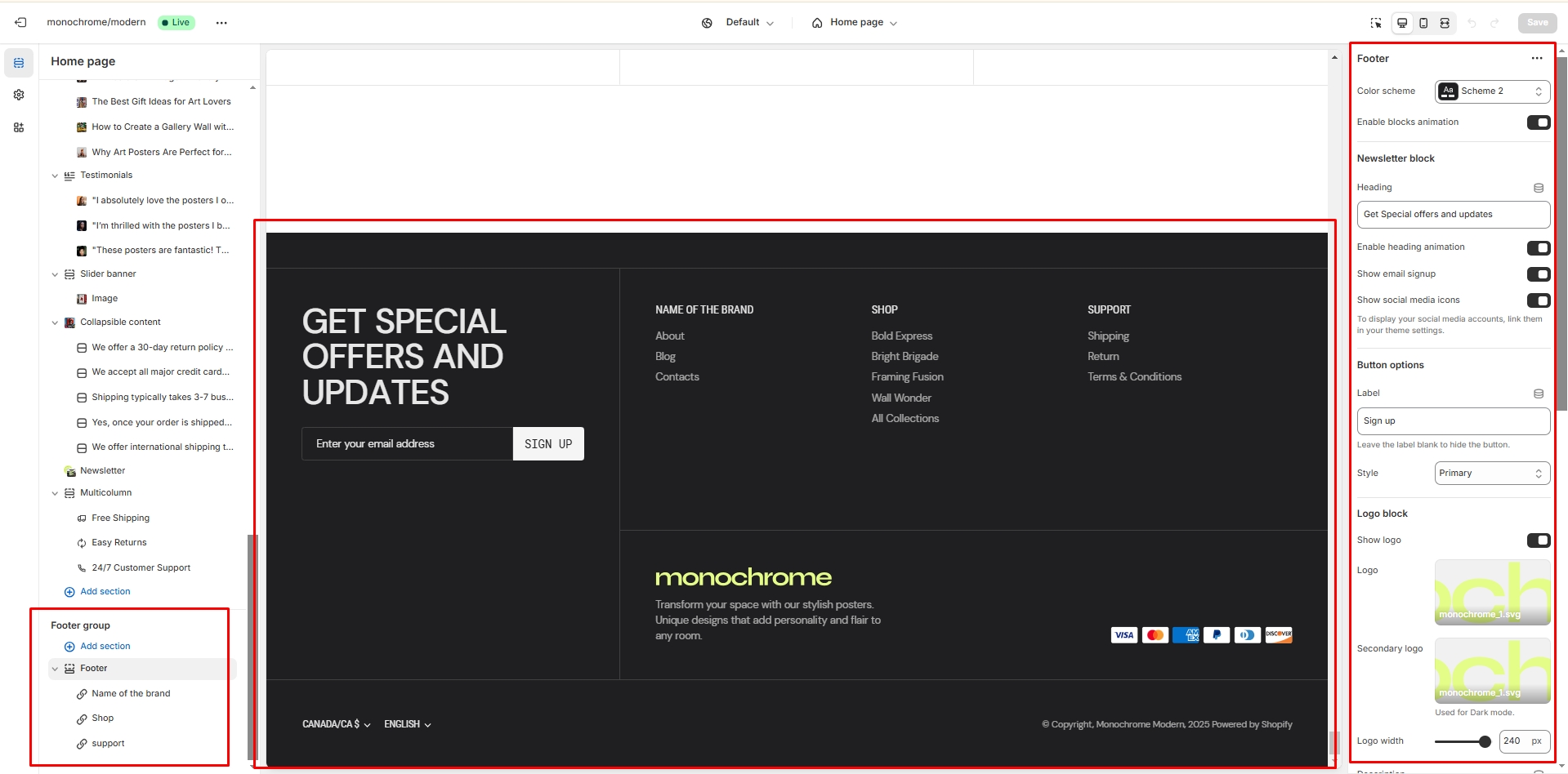
- Use Color scheme selector to change the color scheme.
- Enable block animation adds animation effects to footer blocks.
-
Newsletter settings:
- Set newsletter heading text
- Enable/disable heading animation
- Toggle newsletter display
- Show social media icons enables the display of social media links.
-
Button customization:
- Set sign-up button label (defaults to "Sign up")
- Choose button style (Primary, Secondary, or Tertiary)
-
Logo settings:
- Toggle logo visibility
- Upload primary logo
- Upload secondary logo (for dark/light modes)
- Adjust logo width (50-250px, default: 100px)
- Add custom Description text below the logo.
- Show payment icons enables the display of payment methods.
- Enable language selector allows customers to choose their preferred language.
- Enable country/region selector allows customers to select their location.
- Enable Follow on Shop displays the Follow on Shop button.
- Show policy links enables the display of store policies.
- Show copyright toggles the copyright notice.
-
Menu blocks:
- Add up to 4 menu blocks
- Each block can have a custom heading (default: "Quick links")
- Select menu items for each block (defaults to footer menu)
Overlay Group
Popup
In the Popup settings, you can change layout, add image, subscribe form, edit position, change open and exit animations and options.
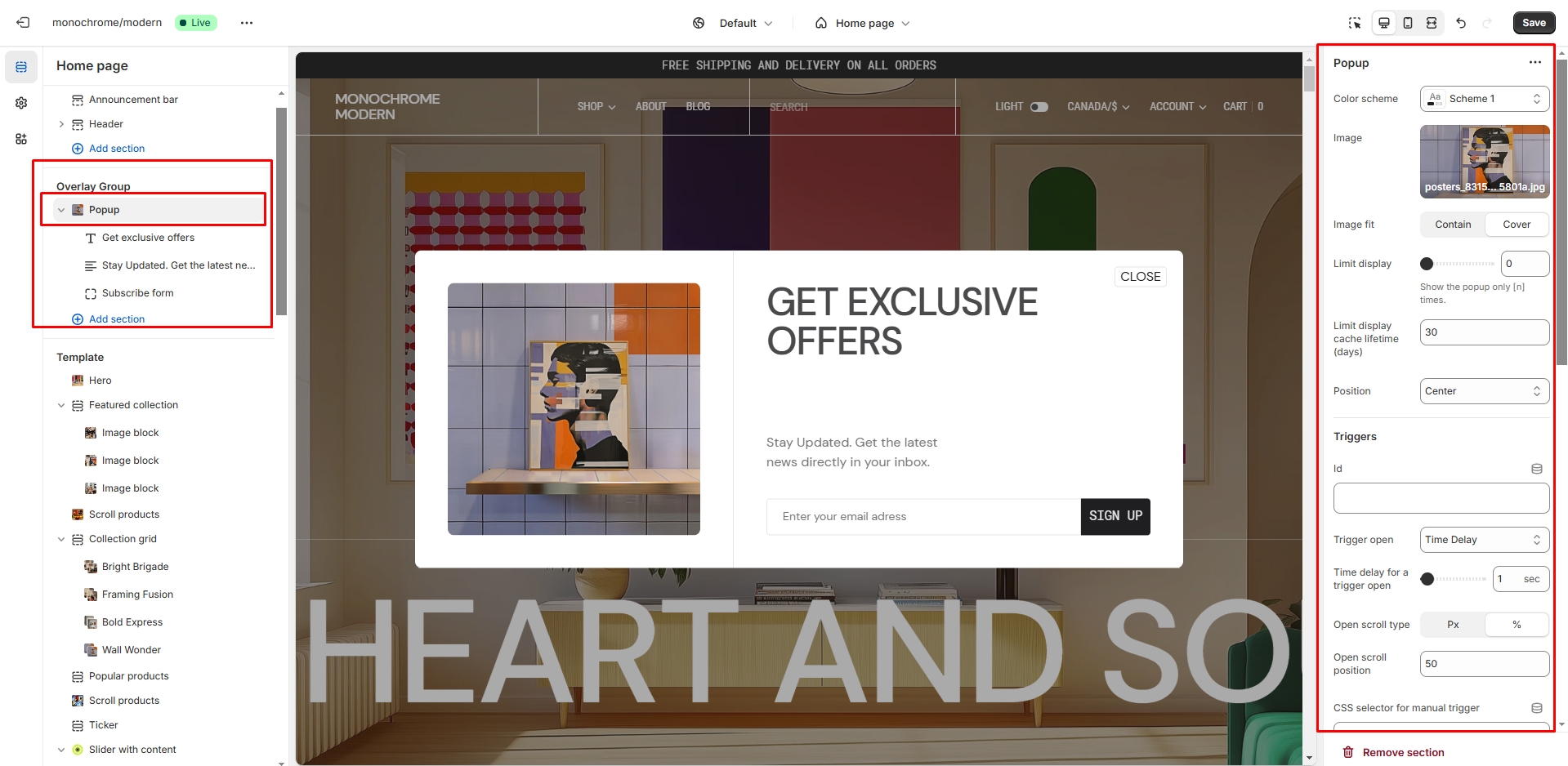
You can also use this popup as a button-trigger for opening another popup or notification bar by following these steps:
- Add the id of the popup/notification bar you chose to open to the Id field in the Triggers section (e.g. "notification").
- Navigate to the popup/notification bar settings and Add the Id with "#" in the beginning to the "CSS selector for manual trigger" field.
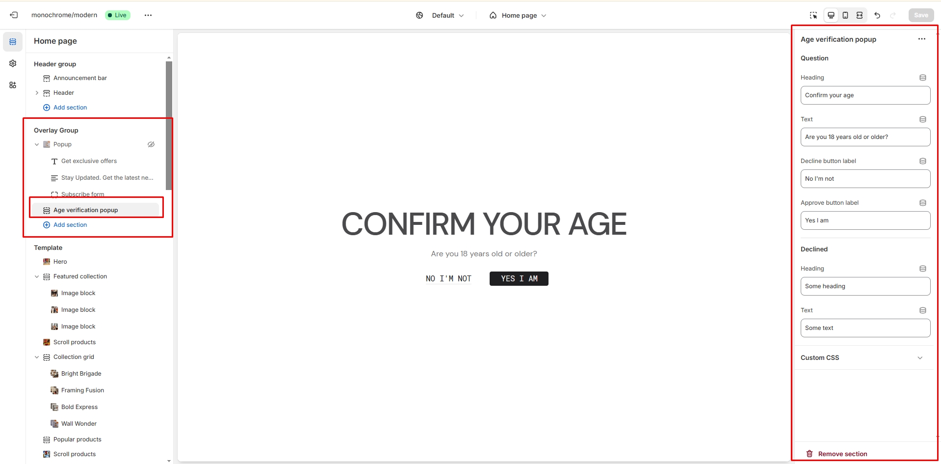
Age verification popup
An Age verification popup is a prompt that appears on a website to confirm the user's age before accessing restricted content. In the Age verification popup settings, you can change customize text and buttons.
All sections
The theme contains several customizable sections that you can add to your page in any order.
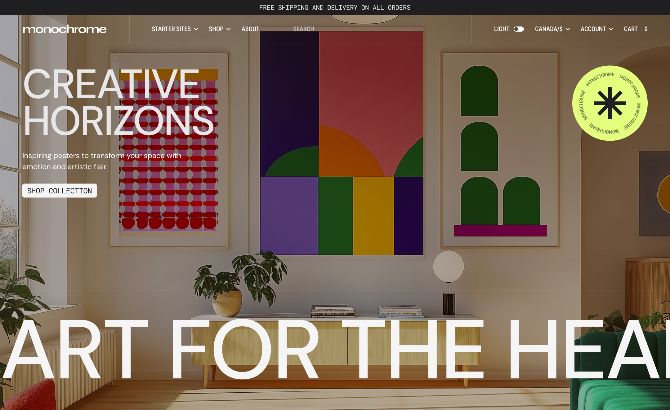
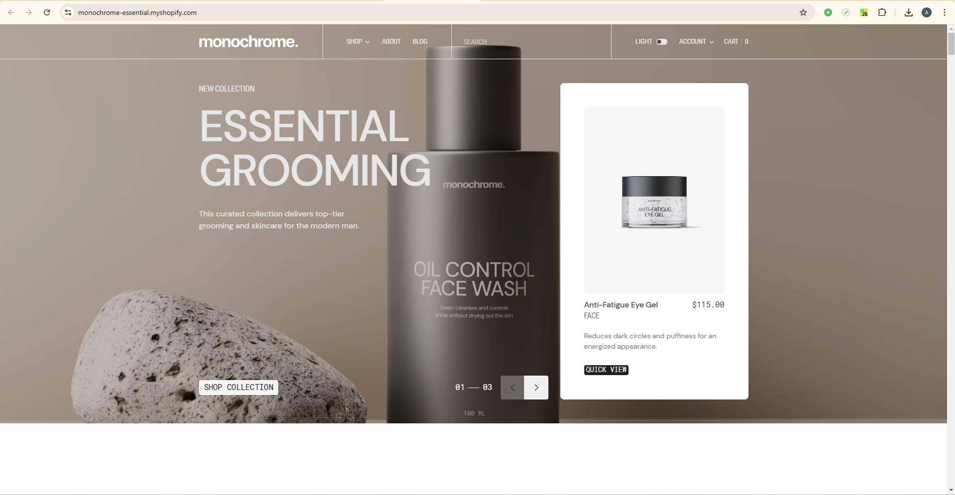
Hero
This section creates a full-width hero banner with customizable content, background media, and an optional animated ticker text.
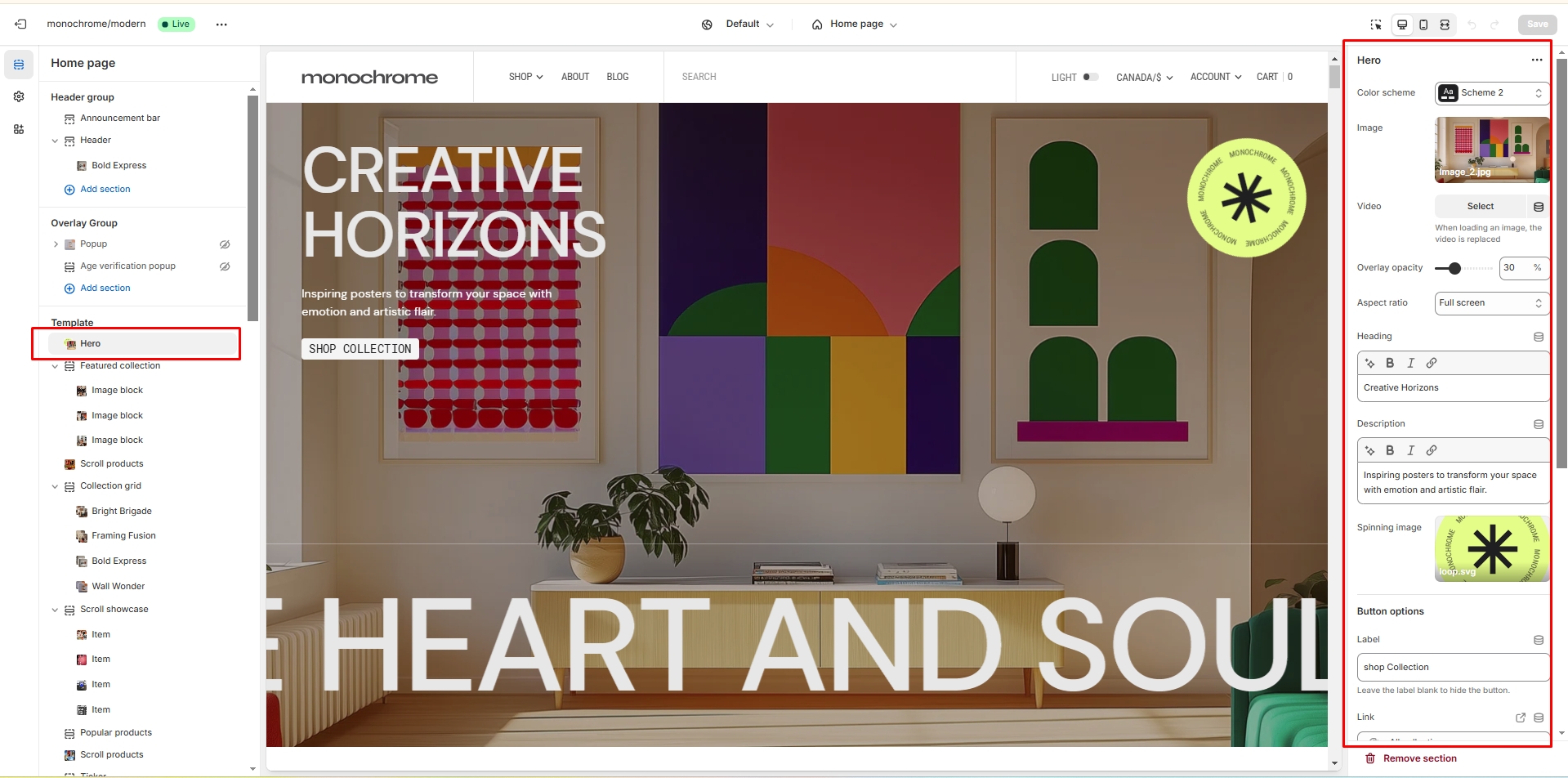
- Color scheme: Select the section's color theme to match your brand aesthetics.
-
Media options:
- Background image: Upload a high-quality image to serve as the hero background.
- Background video: Add a short video clip for a more dynamic hero section.
- Overlay opacity: Adjust the darkness of the overlay (0-100%) to ensure text readability.
-
Image size: Choose from multiple aspect ratios to best fit your
content:
- Square (1:1): Equal width and height, suitable for compact layouts.
- Landscape (3:2): Wider than tall, ideal for showcasing products or scenes.
- Portrait (4:3): Taller than wide, great for vertical-oriented content.
- Widescreen (16:9): Standard widescreen format for a cinematic look.
- Ultra-wide (21:9): Extra-wide format for panoramic displays.
- Adapt to image: Automatically adjusts to the uploaded image's dimensions.
- Large: Fills the entire viewport height for maximum impact.
- Heading: Set the main title to capture visitors' attention.
- Description: Add supporting text to provide more context or details.
-
Button settings:
- Button label: Customize the text displayed on the call-to-action button.
- Button link: Set the destination URL for the button.
- Button style: Choose between Primary, Secondary, or Tertiary styles to match your design.
-
Ticker options:
- Ticker text: Enter the content for the scrolling text element.
- Animation speed: Adjust the scrolling speed from 1 to 20 seconds.
- Font size: Set the text size between 50 and 200 pixels for optimal visibility.
Featured Collection
This section showcases a collection with customizable product displays and optional image/video blocks. It combines product presentation with rich media content.
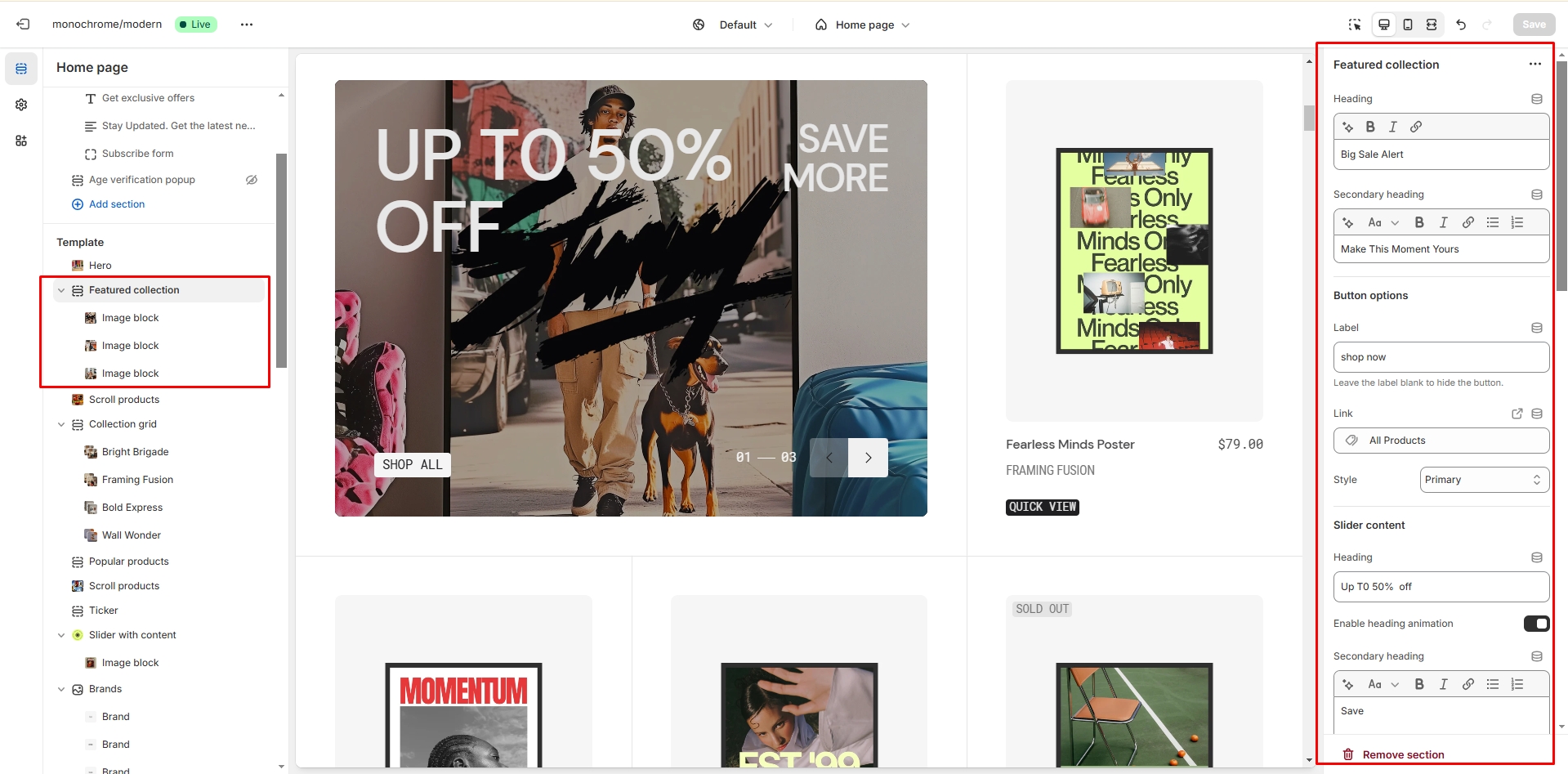
General Settings
- Heading: Set a main heading for the section.
- Description: Add a secondary heading or description.
- Button: Configure the main button label, link, and style (Primary, Secondary, or Tertiary).
- Color scheme: Choose the color scheme for the section.
Collection-specific Settings
- Collection heading: Set a heading specific to the collection display.
- Heading animation: Enable or disable animated effects for the collection heading.
- Collection description: Add descriptive text for the collection.
- Collection button: Configure a separate button for the collection (label, link, and style).
Slider Options
- Autoplay: Enable or disable automatic slideshow playback.
- Stop on hover: Pause autoplay when cursor hovers over the slider.
- Navigation bullets: Show or hide slider navigation.
- Pagination: Enable or disable slide number indicators.
- Slideshow speed: Adjust the transition speed (0.1-6 seconds).
- Slideshow delay: Set the time between slides (0.1-8 seconds).
- Block animation: Add animated effects to section blocks.
Product Card Settings
- Product list: Select up to 12 products to display.
- Image ratio: Choose between landscape, portrait, or square format.
- Image fit: Select contain or cover mode.
- SKU display: Show or hide product SKUs.
- Vendor display: Show or hide vendor names.
- Collection name: Enable or disable the display of collection names.
- Color swatch: Show or hide product color options.
- Product description: Enable or disable product description display.
Section Borders
- Top border: Enable or disable a line above the section.
- Bottom border: Enable or disable a line below the section.
Image Blocks
Add up to 6 custom images or videos with the following options:
- Upload an image or video
- Adjust overlay opacity (0-100%)
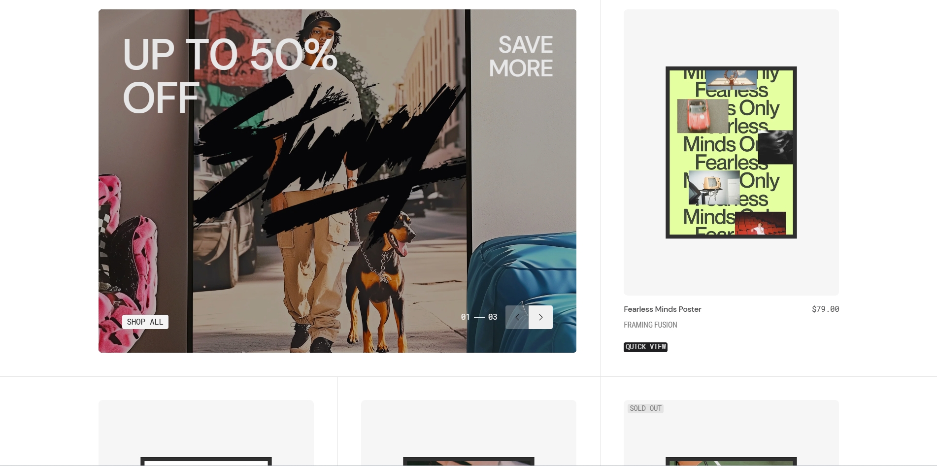
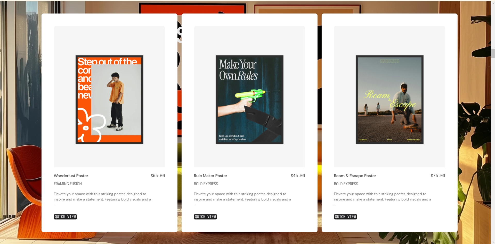
Scroll products
This section creates a scrollable product display with customizable image and product presentation options.
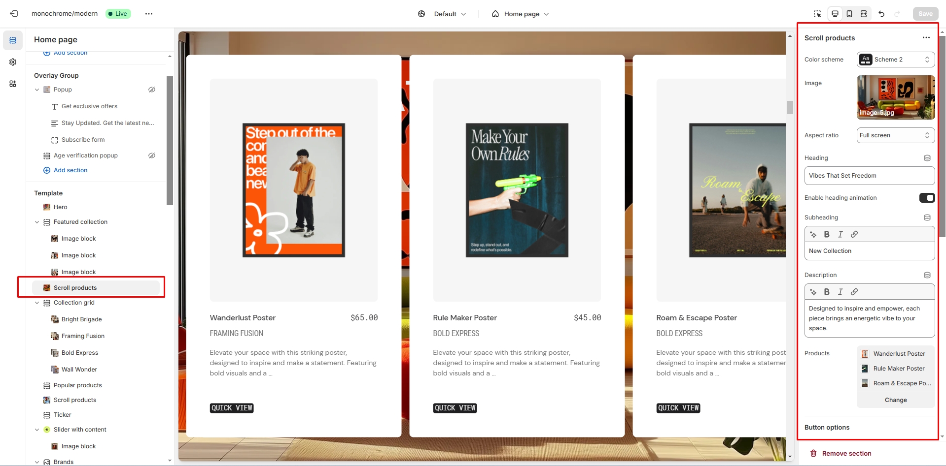
- Use Color scheme selector to change the color scheme.
- Image selector allows you to upload a main section image.
- Overlay opacity slider allows you to adjust the darkness of the overlay (0-100%).
- Image size selector lets you choose between 16:9, adapt to image, or large formats.
- Heading field allows you to set a heading for the section.
- Heading animation toggle enables animated effects for the heading.
- Subheading field allows you to add a subheading to the section.
- Description field allows you to add descriptive text to the section.
- Product list field allows you to select up to 4 products to display.
- Button label field allows you to customize the button text.
- Button link field sets the URL for the button.
- Button style selector lets you choose between Primary, Secondary, or Tertiary styles.
- Image ratio selector allows you to choose between landscape, portrait, or square format.
- Image fit option lets you select contain or cover mode.
- SKU display toggle shows or hides product SKUs.
- Vendor display toggle shows or hides vendor names.
- Collection name toggle enables the display of collection names.
- Color swatch toggle shows or hides product color options.
- Product description toggle enables product description display.
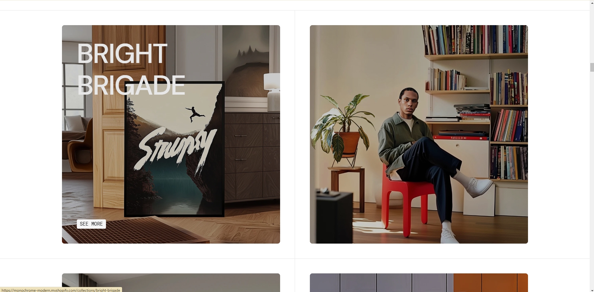
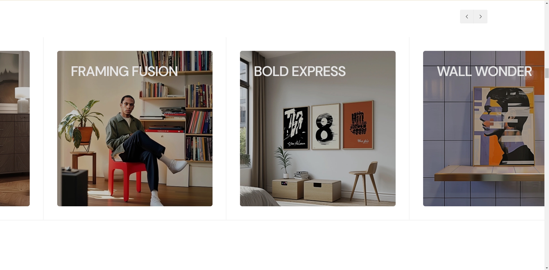
Collection grid
This section displays collections in a customizable grid or slider layout, allowing you to showcase multiple collections with images and descriptions.
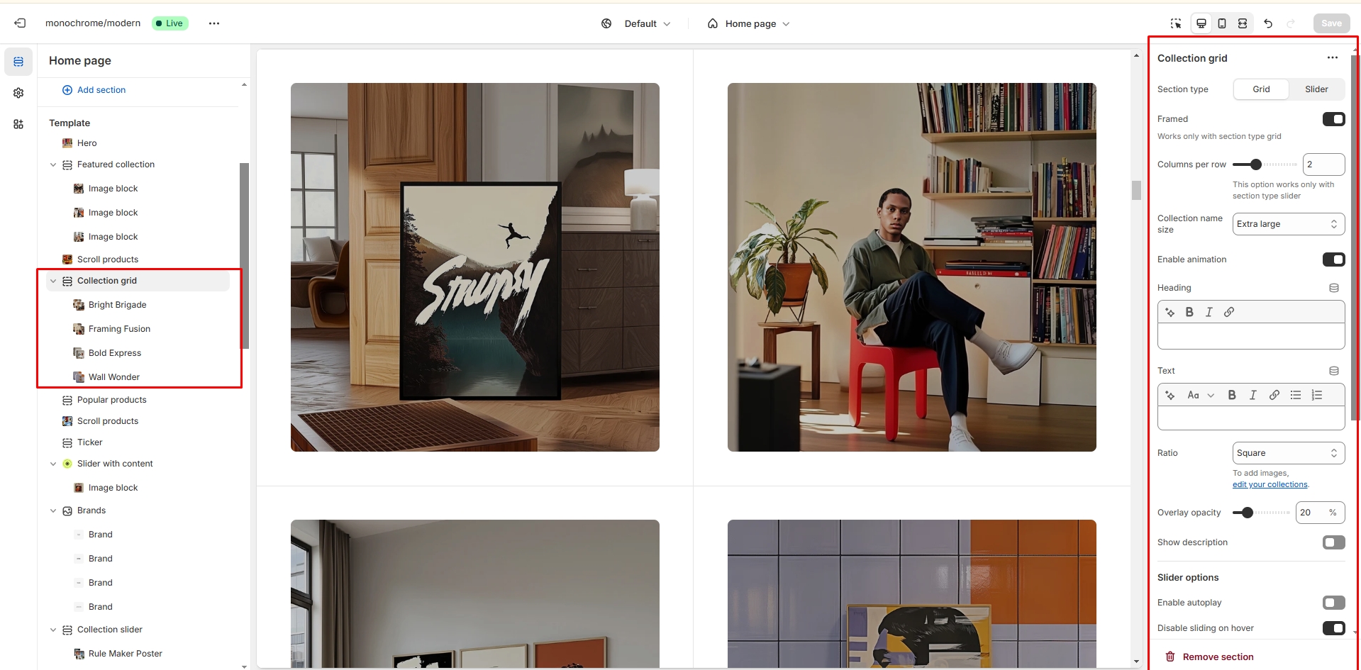
- Section type selector allows you to choose between grid or slider layout.
- Framed display toggle enables borders around collection cards.
- Columns per row slider allows you to set between 1 to 4 collections in each row.
- Heading size selector lets you choose from h1 to h5 sizes for collection titles.
- Collection name animation toggle enables animated effects for collection names.
- Heading field allows you to set a main heading for the section.
- Description field allows you to add descriptive text below the heading.
- Image ratio selector lets you choose between landscape, portrait, or square format.
- Overlay opacity slider allows you to adjust the darkness of the overlay (0-100%).
- Collection description toggle enables the display of collection descriptions.
- Autoplay toggle enables automatic slideshow playback in slider mode.
- Stop on hover option pauses autoplay when cursor hovers over the slider.
- Show arrows toggle displays navigation arrows in slider mode.
- Slideshow speed slider adjusts the transition speed (1-6 seconds).
- Slideshow delay slider sets the time between slides (1-8 seconds).
- Top border toggle enables a line above the section.
- Bottom border toggle enables a line below the section.
-
Collection block settings allow you to:
- Choose a color scheme for each collection
- Select a collection to display
- Upload a custom collection image
- Configure button label, link, and style
Scroll showcase
This section creates an interactive gallery where images or videos scale and fade as users scroll through the content.
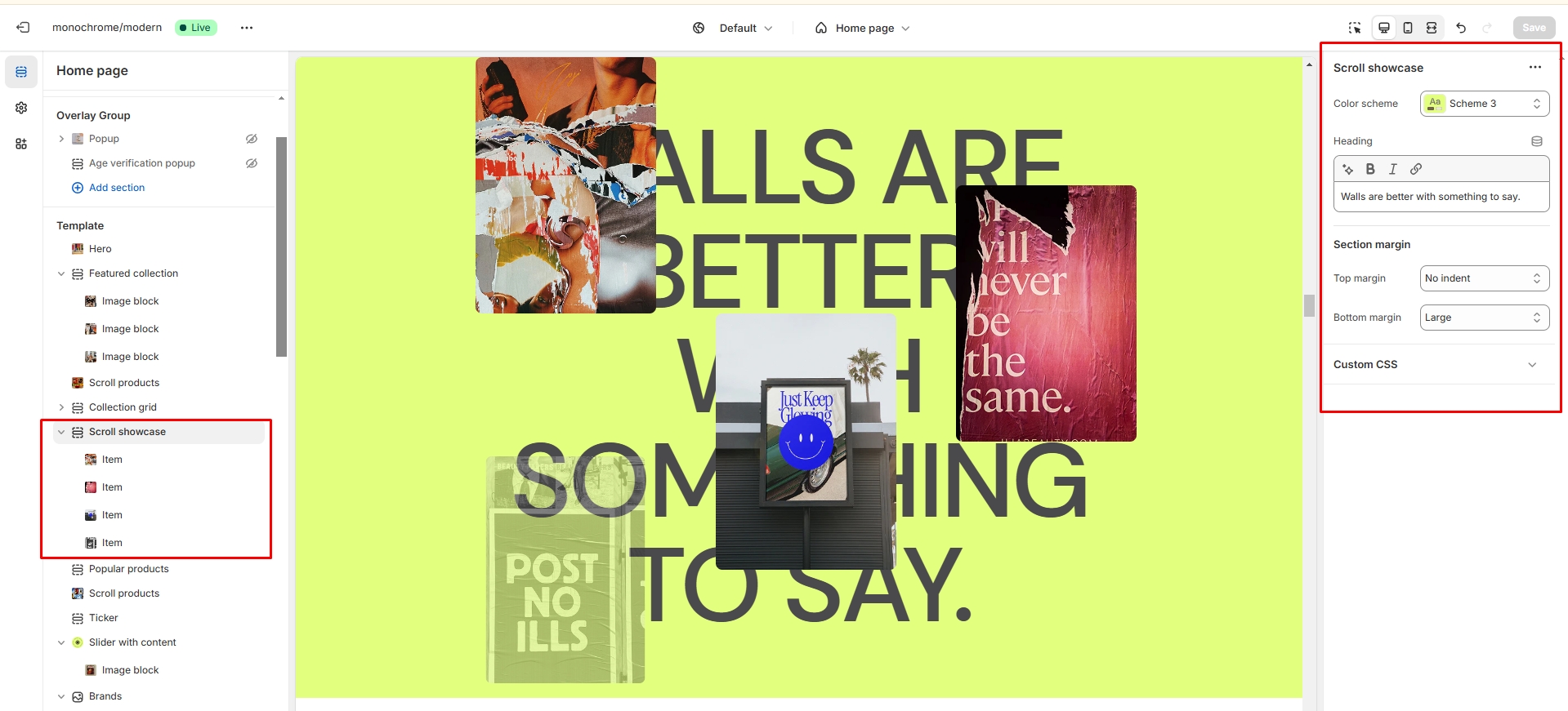
- Color scheme selector allows you to change the section's color theme.
- Heading allows you to set a heading text for the section.
-
Showcase items allow you to add up to 4 items with:
- Image upload option
- Video upload option
-
Each showcase item features interactive scrolling effects:
- Scale animation on scroll
- Opacity changes during transitions
- Smooth transitions between items

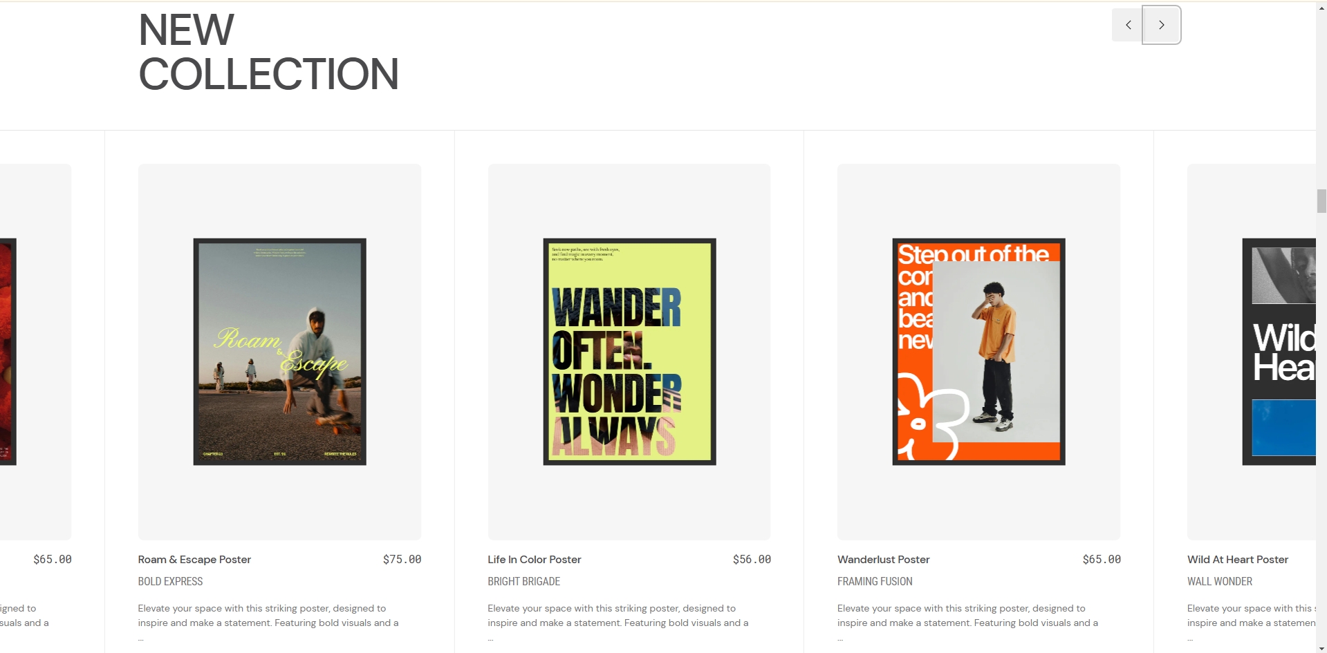
Popular products
The section allows you to select products and customize their display in a slider format with various presentation options.
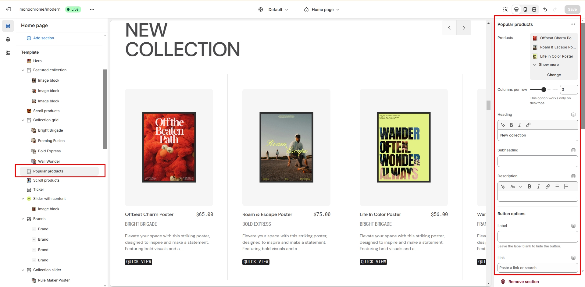
- Product list field allows you to select up to 12 products to display.
- Columns per row slider lets you choose between 2 to 4 products per row.
- Heading allows you to set a heading for the section.
- Subheading allows you to add a secondary heading.
- Description field allows you to add descriptive text.
- Button label field allows you to customize the button text.
- Button link field sets the URL for the button.
- Button style selector lets you choose between Primary, Secondary, or Tertiary styles.
- Autoplay toggle enables automatic slideshow playback.
- Stop on hover option pauses autoplay when cursor hovers over the slider.
- Show arrows toggle displays navigation arrows.
- Slideshow speed slider adjusts the transition speed (0.1-6 seconds).
- Slideshow delay slider sets the time between slides (0.1-8 seconds).
- Block animation toggle adds animated effects to product blocks.
- Image ratio selector lets you choose between landscape, portrait, or square format.
- Image fit option allows you to select contain or cover mode.
- Mobile cards toggle enables showing two cards on mobile devices.
- SKU display toggle shows or hides product SKUs.
- Vendor display toggle shows or hides vendor names.
- Collection name toggle enables the display of collection names.
- Color swatch toggle shows or hides product color options.
- Product description toggle enables product description display.
- Top border toggle enables a line above the section.
- Bottom border toggle enables a line below the section.
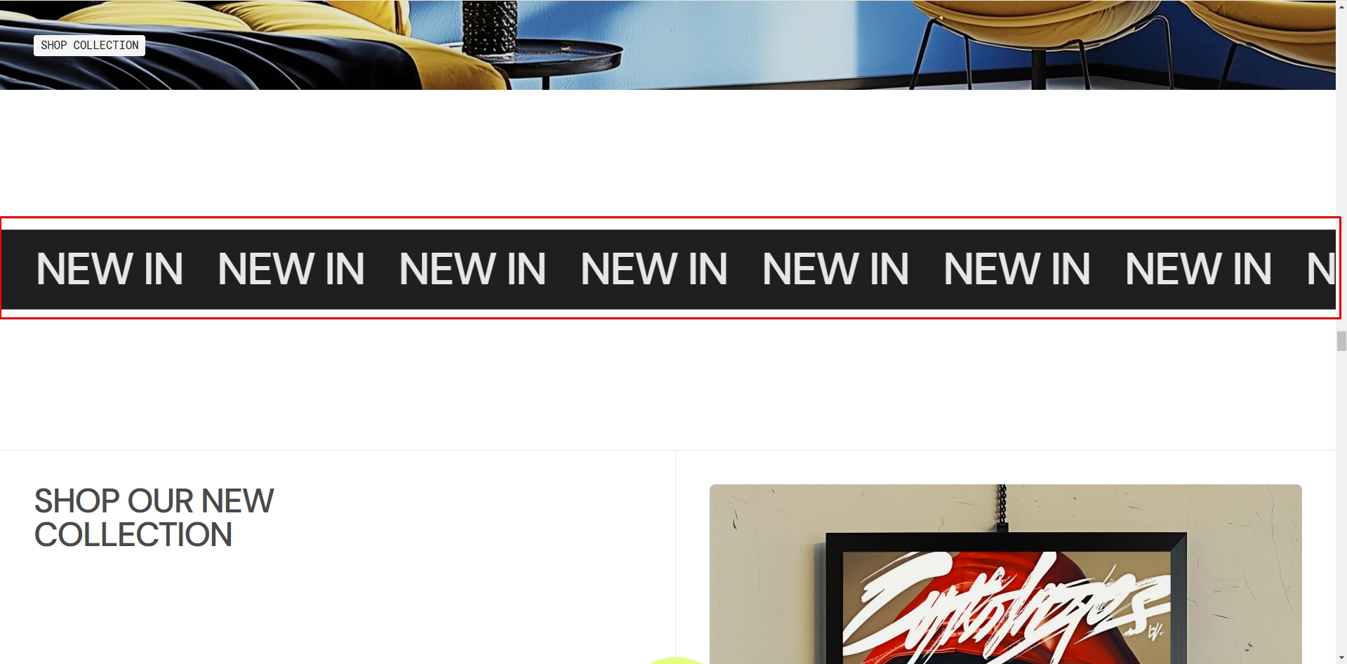
Ticker
This section creates a scrolling text banner that can be used to display announcements or promotional messages.
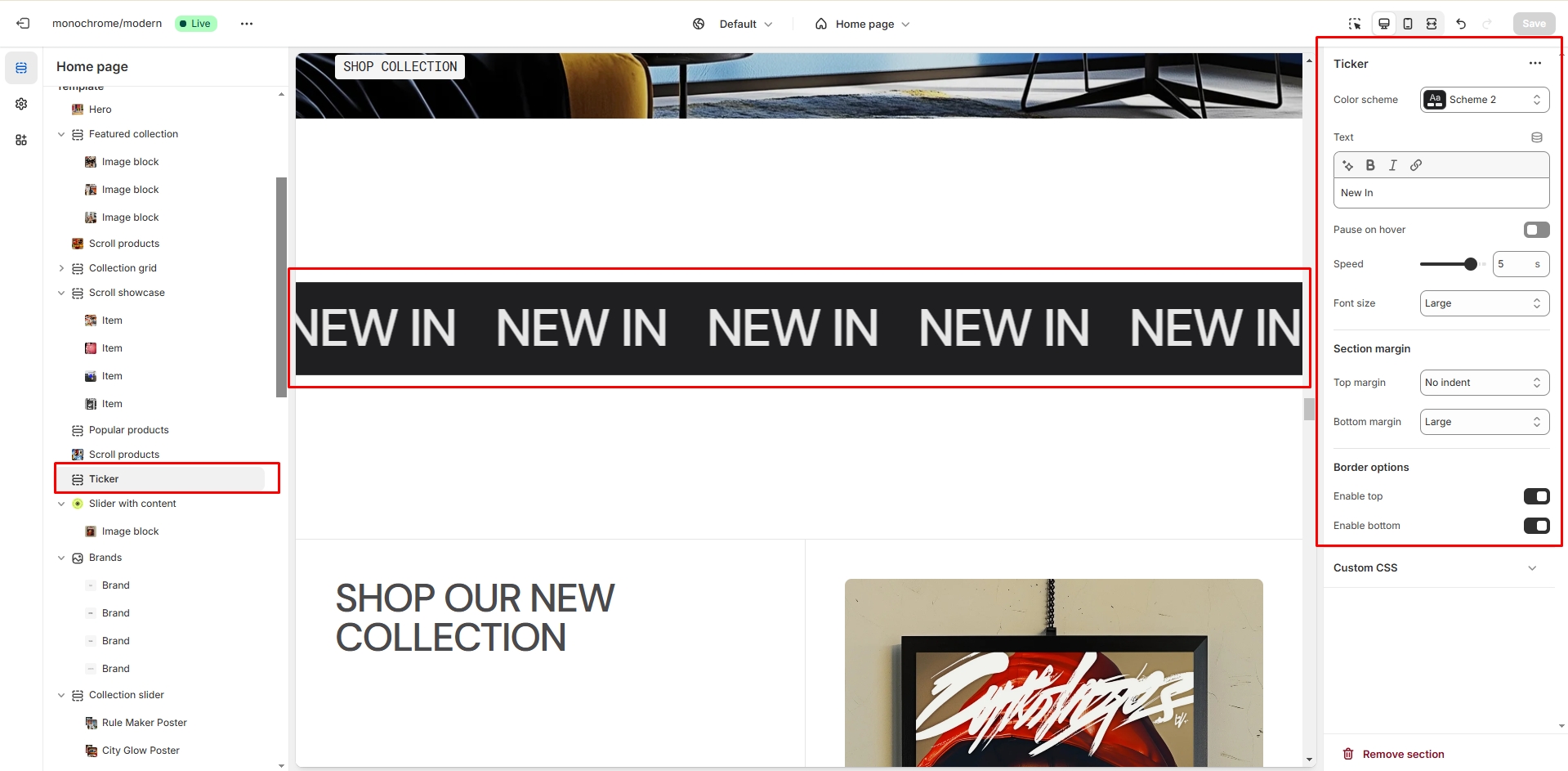
- Color scheme selector allows you to change the section's color theme.
- Ticker text field allows you to set the scrolling message content.
- Animation control toggle enables or disables the scrolling animation.
- Ticker speed slider adjusts the scrolling speed (0.1-6 seconds).
-
Text size selector offers four options:
- Extra small
- Small
- Medium
- Large
-
Border options:
- Enable/disable top border
- Enable/disable bottom border
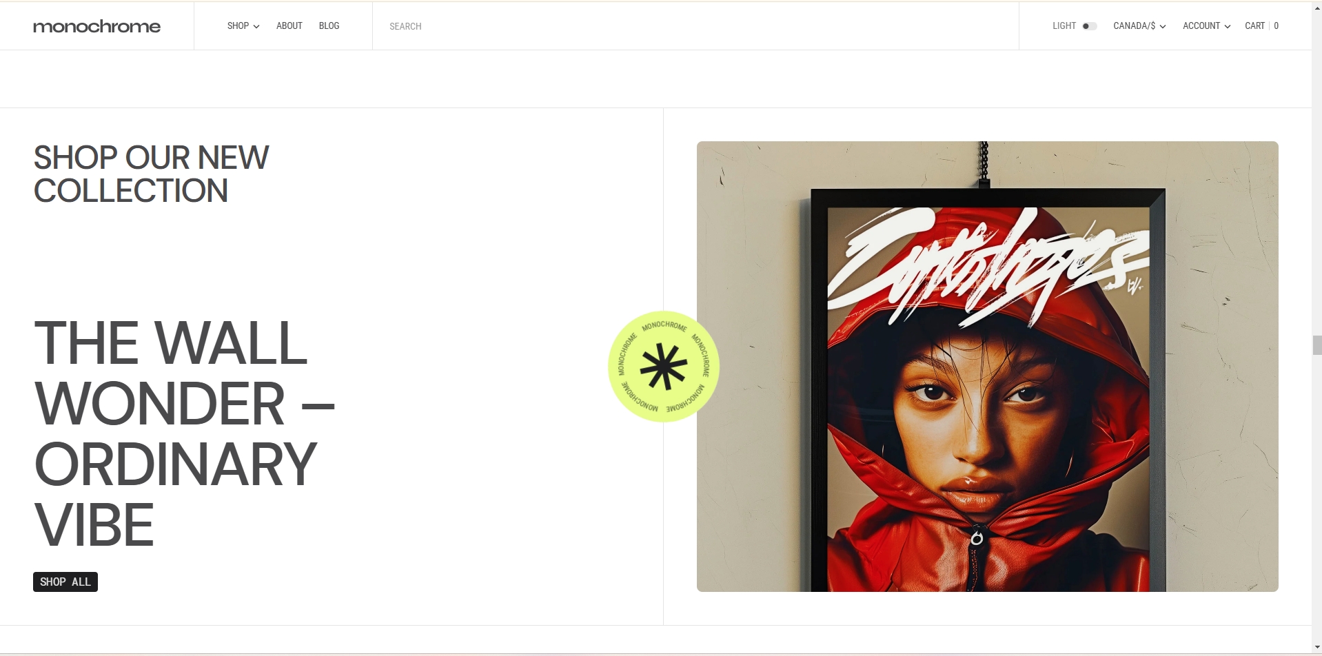
Slider with Content
This section creates a customizable content slider that combines text elements with media slides, perfect for showcasing products or features with detailed descriptions.
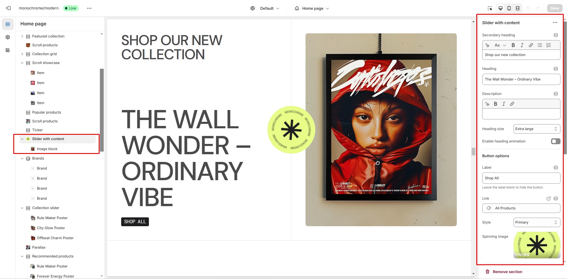
- Secondary heading: Add a subtitle above the main heading to provide additional context or information.
- Main heading: Set the primary title text for the slider section.
-
Heading options:
- Size selector: Choose between H1, H2, or H3 to set the appropriate heading level.
- Animation toggle: Enable or disable animated effects for the heading.
- Description: Add a text field for additional content to provide more details about the featured items.
-
Button settings:
- Button label: Set the text displayed on the button.
- Button link: Specify the URL the button should link to when clicked.
- Button style: Choose between Primary, Secondary, or Tertiary styles to match your design.
- Spinning image: Upload an image that will have a rotation effect applied, adding visual interest to the slider.
-
Slider controls:
- Autoplay: Toggle automatic advancement of slides.
- Stop on hover: Pause autoplay when the cursor hovers over the slider.
- Navigation bullets: Show or hide clickable navigation dots for each slide.
- Pagination: Display or hide slide numbers or progress indicators.
- Slide transition speed: Set the duration of slide transitions (0.1-6 seconds).
- Slide delay time: Adjust the time each slide is displayed before transitioning (0.1-8 seconds).
-
Border options:
- Top border: Enable or disable a decorative line above the slider section.
- Bottom border: Enable or disable a decorative line below the slider section.
-
Content blocks: Add up to 6 slides, each with:
- Image upload: Select an image to display on the slide.
- Video upload: Optionally add a video to the slide instead of an image.
- Color scheme: Choose a color palette for each slide to match your brand or theme.
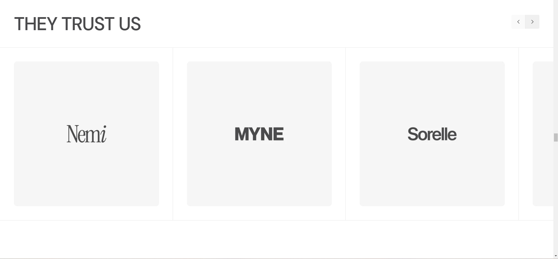
Brands
This section creates a customizable brand logo showcase with slider functionality, perfect for displaying partner logos or brand collections.
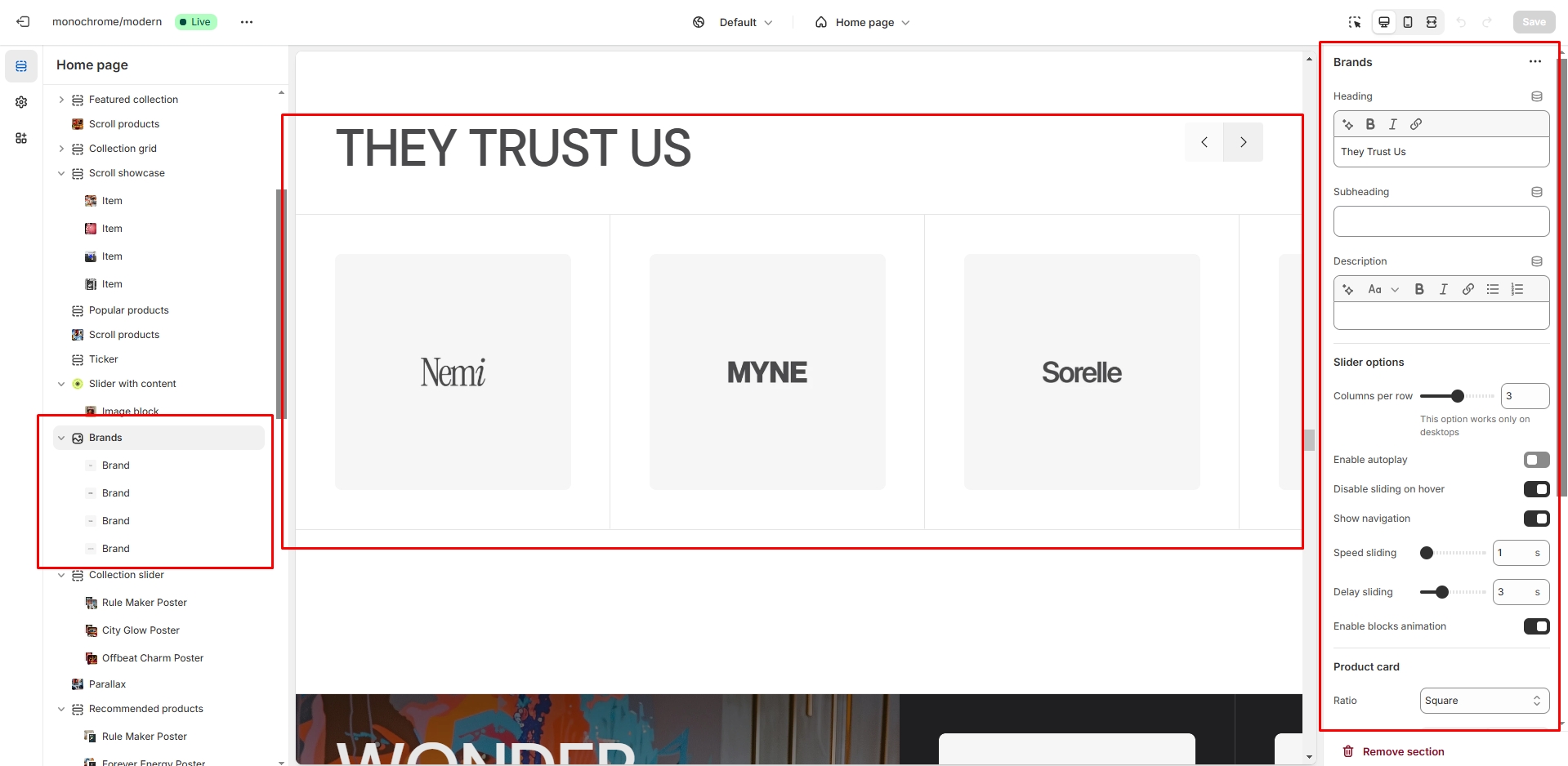
- Heading: Set the main title for the brands section.
- Subheading: Add additional title text to provide context or introduce the brands.
- Description: Include a text field for additional content about the featured brands.
-
Slider options:
- Columns per row: Choose to display 2-4 brand logos in each row.
- Autoplay: Enable or disable automatic advancement of the brand slider.
- Stop on hover: Pause autoplay when the cursor hovers over the slider.
- Navigation arrows: Show or hide clickable arrows for manual navigation.
- Slide transition speed: Set the duration of slide transitions (1-6 seconds).
- Slide delay time: Adjust the time each slide is displayed before transitioning (1-8 seconds).
- Block animation: Toggle entrance effects for brand logos as they come into view.
-
Image settings:
- Aspect ratio: Choose between Landscape, Portrait, or Square for consistent logo display.
- Image fit: Select Contain to show the full logo or Cover to fill the designated space.
-
Brand blocks: Add multiple brand logos, each with:
- Light mode logo: Upload an image for display in light color schemes.
- Dark mode logo: Optionally upload an alternate image for dark color schemes.
-
Border options:
- Top border: Enable or disable a decorative line above the brands section.
- Bottom border: Enable or disable a decorative line below the brands section.
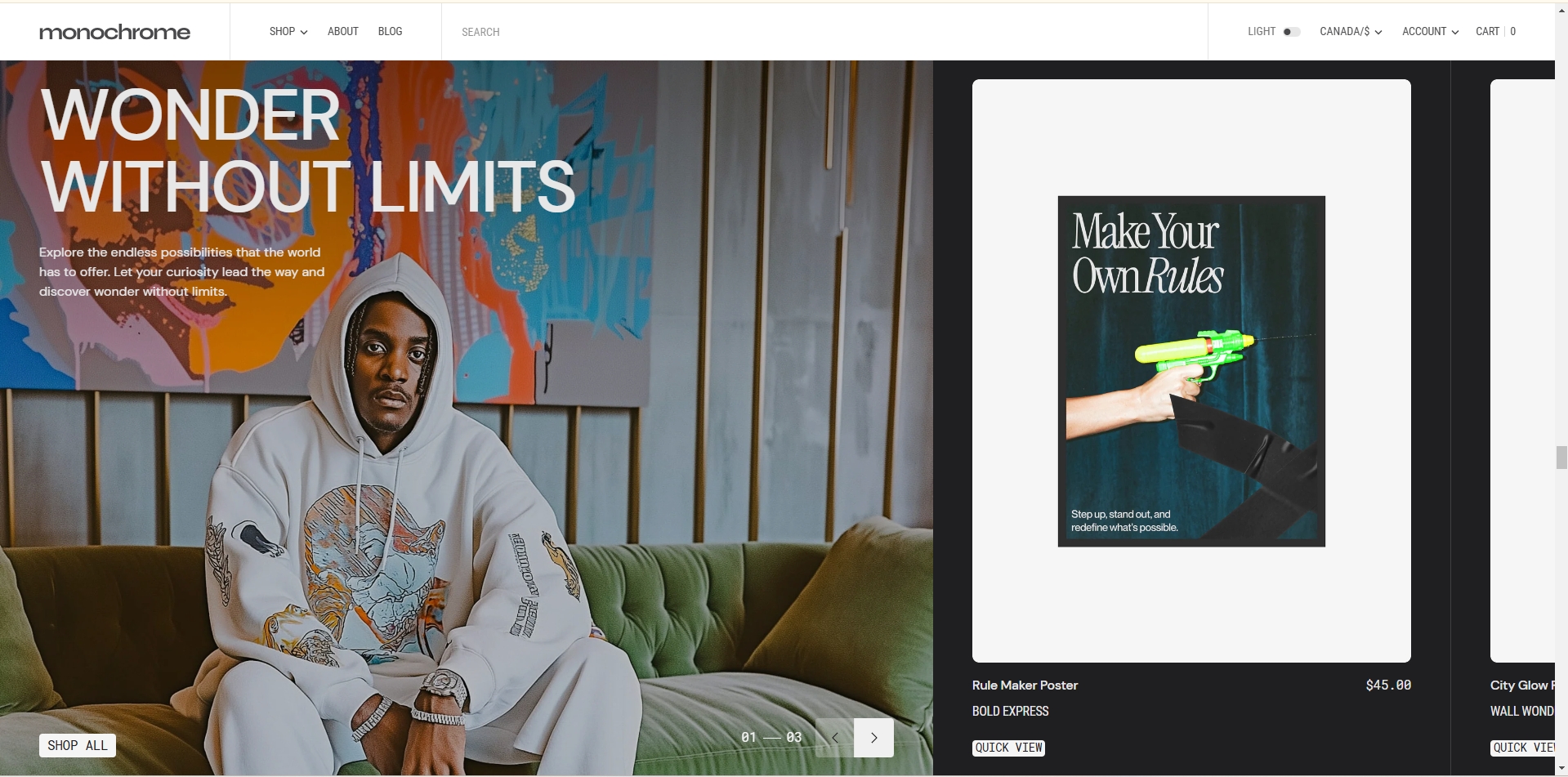
Collection Slider
This section creates a dynamic slider that combines collection images with product displays, allowing for rich visual merchandising.
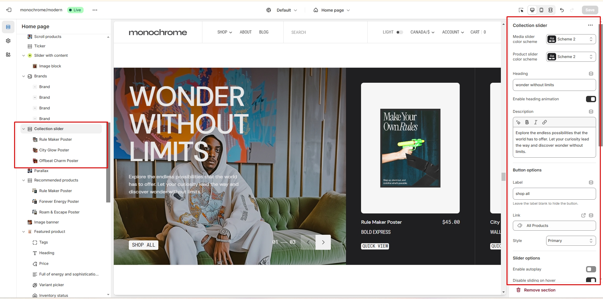
-
Color schemes:
- Media color scheme: Set the color palette for the slider area.
- Product color scheme: Choose colors for the product card displays.
- Collection heading: Set the main title for the collection slider.
- Heading animation: Enable or disable animated entrance effects for the heading.
- Description: Add descriptive text about the featured collection.
-
Collection button:
- Button label: Set the text displayed on the button.
- Button link: Specify the URL the button should link to when clicked.
- Button style: Choose between Primary, Secondary, or Tertiary styles.
-
Slider options:
- Autoplay: Enable or disable automatic advancement of slides.
- Stop on hover: Pause autoplay when the cursor hovers over the slider.
- Navigation bullets: Show or hide clickable navigation dots for each slide.
- Pagination: Display or hide slide numbers or progress indicators.
- Slide transition speed: Set the duration of slide transitions (0.1-6 seconds).
- Slide delay time: Adjust the time each slide is displayed before transitioning (0.1-8 seconds).
-
Product card settings:
- Image ratio: Choose between Landscape, Portrait, or Square for product images.
- Image fit: Select Contain to show the full product or Cover to fill the card space.
- SKU display: Toggle the visibility of product SKUs on cards.
- Vendor display: Show or hide the product vendor name.
- Collection name display: Enable or disable showing the collection name on product cards.
- Color swatch display: Toggle the visibility of color options for products.
- Description display: Show or hide product descriptions on cards.
-
Border options:
- Top border: Enable or disable a decorative line above the collection slider.
- Bottom border: Enable or disable a decorative line below the collection slider.
-
Image blocks: Add up to 6 slides, each with:
- Image upload: Select an image to represent the collection.
- Video upload: Optionally add a video instead of an image.
- Product selection: Choose a product to feature alongside the collection image.
- Overlay opacity: Adjust the transparency of the image overlay (0-100%).
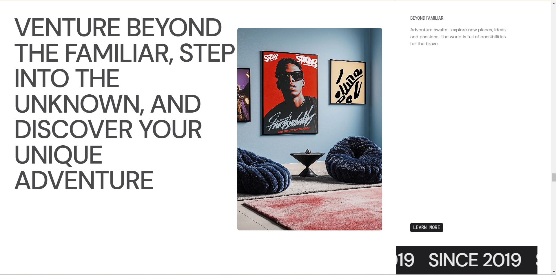
Parallax Gallery
This section creates a visually engaging parallax scrolling effect with media background and customizable content overlay.
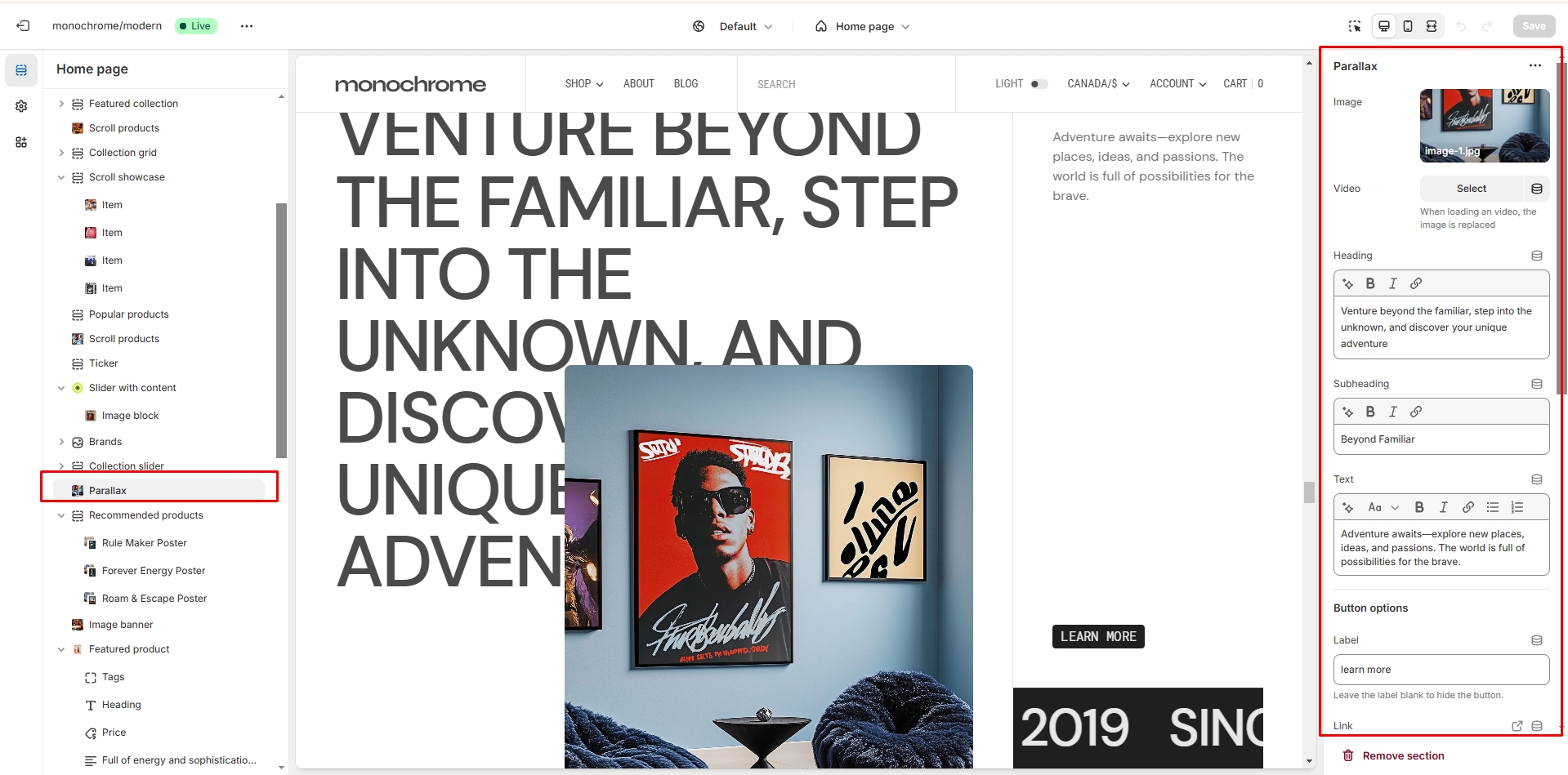
-
Media options:
- Background image: Upload an image to serve as the parallax background.
- Background video: Alternatively, upload a video for a dynamic background effect.
- Heading: Set the main title for the parallax section.
- Subheading: Add additional title text to provide context or introduce the content.
- Description: Include a text field for detailed content about the featured items or theme.
-
Button settings:
- Button label: Set the text displayed on the button.
- Button link: Specify the URL the button should link to when clicked.
- Button style: Choose between Primary, Secondary, or Tertiary styles to match your design.
- Color scheme: Select a color palette for the parallax section to match your theme.
-
Ticker options:
- Ticker text: Enter the content for a scrolling text element.
- Enable/disable: Toggle the visibility of the ticker feature.
- Animation speed: Adjust the scrolling speed of the ticker (0.1-6 seconds).
- Text size: Choose from Extra small, Small, Medium, or Large for the ticker text.
-
Border options:
- Top border: Enable or disable a decorative line above the parallax section.
- Bottom border: Enable or disable a decorative line below the parallax section.
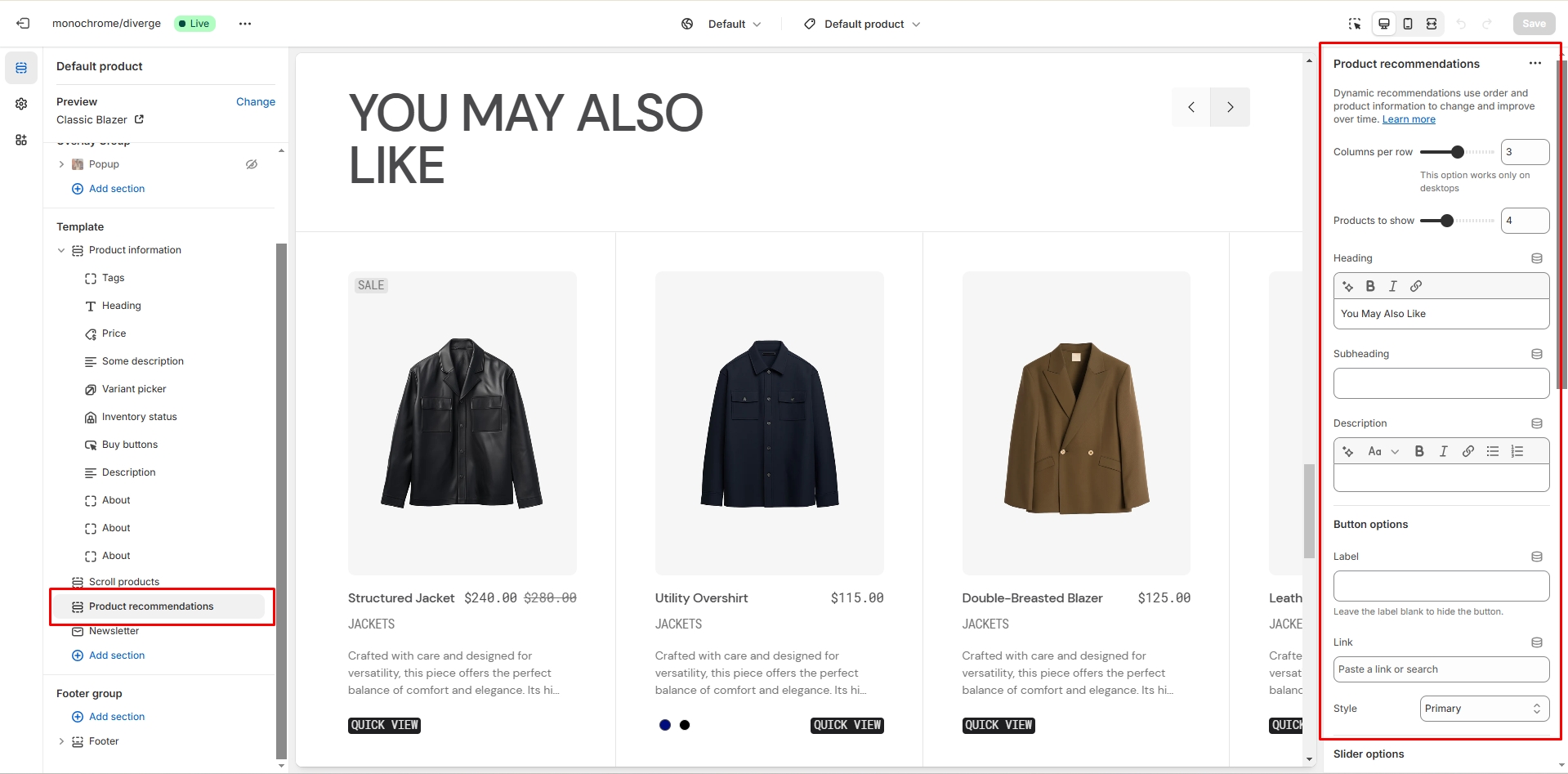
Recommended Products
This section displays a customizable slider of recommended products, allowing you to manually select products and tailor their presentation.
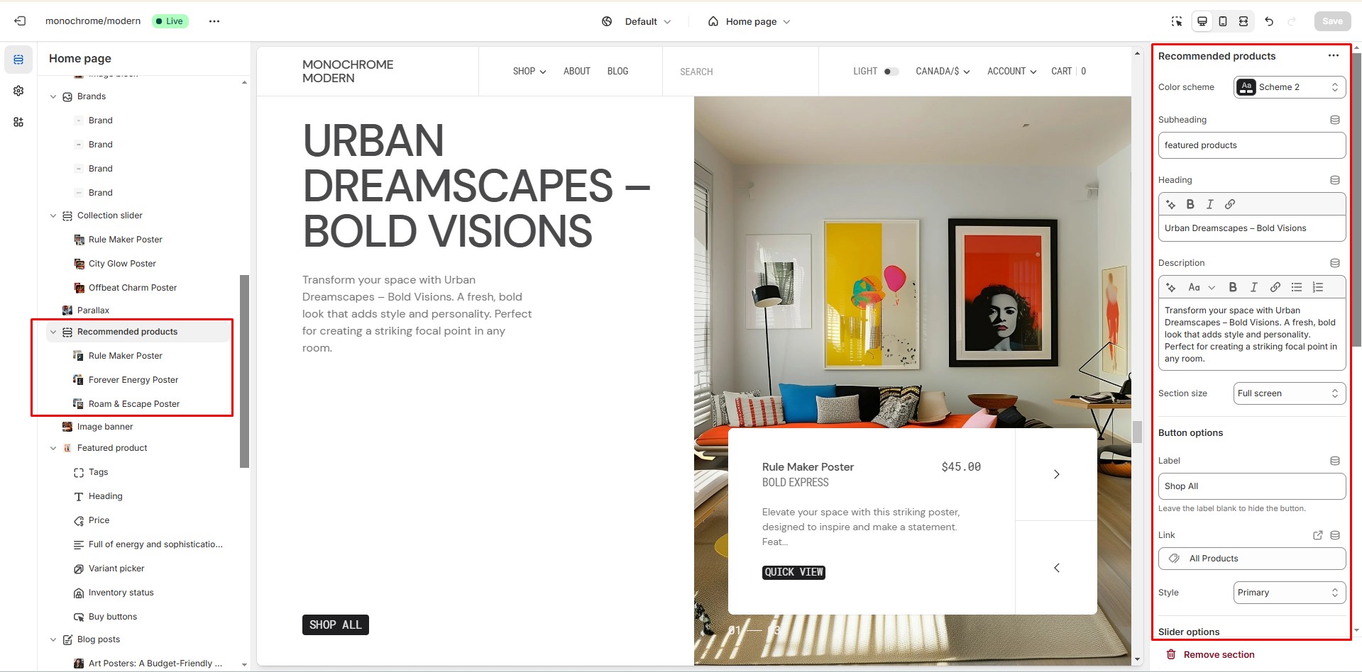
- Color scheme: Choose a color palette that complements your store's design.
- Subheading: Add a secondary title to introduce the recommended products.
- Heading: Set the main title for the section to grab attention.
- Description: Include additional text to provide context or promote the featured products.
- Image size: Select from small, medium, or large options to determine the product image dimensions.
-
Button customization:
- Button label: Set the text for the call-to-action button.
- Button link: Specify the URL where customers will be directed upon clicking.
- Button style: Choose from Primary, Secondary, or Tertiary to match your design preferences.
-
Slider options:
- Autoplay: Enable or disable automatic slideshow playback.
- Stop on hover: Pause the autoplay when a customer hovers over the slider.
- Navigation bullets: Show or hide clickable navigation dots.
- Pagination: Display or hide slide numbers or progress indicators.
- Slideshow speed: Set the duration of slide transitions (1-6 seconds).
- Slideshow delay: Adjust the time each slide is displayed before transitioning (1-8 seconds).
-
Product card options:
- Vendor name: Choose to display or hide the product manufacturer or brand.
- Collection name: Opt to show or conceal the name of the collection the product belongs to.
- Product description: Enable or disable the display of short product descriptions.
-
Border options:
- Top border: Add a decorative line above the recommended products section.
- Bottom border: Include a separating line below the section.
-
Product blocks: Add up to 6 product blocks, each allowing you
to:
- Select a specific product to feature in the recommendations.
- Optionally upload a custom image to represent the product.
Image banner
This section creates a customizable banner with image background, text overlay, and call-to-action elements.
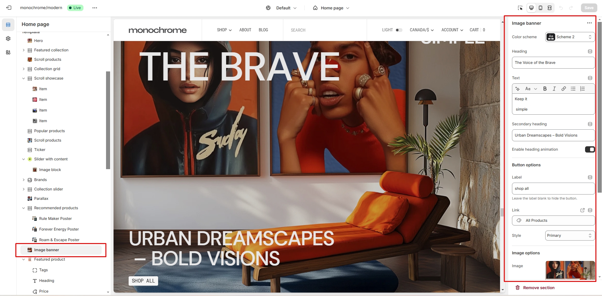
- Color scheme selector for section theme.
- Heading allows you to set the main title.
- Secondary heading for additional title text.
- Description field for detailed content.
- Heading animation toggle enables animated entrance effects.
-
Button settings:
- Button label: Set the text displayed on the button.
- Button link: Specify the URL the button should link to when clicked.
- Button style: Choose between Primary, Secondary, or Tertiary styles to match your design.
-
Image settings:
- Background image upload
- Image size (Small, Medium, Large)
- Overlay opacity (0-100%)
Featured product
This section allows you to showcase a single product with detailed information and customizable display options.
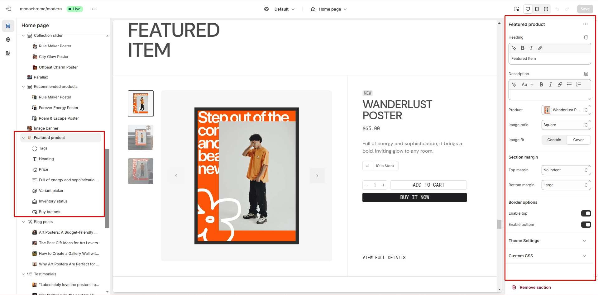
- Heading allows you to set a heading for the section.
- Description field allows you to add descriptive text.
- Product selector allows you to choose the featured product.
- Image ratio selector lets you choose between landscape, portrait, or square format.
- Image fit option allows you to select contain or cover mode.
- Top border toggle enables a line above the section.
- Bottom border toggle enables a line below the section.
- Text block allows you to add custom text content.
- Title block displays the product name.
- Tags block shows product tags.
- Price block displays product price with optional tax information.
- Variant picker lets customers select product options (dropdown or button style).
-
Buy buttons settings include:
- Dynamic checkout button toggle
- Quantity selector toggle
- Gift card recipient option
-
Share buttons allow sharing on:
- Copy link
-
Popup blocks allow you to add up to 2 popup windows with:
- Custom link text
- Popup heading
- Text content
- Page content
- Custom liquid block allows adding custom code.
- Additional text block enables extra content display.
- Inventory block shows stock information.
- SKU block displays product SKU.
Blog posts
The section allows you to select a blog and customize it.
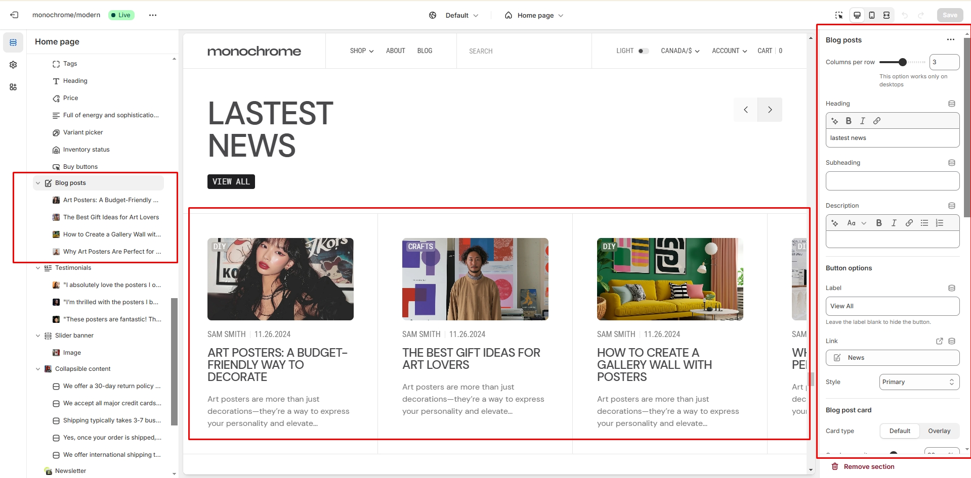
- Post layout field allows you to select layout type.
- Heading field adds a header for the section.
- Blog field allows you to choose a blog.
- Blog posts slider allows you to select the number of columns in one line.
- Show featured image field enables the display of an image for the blog post.
- Show date field enables the display of the date for the blog post.
- Show tags field enables the display of tags for the blog post.
- Show author enables the display of the author for the blog post.
- Enable "Read all button" field enables the display of a button linking to all blog posts.
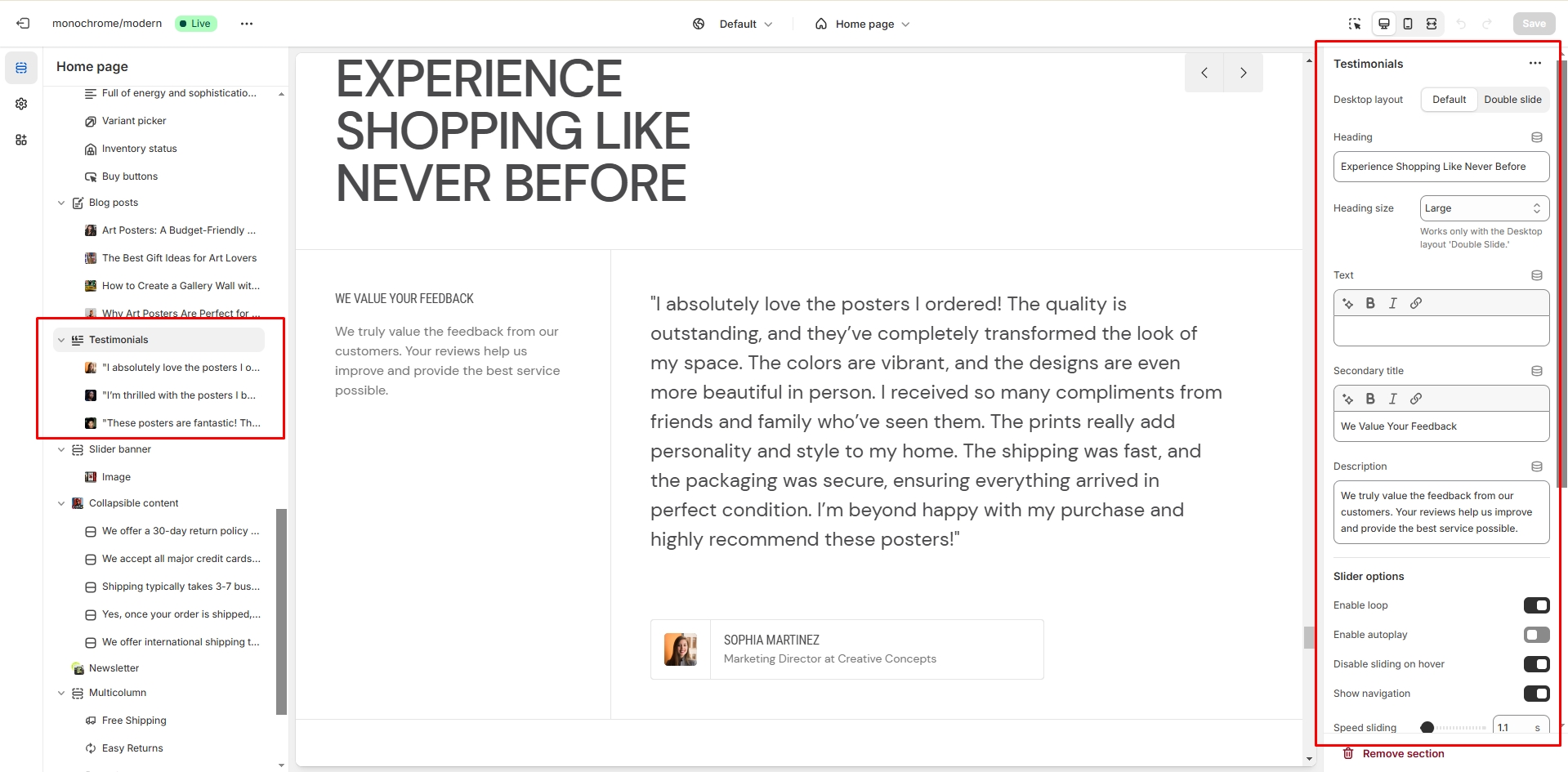
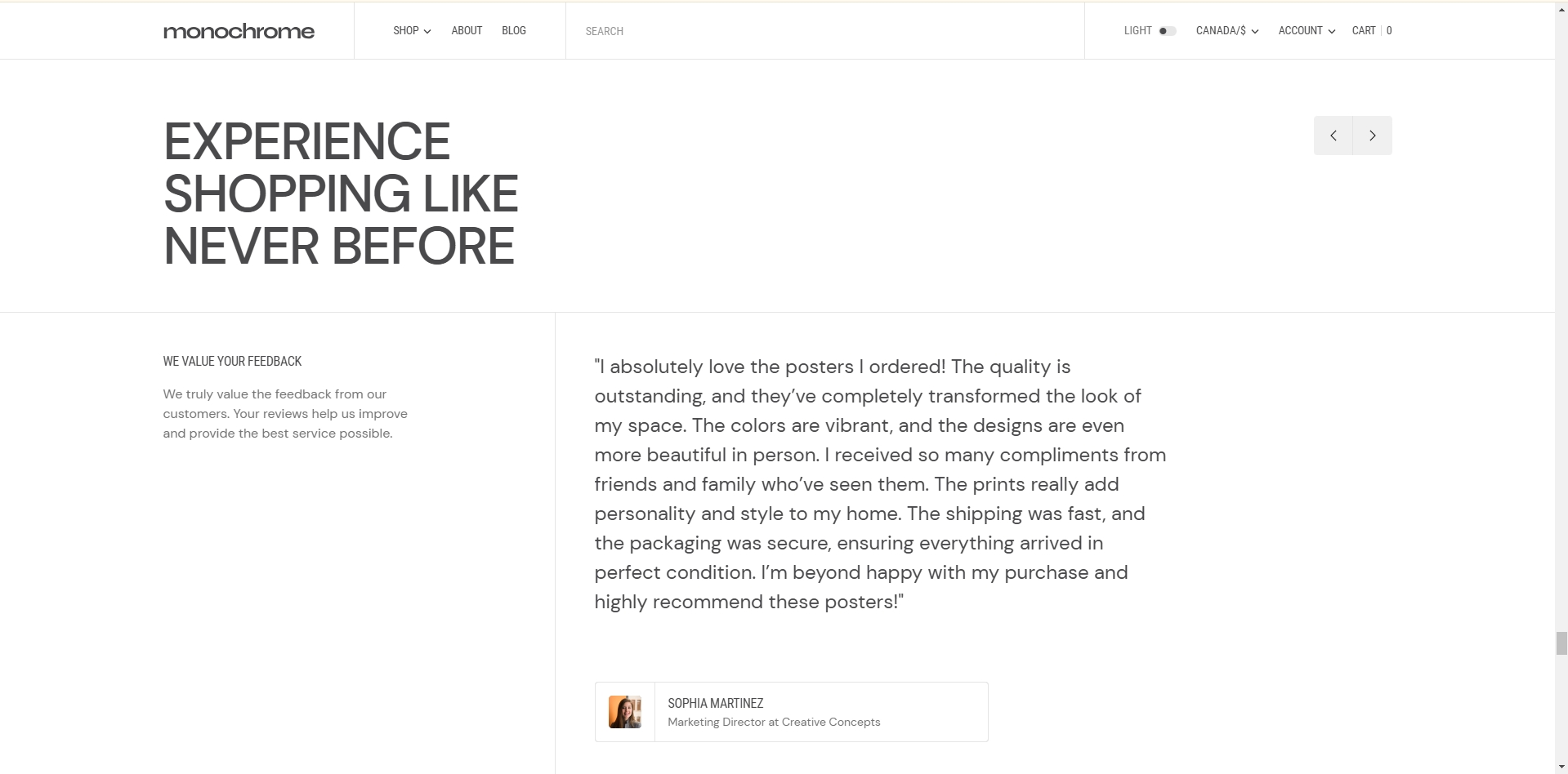
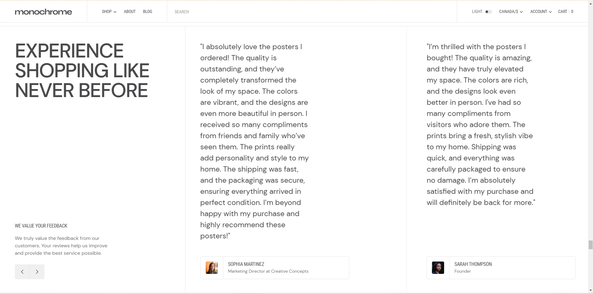
Testimonials
This section creates a customizable testimonial slider to showcase customer reviews, ratings, and feedback with multiple layout options.
-
Layout options:
- Default layout: Standard testimonial display.
- Double slide layout: Shows two testimonials side-by-side for increased content density.
- Heading: Set the main title for the testimonials section.
-
Heading size: Choose from five options to match your design
hierarchy:
- H5: Smallest heading size for subtle emphasis.
- H4: Slightly larger than H5 for moderate emphasis.
- H3: Medium-sized heading for balanced visibility.
- H2: Large heading size (default) for strong emphasis.
- H1: Largest heading size for maximum impact and prominence.
- Description: Add introductory or explanatory text about your testimonials.
- Secondary title: Include a subtitle to provide additional context.
- Additional text: Insert extra content to support your testimonials.
-
Slider options:
- Loop: Enable continuous looping of testimonials.
- Autoplay: Activate automatic advancement of slides.
- Stop on hover: Pause autoplay when the cursor hovers over the slider.
- Navigation arrows: Display or hide clickable arrows for manual navigation.
- Slide transition speed: Set the duration of slide transitions (1-6 seconds).
- Slide delay time: Adjust the time each testimonial is displayed before transitioning (1-8 seconds).
-
Border options:
- Top border: Add a decorative line above the testimonials section.
- Bottom border: Include a separating line below the section.
-
Testimonial slides: Add multiple customer reviews, each with:
- Review text: The actual testimonial content from the customer.
- Author's image: A photo or avatar of the person giving the testimonial.
- Product name: The name of the product being reviewed (if applicable).
- Author's name: The name of the person providing the testimonial.
- Star rating: Enable or disable the display of a star rating.
- Rating score: Set the number of stars (1-5) for the testimonial.
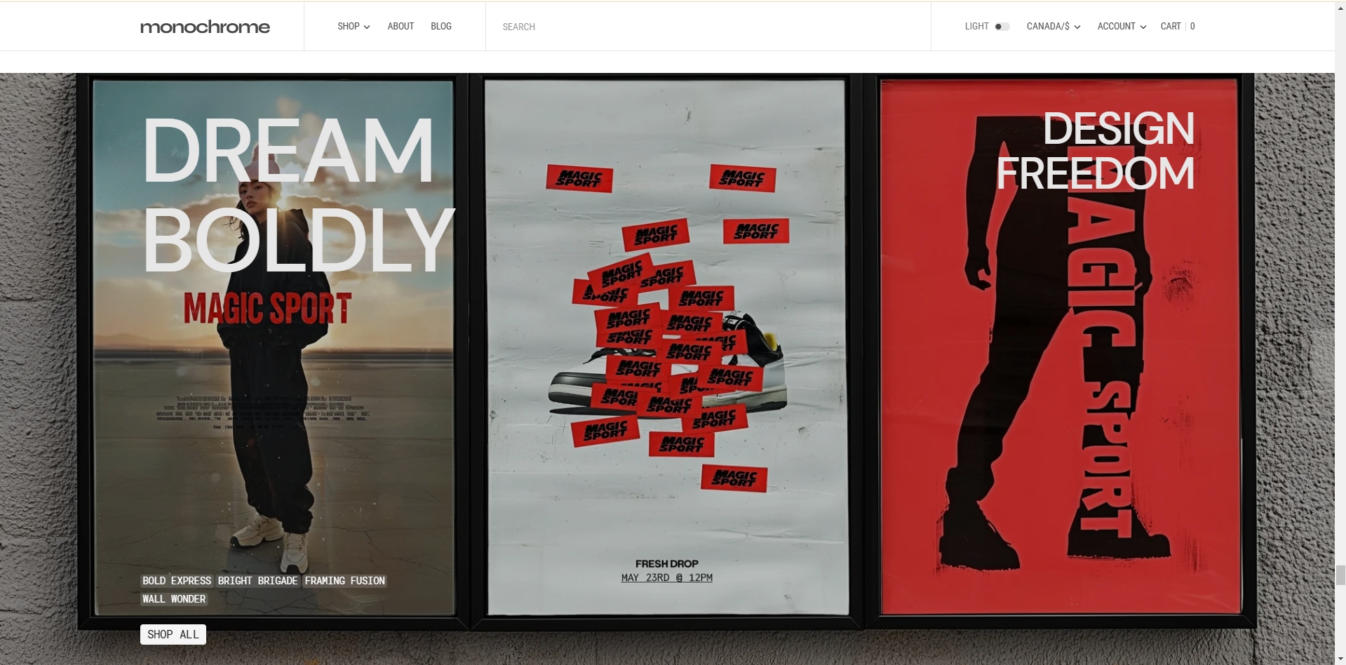
Slider Banner
This section creates a customizable banner slider that can showcase images and videos with text overlays and call-to-action buttons.
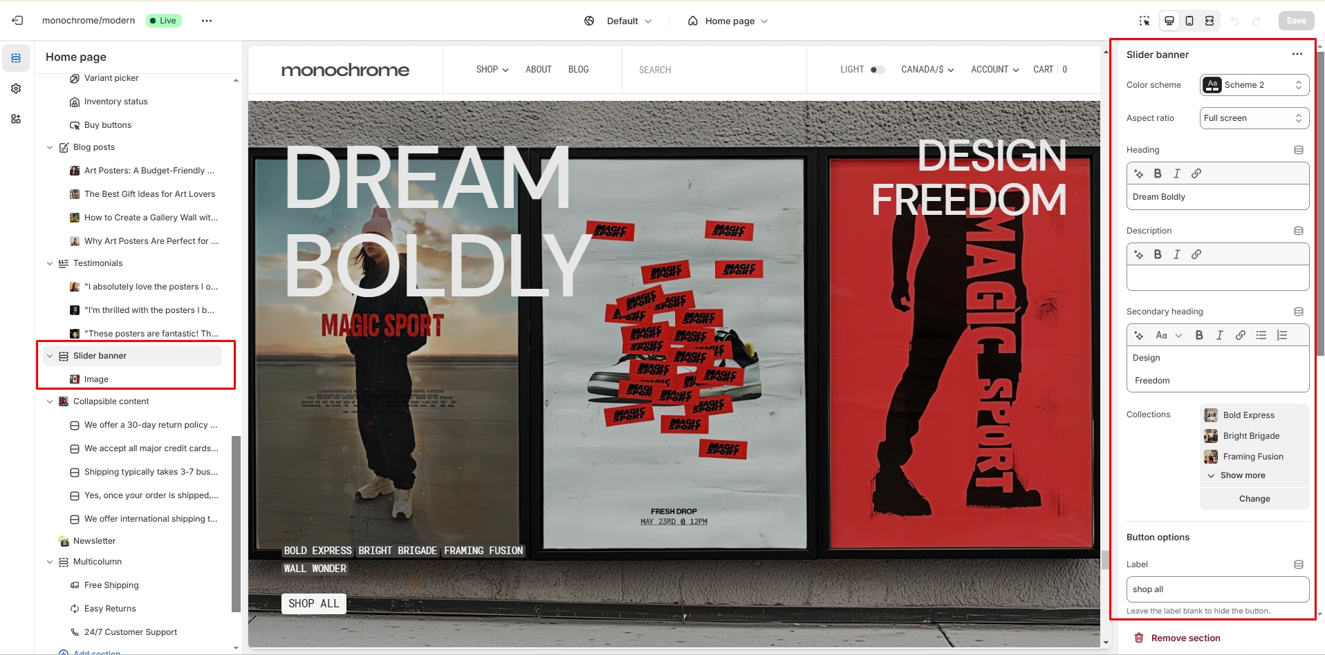
- Color scheme: Select a color palette that complements your store's design.
-
Image size: Choose from multiple aspect ratios to best fit your
content:
- Square (1:1): Equal width and height, suitable for compact layouts.
- Landscape (3:2): Wider than tall, ideal for showcasing products or scenes.
- Portrait (4:3): Taller than wide, great for vertical-oriented content.
- Widescreen (16:9): Standard widescreen format for a cinematic look.
- Ultra-wide (21:9): Extra-wide format for panoramic displays.
- Adapt to image: Automatically adjusts to the uploaded image's dimensions.
- Large: Fills the entire viewport height for maximum impact.
- Heading: Set the main title for the slider banner section.
- Description: Add supporting text to provide more context or details.
- Secondary heading: Include a subtitle for additional information.
- Collection list: Select specific collections to feature in the slider.
-
Button customization:
- Button label: Set the text for the call-to-action button.
- Button link: Specify the URL where customers will be directed upon clicking.
- Button style: Choose from Primary, Secondary, or Tertiary to match your design preferences.
-
Slider options:
- Autoplay: Enable or disable automatic advancement of slides.
- Navigation arrows: Show or hide clickable arrows for manual navigation.
- Pagination dots: Display or hide clickable dots for each slide.
- Slide transition speed: Set the duration of slide transitions (0.1-6 seconds).
- Slide delay time: Adjust the time each slide is displayed before transitioning (0.1-8 seconds).
- Transition effects: Choose between Slide or Fade transitions for a smooth visual experience.
-
Slide blocks: Add up to 9 slides, each with:
- Image upload: Select a high-quality image for the slide background.
- Video upload: Optionally add a video clip instead of an image for more dynamic content.
- Overlay opacity: Adjust the transparency of the image overlay (0-100%) to ensure text readability.
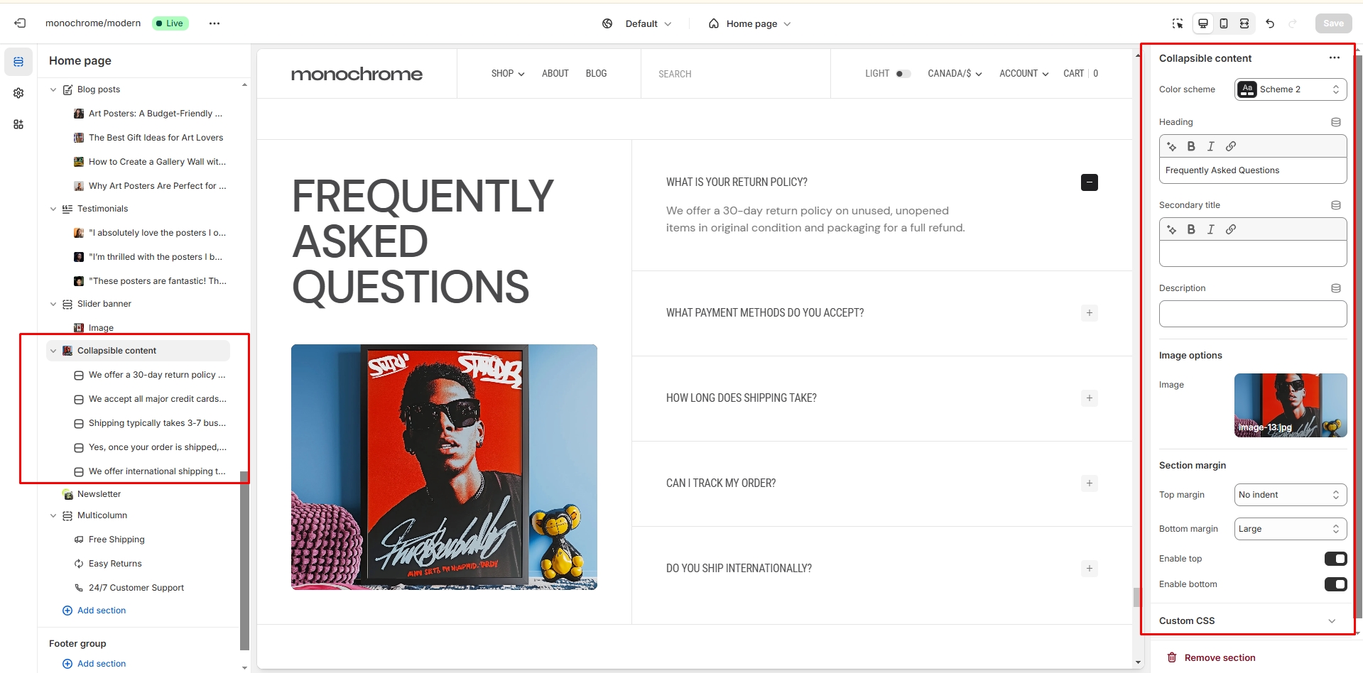
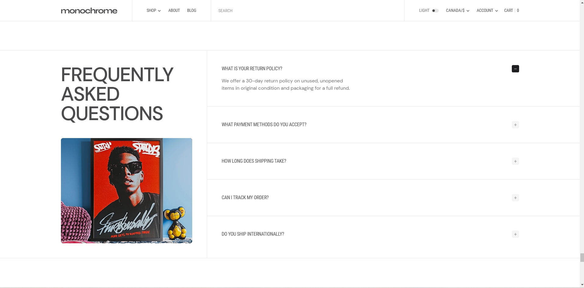
Collapsible content
You can add and customize a collapsible content section, such as using it for FAQs.
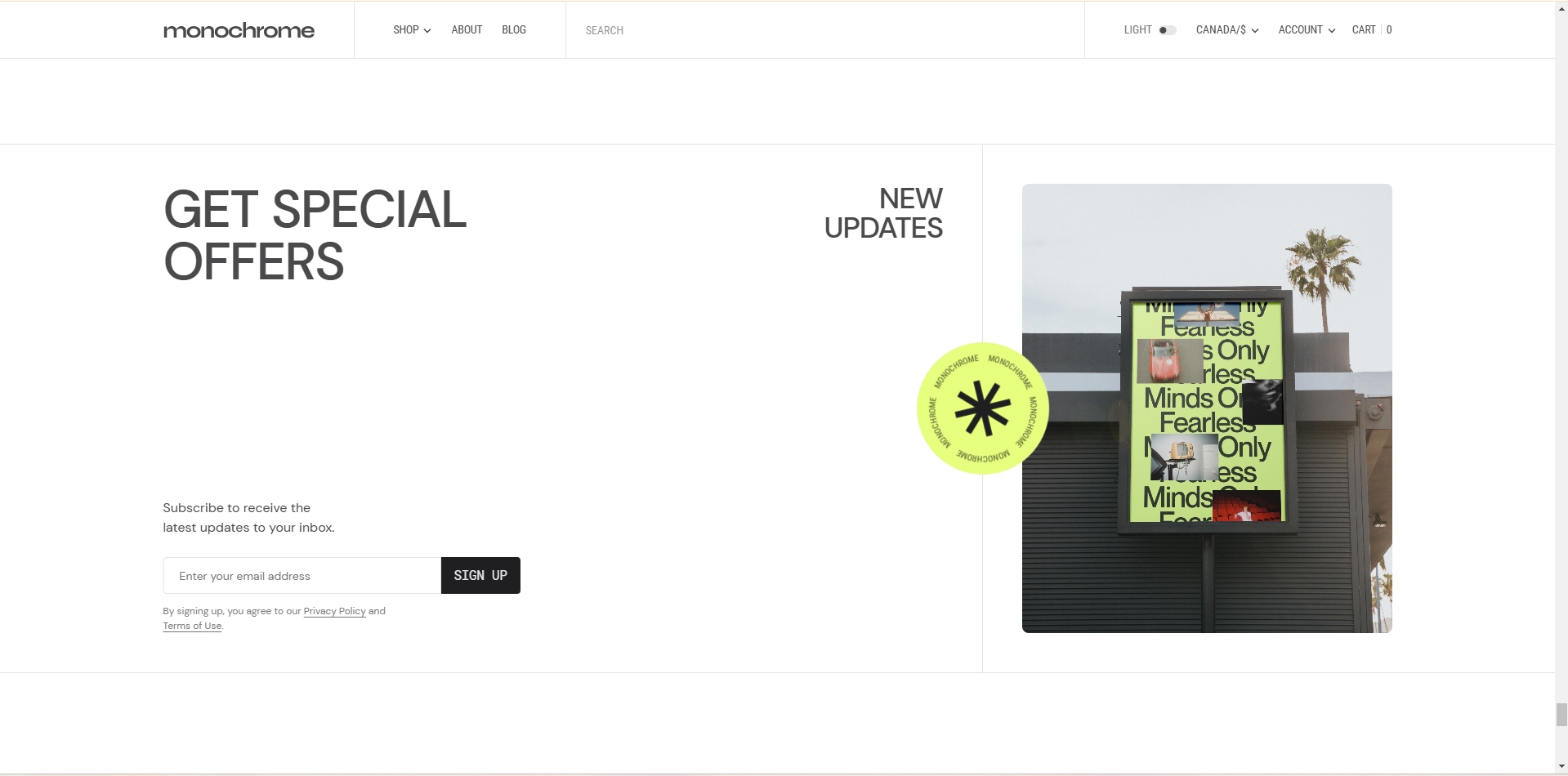
Newsletter
This section creates a newsletter signup form with customizable content and image display options.
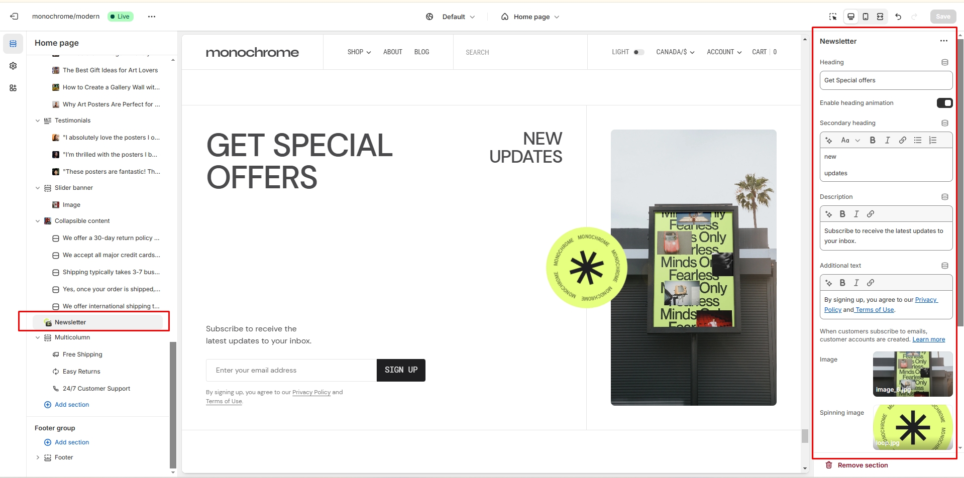
- Heading: Set the main title to encourage newsletter subscriptions.
- Heading animation: Enable or disable animated entrance effects for the heading.
- Secondary heading: Add a subtitle to provide additional context or incentives.
- Newsletter text: Include descriptive content explaining the benefits of subscribing.
- Additional text: Insert extra information below the signup form, such as privacy policy details.
-
Image options:
- Main background image: Upload an image to serve as the section's background.
- Spinning image: Add a separate image with a rotation effect for visual interest.
-
Border options:
- Top border: Add a decorative line above the newsletter section.
- Bottom border: Include a separating line below the section.
-
Form features:
- Email validation: Ensures entered email addresses are in the correct format.
- Error message display: Shows user-friendly error messages for invalid inputs.
- Success confirmation: Displays a confirmation message after successful subscription.
- Accessible form labels: Includes proper labeling for improved accessibility.
Multicolumn
This section creates a flexible multi-column layout that can display images, text, and buttons in a responsive grid or swipeable carousel on mobile.
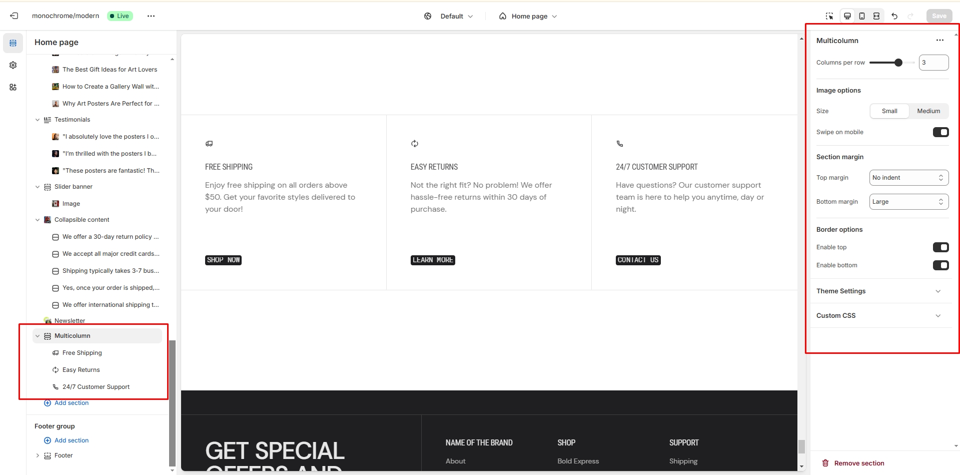
-
Column settings:
- Number of columns: Choose to display 1-4 columns of content.
- Mobile swipe functionality: Enable or disable touch-based swiping on mobile devices.
-
Image options:
- Size selector: Choose between Small or Medium image sizes to fit your layout.
- Primary image: Upload the main image for each column.
- Secondary image: Add an alternate image that appears on hover for interactive effect.
-
Column blocks: Add multiple columns, each with:
- Heading text: Set a title for each column to introduce its content.
- Description text: Add detailed information or explanatory text for each column.
-
Button configuration:
- Button label: Customize the text displayed on the call-to-action button.
- Button link: Set the destination URL for the button.
- Button style: Choose between Primary, Secondary, or Tertiary styles to match your design.
-
Border options:
- Top border: Add a decorative line above the multicolumn section.
- Bottom border: Include a separating line below the section.
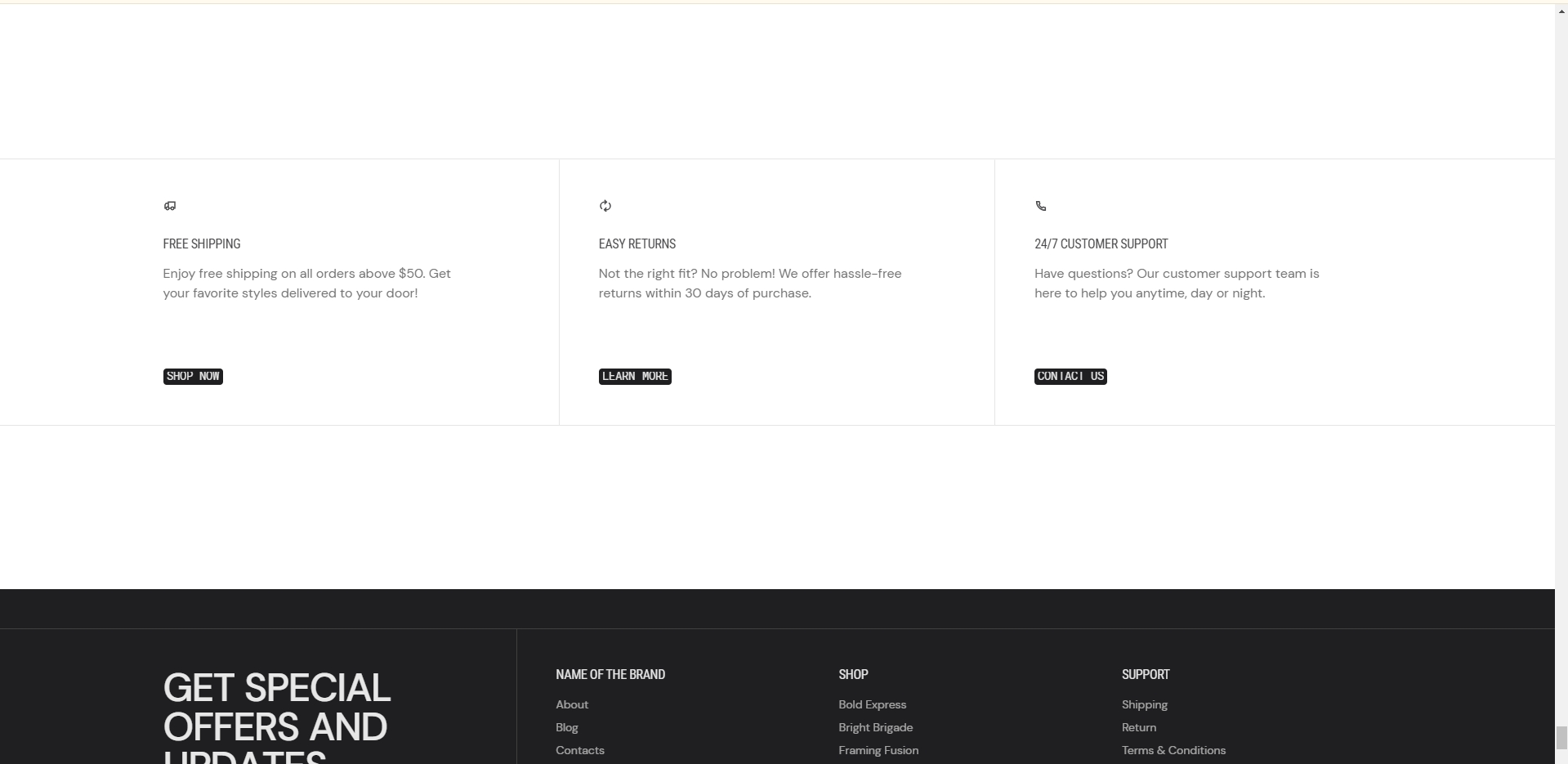
Slideshow
In this section, you can add and customize slides, adjust the color scheme, width, aspect ratio, and slide autoplay duration.
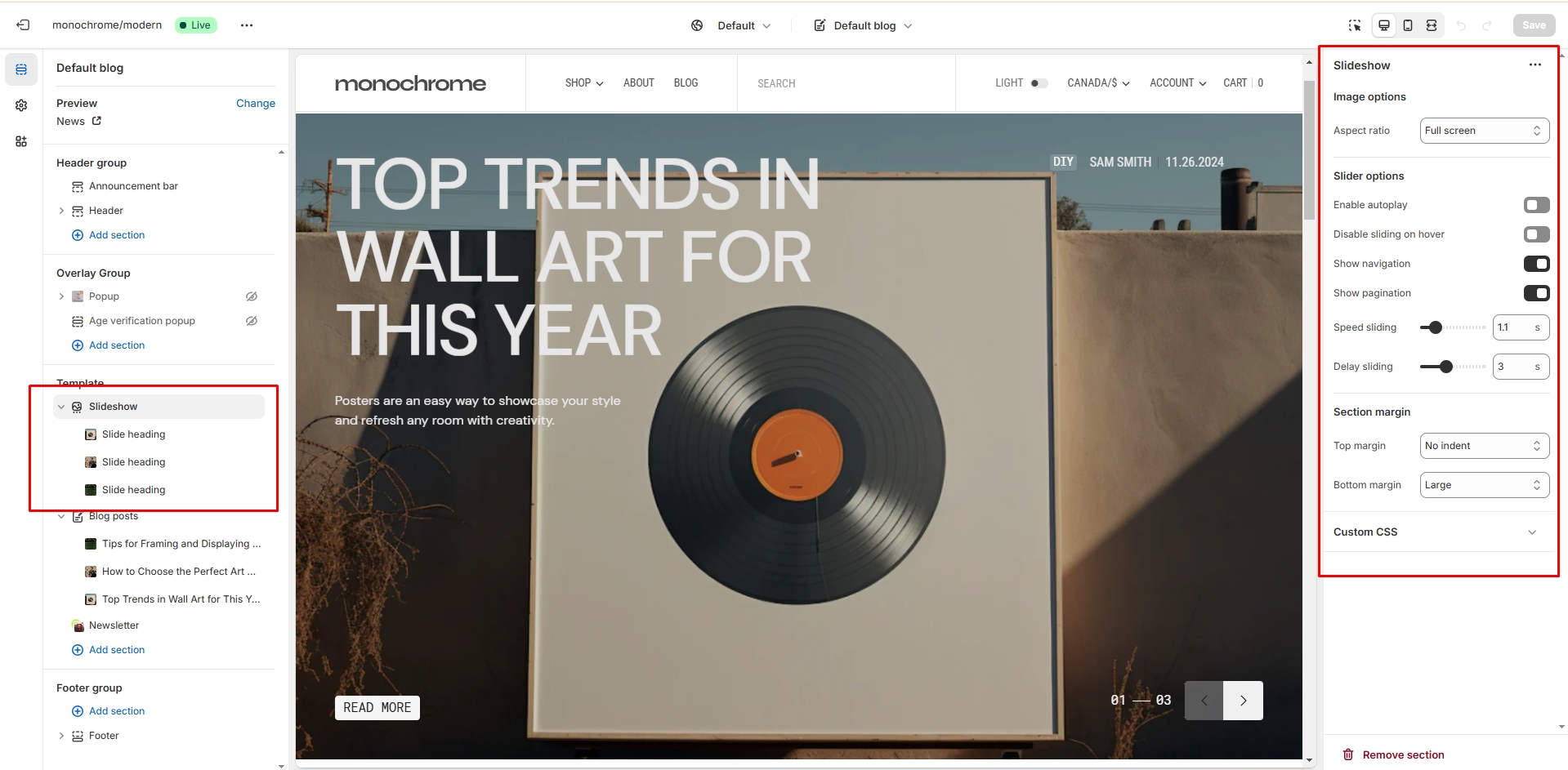
Slider with Product
This section creates an interactive slider that pairs promotional slides with featured products, ideal for product launches and promotions.
Slider Options
- Autoplay: Enable or disable automatic slideshow playback.
- Stop on hover: Pause autoplay when cursor hovers over the slider.
- Slideshow speed: Adjust the transition speed (0.1-6 seconds).
- Slideshow delay: Set the time between slides (0.1-8 seconds).
- Navigation bullets: Show or hide slider navigation arrows.
- Pagination: Enable or disable slide number indicators.
Slide Block Settings (up to 8 slides)
- Image: Upload a background image for the slide.
- Color scheme: Select a color scheme for the slide.
- Overlay opacity: Adjust the opacity of the image overlay (0-100%).
- Subheading: Add a subheading text.
- Heading: Set the main heading for the slide.
- Text: Add descriptive text for the slide.
Product Settings (per slide)
- Product: Select a product to feature on the slide.
- Image ratio: Choose between landscape, portrait, or square format.
- Image fit: Select contain or cover mode for the product image.
- Show SKU: Toggle the display of the product SKU.
- Show vendor: Toggle the display of the product vendor.
- Show collection name: Toggle the display of the collection name.
- Show color swatch: Toggle the display of product color options.
- Show description: Toggle the display of the product description.
Button Settings (per slide)
- Button label: Set the text for the button.
- Button link: Set the URL for the button.
- Button style: Choose between Primary, Secondary, or Tertiary styles.
Additional Features
- Smooth transitions between slides with fade effects for images.
- Text animations for headings and descriptions.
- Responsive design adapting to different screen sizes.
- Integration with Swiper library for advanced slider functionality.
Page
Information on topic pages
Product Page
This section creates a comprehensive product display page with customizable layout, media gallery, and product information blocks.
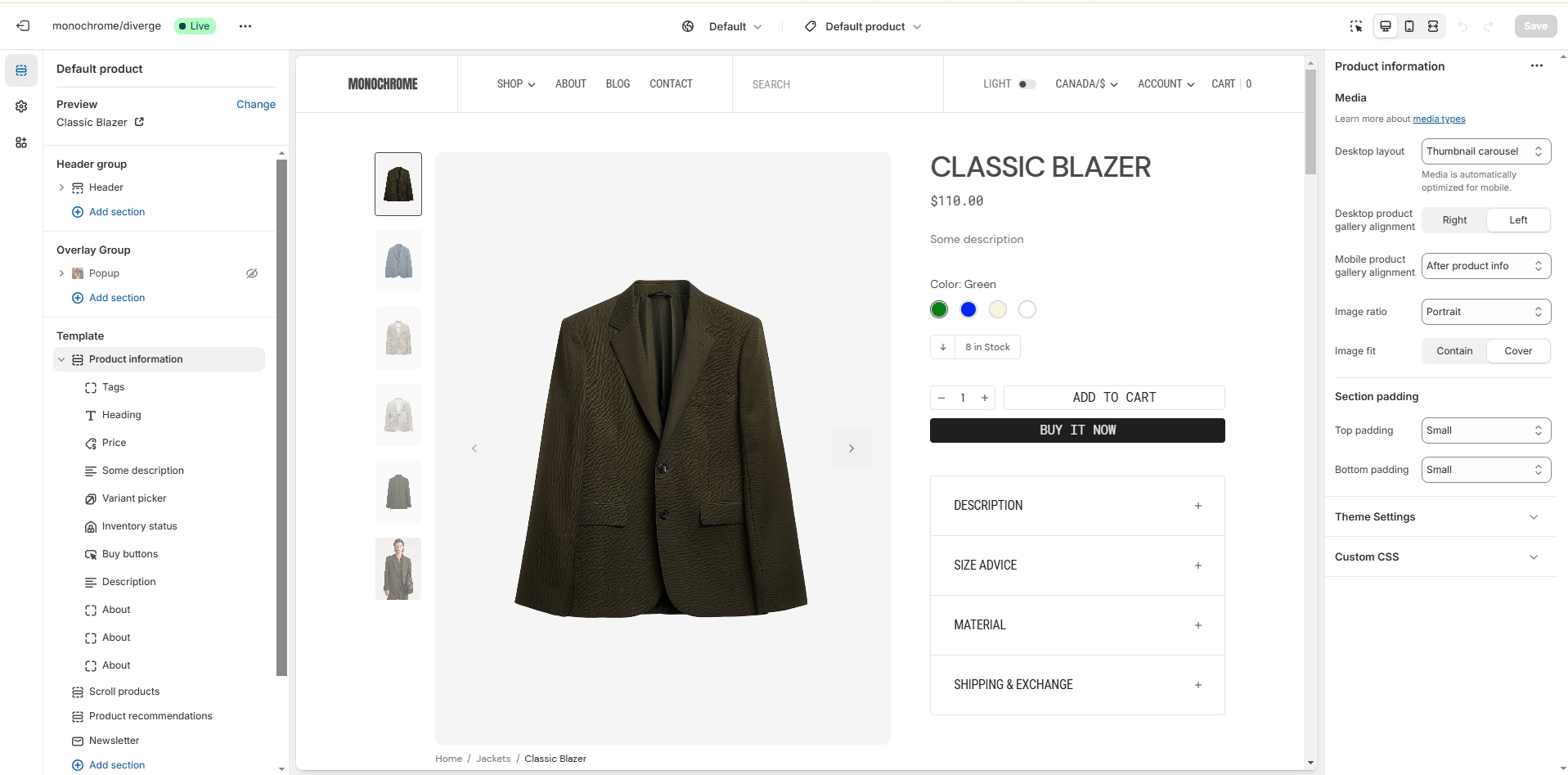
Product Information
-
Gallery settings:
- Layout style: Choose between Stacked, Grid, or Thumbnail carousel for product images.
- Desktop alignment: Position the gallery on the Left or Right side of the page on desktop.
- Mobile alignment: Place the gallery Before content or After content on mobile devices.
- Image ratio: Select from Landscape, Portrait, or Square aspect ratios for product images.
- Image fit: Choose between Contain (show full image) or Cover (fill frame) modes.
-
Content blocks:
- Text blocks: Add custom content areas to provide additional product information.
- Title block: Display the product name prominently on the page.
- Price block: Show the product price with an option to display tax information.
- Variant picker: Allow customers to select product options using either a Dropdown or Button style.
- Tags display: Show relevant product tags to improve categorization and searchability.
- SKU display: Present the product's Stock Keeping Unit for inventory management.
-
Buy buttons block:
- Dynamic checkout button: Toggle the display of a quick checkout option.
- Quantity selector: Enable or disable the ability for customers to choose product quantity.
- Gift card recipient form: Toggle the display of a form for gift card purchases.
-
Description block:
- Custom heading: Set a personalized title for the product description section.
- Display style: Choose between Collapsible (expandable) or Fixed (always visible) layouts.
- Default open state: Determine whether the description is expanded or collapsed by default.
-
Popup blocks (up to 2):
- Custom link text: Set the text for the link that opens the popup.
- Popup heading: Add a title to the popup for context.
- Rich text content: Include formatted text, images, or other content within the popup.
- Page content integration: Pull in content from an existing page to populate the popup.
-
Share buttons:
- Facebook sharing: Enable or disable the option to share on Facebook.
- Twitter sharing: Allow or disallow sharing on Twitter.
- Pinterest sharing: Include or exclude the option to pin on Pinterest.
- Copy link: Provide a quick way for customers to copy the product URL.
-
Additional features:
- Inventory status: Display current stock levels or availability information.
- Pickup availability: Show information about in-store pickup options if available.
- Custom liquid: Integrate custom Liquid code for advanced functionality or styling.
- Additional text blocks: Include extra content areas for more product details or promotional text.
Complementary Products
- Products to show: Set the number of related products to display in the slider (1-10 products).
-
Product card options:
- Secondary image on hover: Toggle the display of an alternate product image when customers hover over the card.
- Vendor display: Choose whether to show or hide the product's vendor name.
- Collection name display: Opt to show or hide the name of the collection the product belongs to.
- Image ratio: Select from Landscape, Portrait, or Square aspect ratios for the product card images.
- Image fit: Choose between Contain (show full image) or Cover (fill frame) modes for product card images.
Collection Page
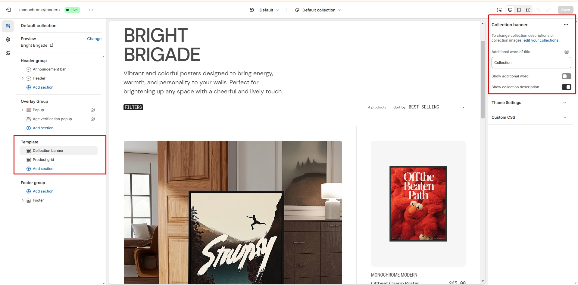
Collection Banner
- Additional word: Set an additional word to be added to the collection title (default: "Collection").
- Show additional word: Enable or disable the display of the additional word.
- Show collection description: Enable or disable the display of the collection description.
Product Grid
- Products per page: Set the number of products displayed per page (range: 6-50, default: 9).
- Sort: Choose the default sorting method for products (alphabetical, reverse alphabetical, newest to oldest, oldest to newest, price high to low, price low to high).
- Heading: Set a heading for the product grid section.
- Description: Add a description for the product grid section.
Button Settings
- Button label: Set the text for the button.
- Button link: Set the URL for the button.
- Button style: Choose the style of the button (primary, secondary, or tertiary).
Product Card Settings
- Show two cards on mobile: Enable to display two product cards per row on mobile devices.
- Show SKU: Enable or disable the display of the product SKU.
- Show vendor: Enable or disable the display of the product vendor.
- Show collection name: Enable or disable the display of the collection name on the product card.
- Show description: Enable or disable the display of the product description.
- Show color swatch: Enable or disable the display of color swatches.
Image Settings
- Image ratio: Choose the image ratio (landscape, portrait, or square).
- Image fit: Select the image fit (contain or cover).
Border Settings
- Enable top border: Enable or disable the top border of the section.
- Enable bottom border: Enable or disable the bottom border of the section.
Collections List
Displays a list of all collections
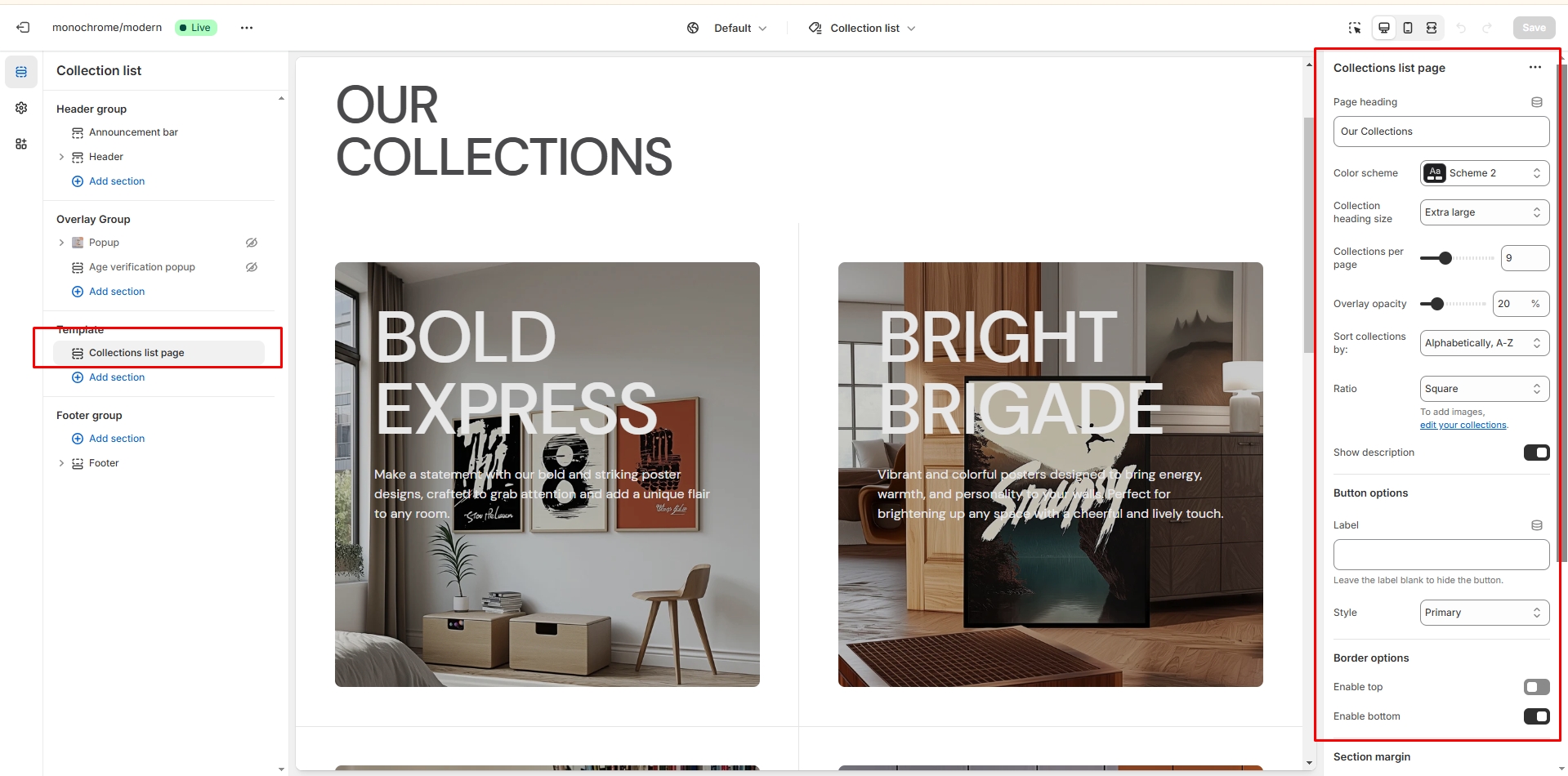
- Title: Set a heading for the section (default: "Collections").
- Color scheme: Choose the color scheme for the section.
- Heading size: Select the size of the collection titles (h5 to h1).
- Collections per page: Set the number of collections displayed per page (range: 3-23, default: 9).
- Overlay opacity: Adjust the opacity of the overlay on collection images (range: 0-100%).
- Sort collections by: Choose how to sort the collections (alphabetical, reverse alphabetical, date, reverse date, product count high to low, product count low to high).
Image Settings
- Image ratio: Choose the aspect ratio for collection images (landscape, portrait, or square).
Content Settings
- Show collection description: Enable or disable the display of collection descriptions.
Button Settings
- Button label: Set the text for the button (if left empty, no button will be shown).
- Button style: Choose the style of the button (primary, secondary, or tertiary).
Border Settings
- Enable top border: Add a border to the top of the section.
- Enable bottom border: Add a border to the bottom of the section.
Cart
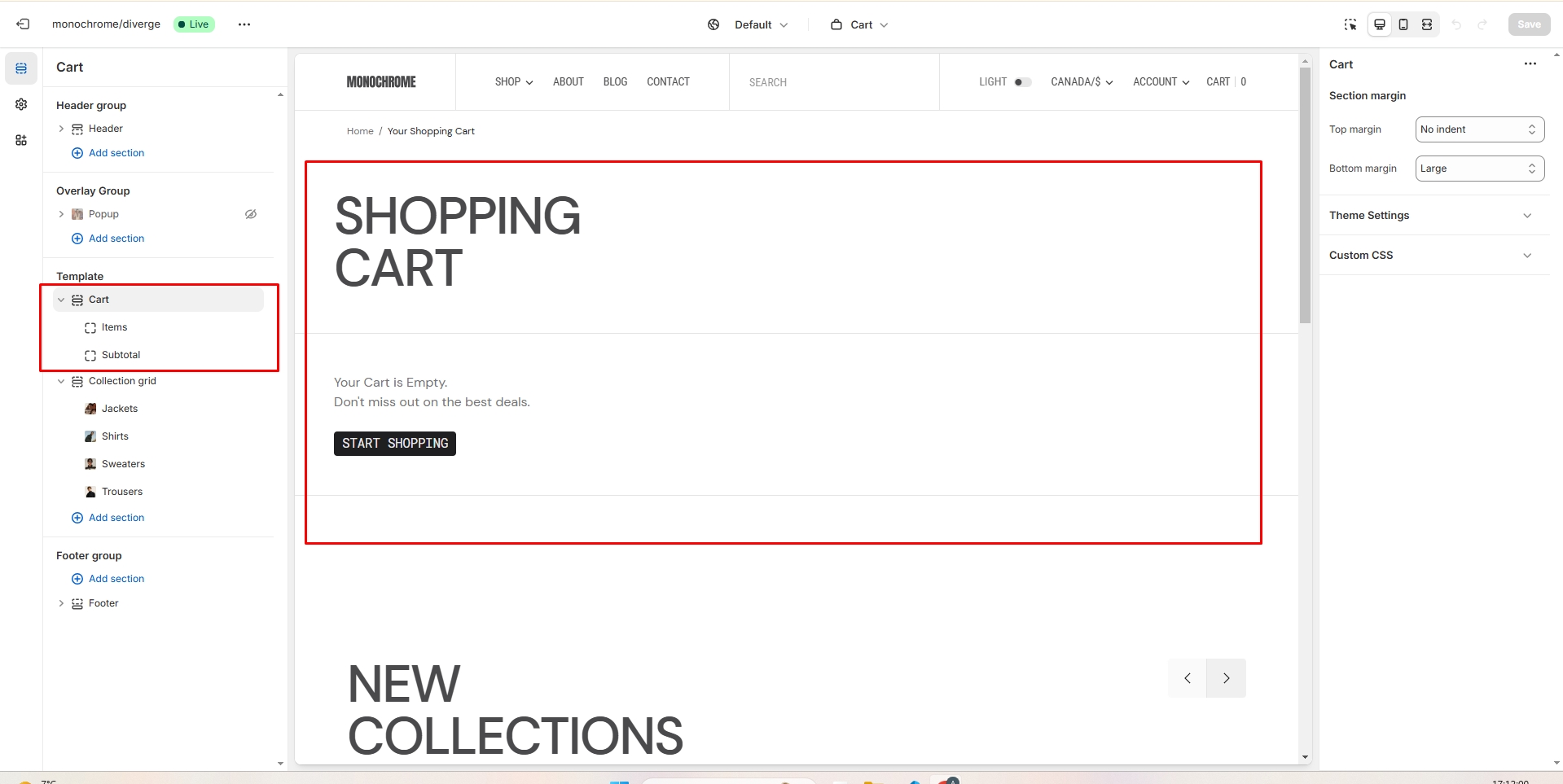
- Image fit: Choose how the product images fit within their container (contain or cover).
- Show vendor: Enable or disable the display of the product vendor.
- Show collection name: Enable or disable the display of the collection name.
- Show cart note: Enable or disable the option for customers to add a note to their cart.
- Additional text: Add custom text to display in the cart footer.
Blog
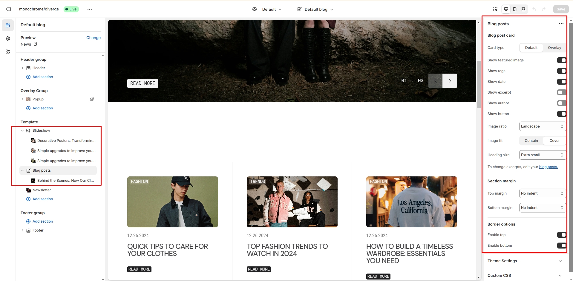
- Blog posts per page field sets the number of displayed cards.
- Blog posts per row slider allows you to select the number of columns in one line.
- Animations settings allows you enable animation effect on scroll
- Slider options allows you to customize slider.
- Blog post options allows you to customize slider blog post.
- On the block you can select a blog that can add the intro banner
Blog post
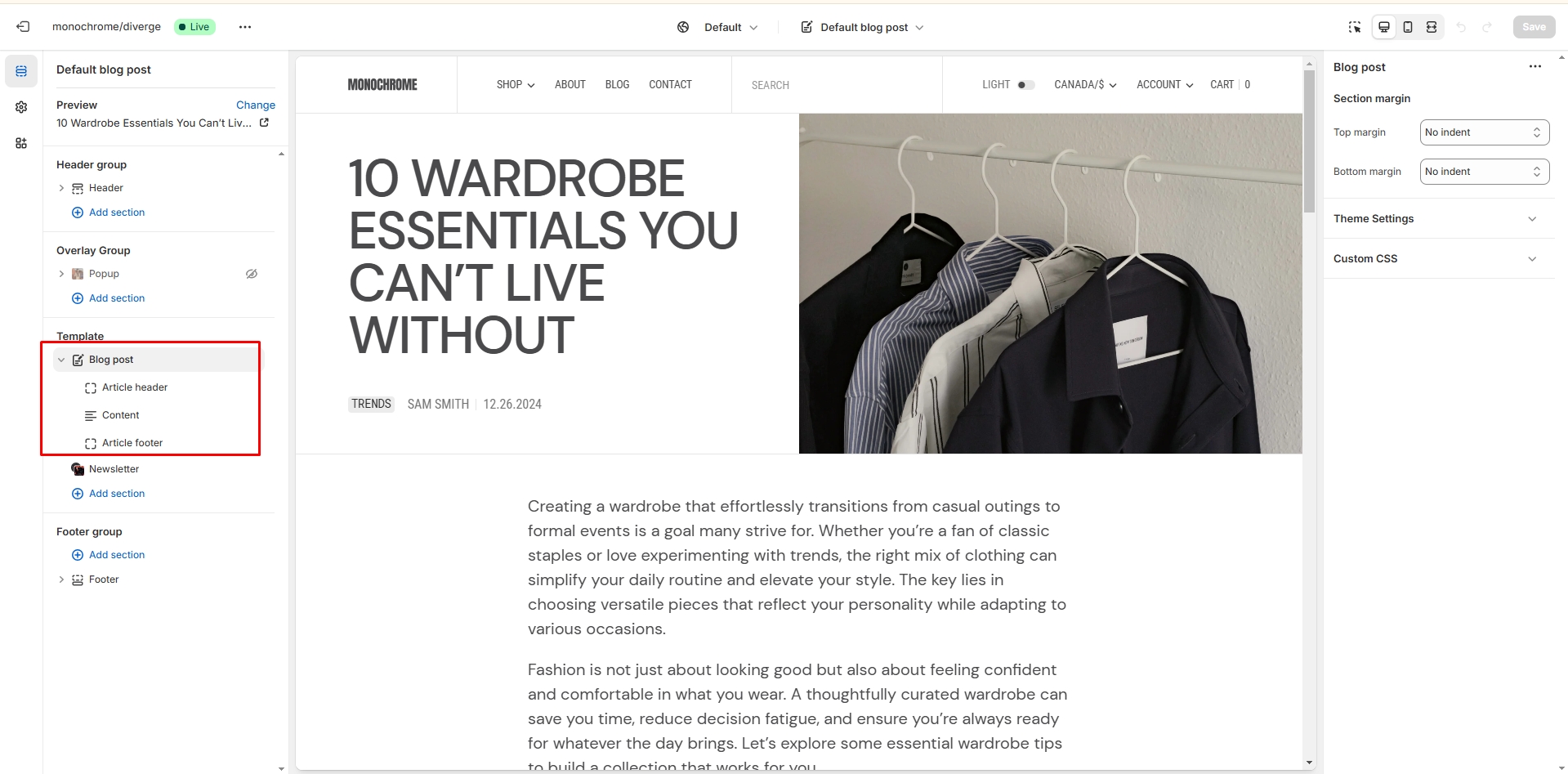
- Header layout allows you to select the location of the image.
- Block Article header option Show tags field enables the display of tags for the blog post.
- Block Article header option Show excerpt field enables the display of the excerpt for the blog post.
- Block Article header option Show date field enables the display of the date for the blog post.
- Block Article header option Show author field enables the display of the author for the blog post.
- Block Article header option Featured image height field allows you to select an image ratio.
- Block Content option Show Share block allows enable links from the list.
- Block Content option Show date field enable date for blog post.
- Block Content option Show author field enable author for blog post.
Importing Our Demos
You can also copy the structure of any of our 5 demos in a few steps.
- Copy the demo structure from the links (Cmd-A or Ctrl-A to select all).
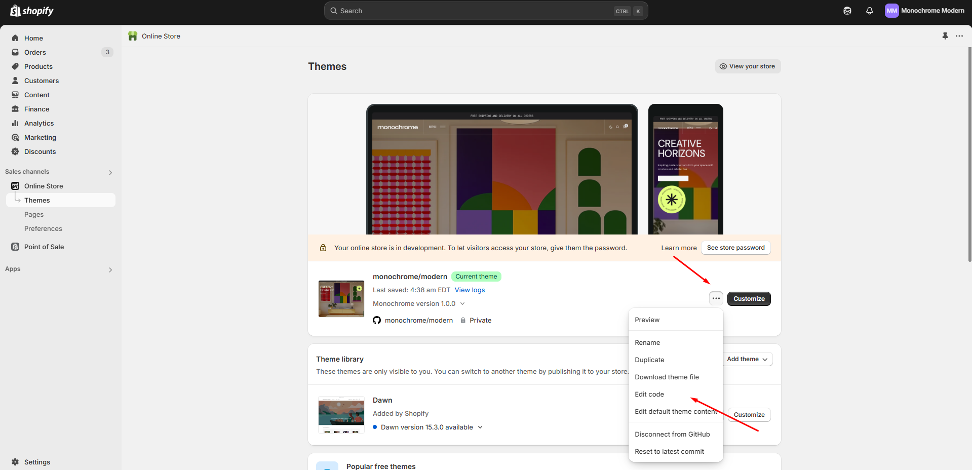
- Follow to the section Online Store > Themes in your store. Click the three dots button of your theme.
-
Open the code editor by clicking the Edit code button.
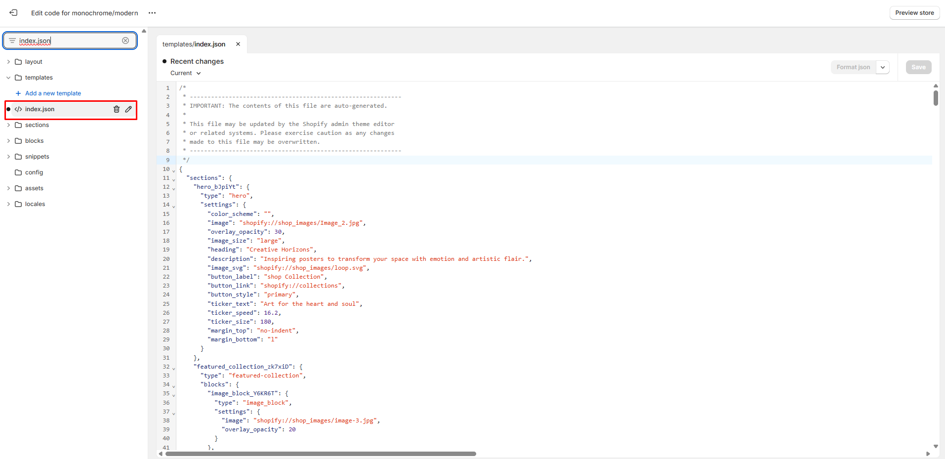
-
In the code editor, search for the file "index.json", select all
content, and paste replacing the demo structure. Click "Save" to
save your changes. If there's an error, click "Format json" and try
to save the file again.
Demos structure
Support
You can ask any questions about the theme and our support agent will help you within 24 hours on business days.
Visit Help Center View Terms & Conditions